

Color is more than decoration, it is a strategic tool that shapes perception, communicates personality, and guides attention. For small businesses, color is one of the most powerful elements of brand identity. Whether you’re selecting brand colors, designing printed materials, or creating a cohesive customer experience, understanding color theory gives you the clarity and confidence to make intentional choices.
What is color theory?
Color theory is the framework designers use to understand how colors interact, how they influence emotion, and how they can be combined effectively. It provides a foundation for creating visual harmony — in brand palettes, logos, websites, packaging, signage, and any customer-facing materials.
Color Is Visual Perception
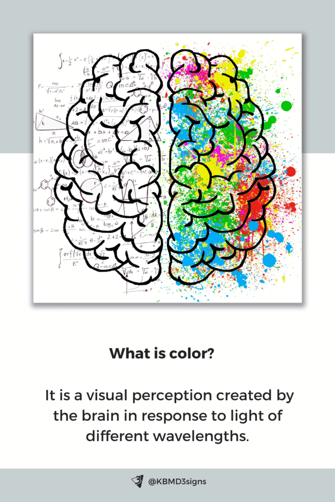
Color is not a property of an object but a response created by the brain. When light reaches the eye, different wavelengths are interpreted as different colors. Because color is perception, not physics alone, it also influences how people feel, think, and act — which is why thoughtful color selection plays such a critical role in brand design.
In this article, we’ll explore essential color theory concepts for small businesses: the color wheel, color characteristics, meaningful palettes, and the psychology behind color choices.
Article content:
- Quote by Marc Chagall
- Foundational Elements Of Color Theory
- Color Wheel Based On The RYB Color Model
- Difference Between Hue, Value, and Chroma
- Distinction Between Shade, Tint, and Tone
- Understanding Color Temperature
- Harmonious Color Schemes
- The Psychology of Color
- Meaning of Colors
- Colors and Emotions
- Understanding the Psychology of Color
- FAQ’s About “What is Color Theory?”
1. Quote by Marc Chagall
This well-known quote by Marc Chagall beautifully captures the relationship between color and contrast — a principle at the heart of design.
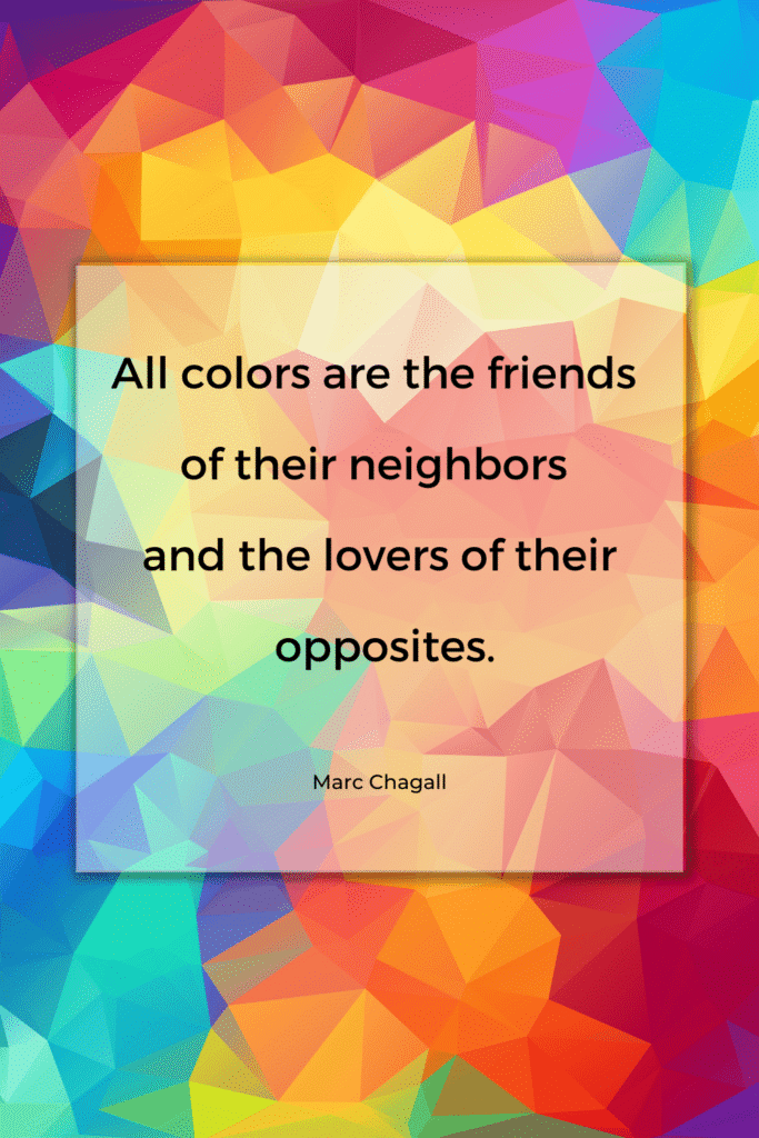
Designers use this idea every day when building palettes: harmonies come from neighbors, and impact comes from opposites.
2. Foundational Elements of Color Theory
A core part of color theory is understanding color models — systems that describe how colors are created.
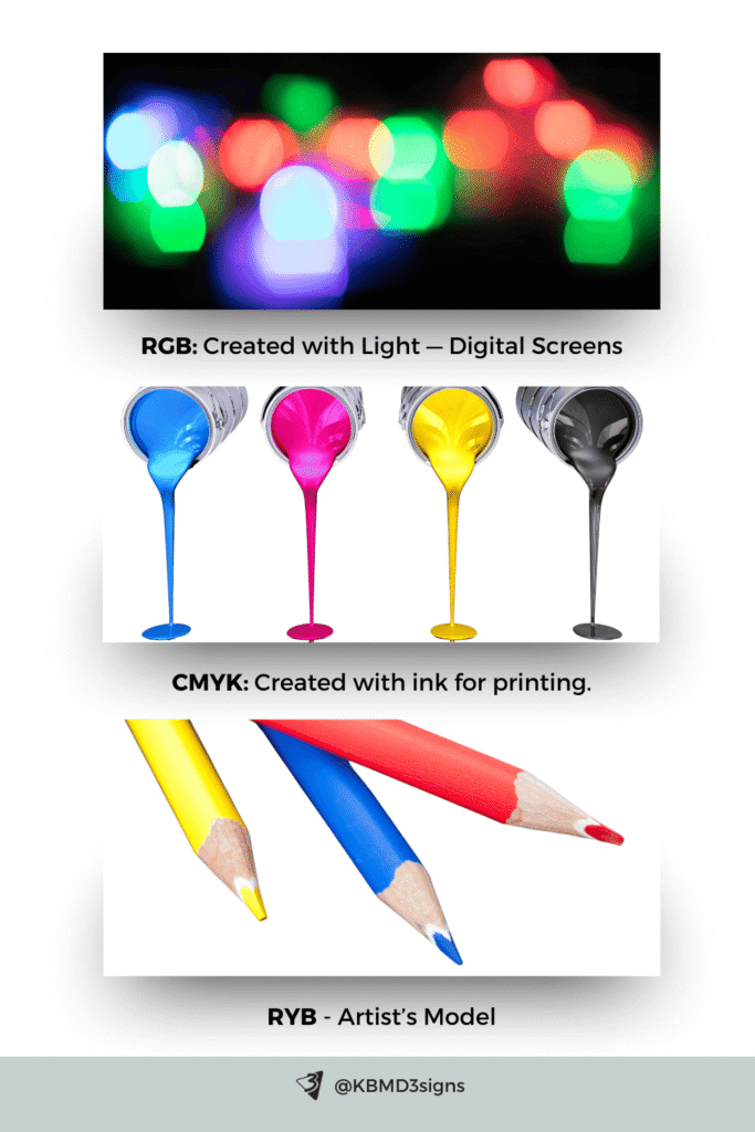
RGB (Red, Green, Blue)
- Used for digital screens
- Color is created with light
- Ideal for websites, social media, and digital ads
CMYK (Cyan, Magenta, Yellow, Key/Black)
- Used for printing
- Color is created with ink
- Essential for business cards, brochures, packaging, and signage
RYB (Red, Yellow, Blue)
- Traditional artist’s model
- Useful for understanding basic mixing and color relationships
- Commonly used for teaching foundational color theory
3. Color Wheel Based On The RYB Color Model
The color wheel is a visual guide showing how colors relate to each other. It helps designers build balanced palettes and understand how colors interact.
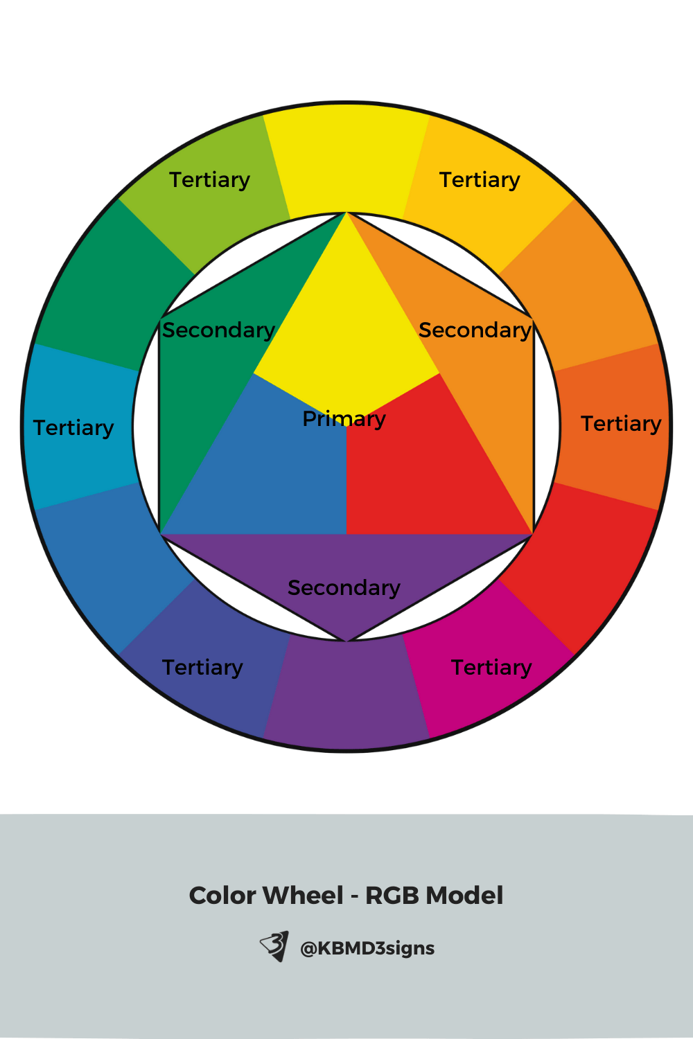
Whether you’re creating a brand palette or choosing colors for printed materials, the color wheel is an essential tool.
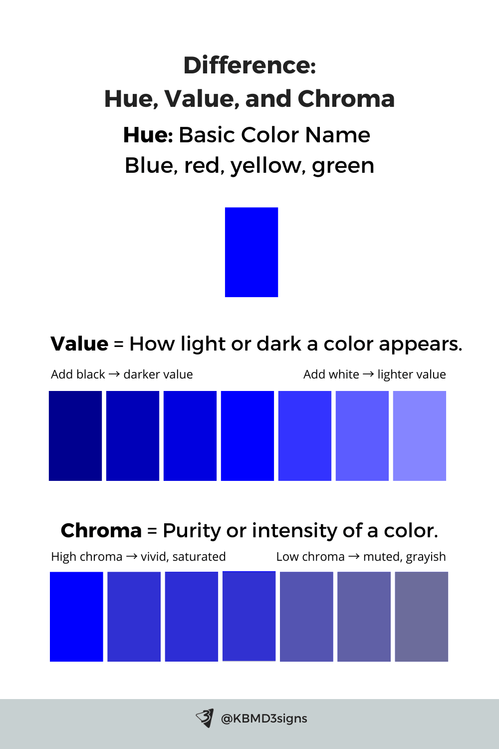
4. Difference Between Hue, Value, and Chroma
Hue
The basic name of the color — blue, red, yellow, green.
Value
How light or dark a color appears.
- Add white → lighter value
- Add black → darker value
Value affects readability, contrast, and visual hierarchy — especially important for text, logos, and print materials.
Chroma
The purity or intensity of a color.
- High chroma → vivid, saturated
- Low chroma → muted, grayish
Chroma influences how modern, bold, subtle, or sophisticated a brand feels.
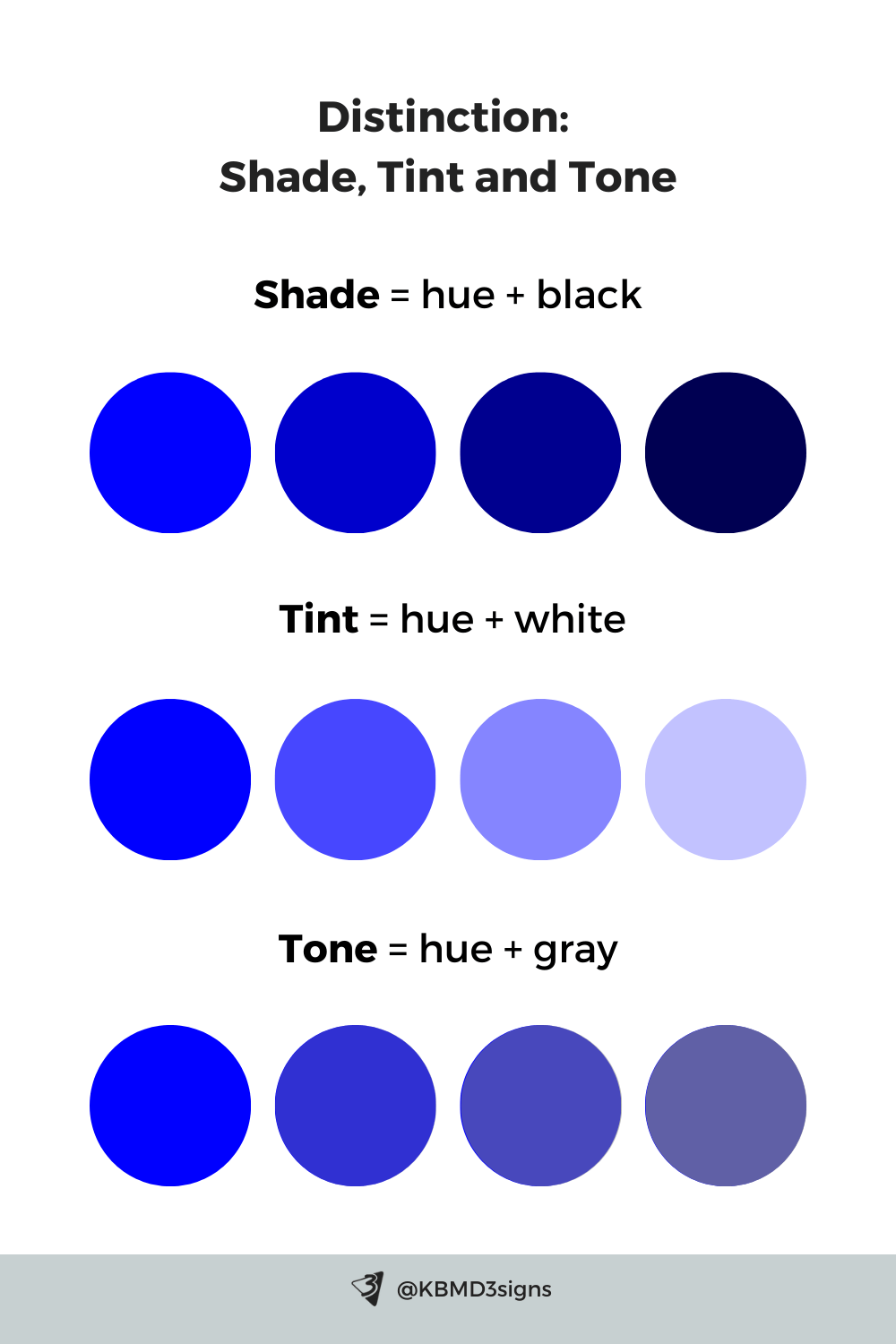
5. Distinction Between Shade, Tint, and Tone
Shade affects value, tone affects chroma, and together they help designers refine a brand palette for versatility. Using shades, tints, and tones ensures your palette works across digital, print, and environmental applications.
6. Understanding Color Temperature
Color temperature describes a color’s warmth or coolness, it is an important factor in brand personality.
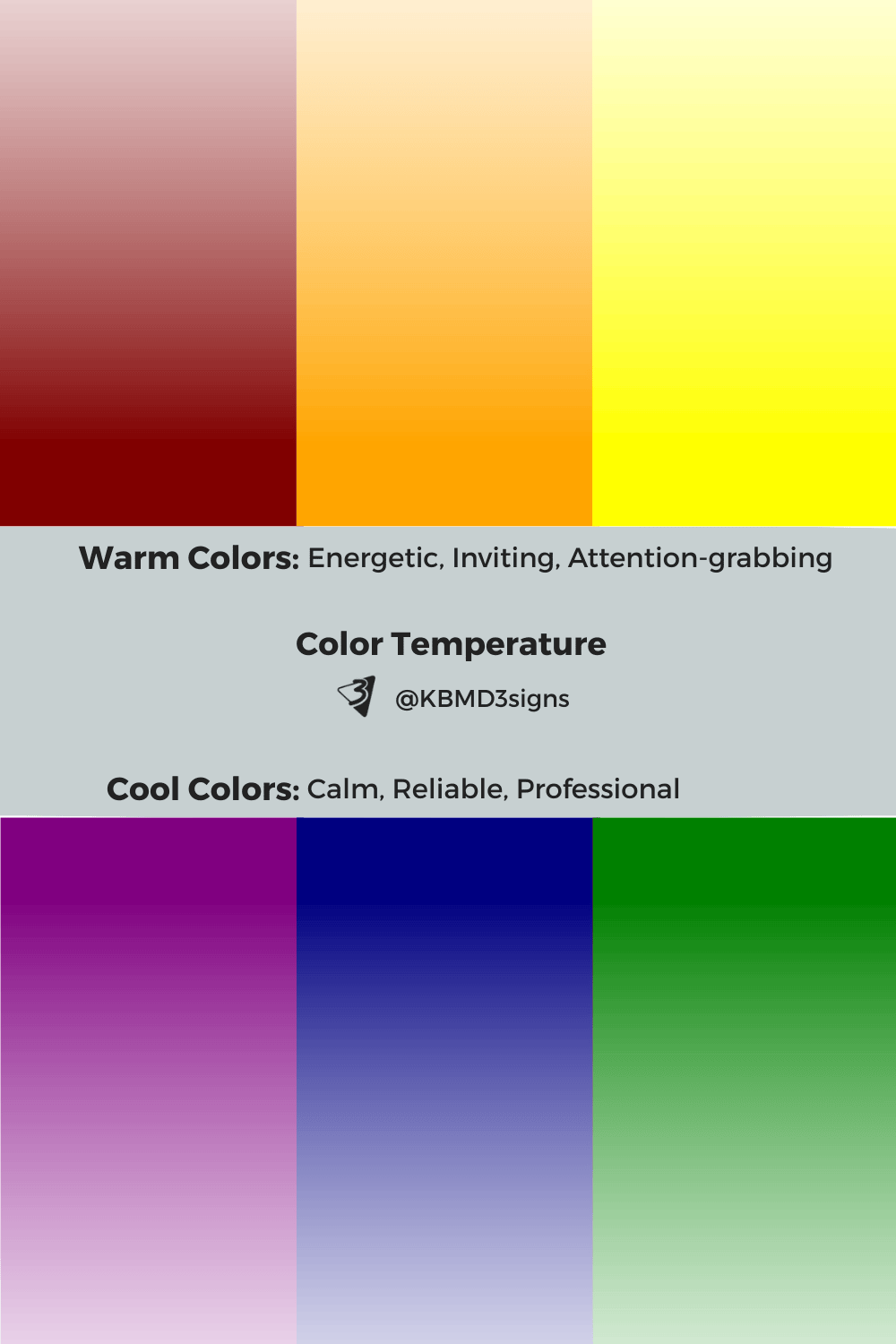
Warm colors
Red, orange, yellow
- Energetic
- Inviting
- Attention-grabbing
Often used in food brands, retail, and creative industries.
Cool colors
Blue, green, purple
- Calm
- Reliable
- Professional
Common in wellness, corporate, and service-based brands.
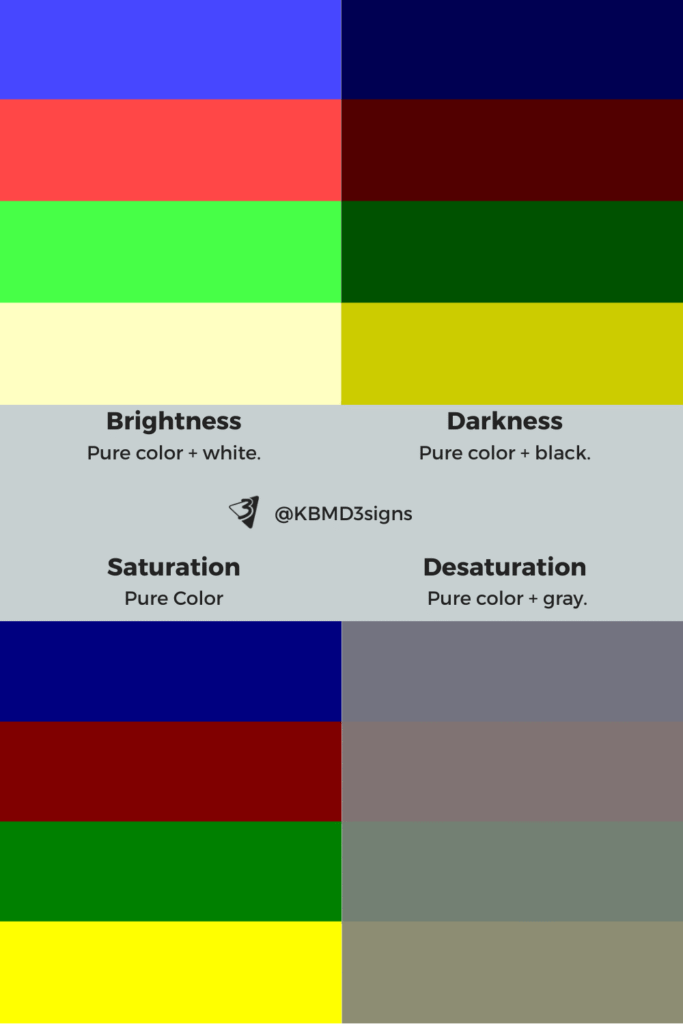
Brightness, darkness, saturation, desaturation
These qualities determine whether a brand feels bold, refined, playful, soft, minimalist, or luxurious.
7. Harmonious Color Schemes
Color schemes are structured color relationships that create visual harmony.
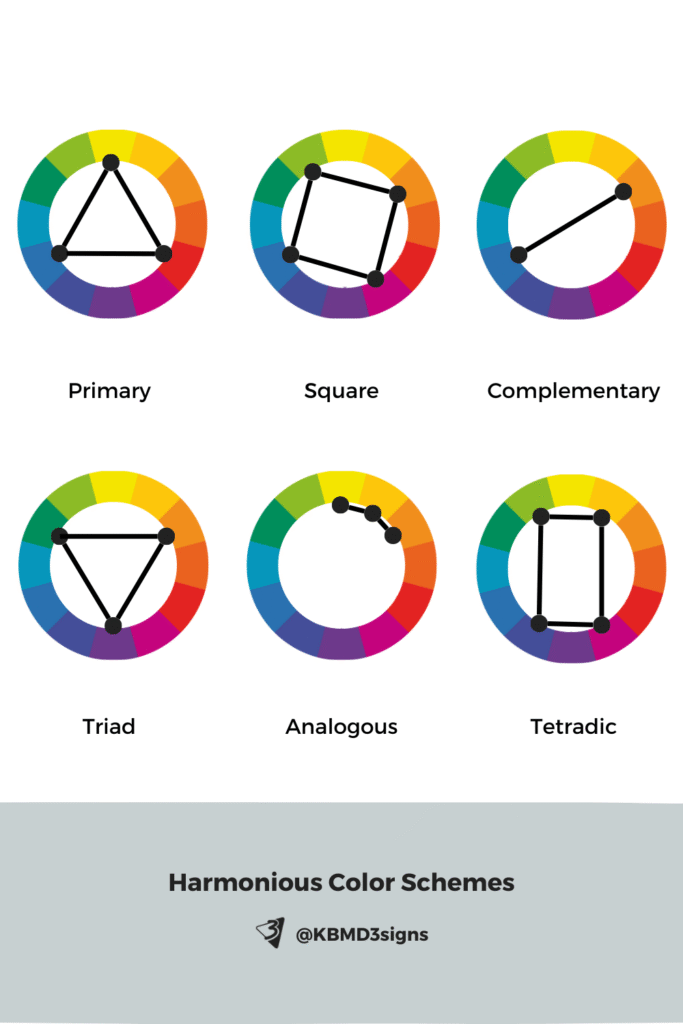
- Monochromatic: variations of one hue
- Analogous: colors next to each other on the wheel
- Complementary: opposite colors for contrast
- Split Complementary: one hue + two adjacent to its complement
- Triadic: three evenly spaced colors
- Tetradic: two complementary pairs
For small businesses, these schemes help create cohesive brand palettes, product packaging, and offline marketing materials.
Here are color tools that serve well to match colors to existing color schemes, color palette ideas, and colors by #Hex codes and names.
8. Psychology of Color
Color influences how people feel and behave — which makes it a powerful branding tool.
Examples:
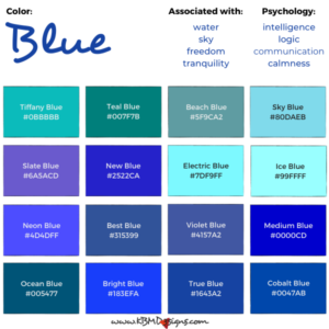
- Blue → trust, stability
- Green → growth, health, nature
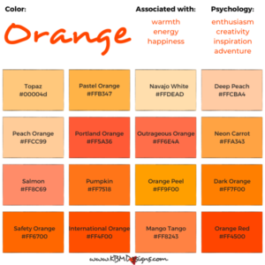
- Yellow → optimism, creativity
- Red → passion, urgency
- Black → sophistication, authority
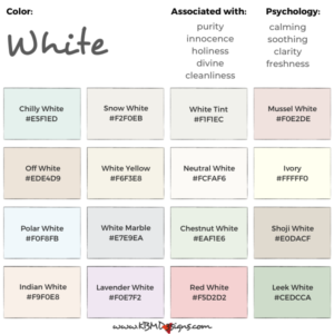
- White → clarity, purity, minimalism
Understanding these associations helps small businesses choose colors that support their message.
9. Meaning of Colors
Color meanings vary across cultures and industries, but general patterns include:
- Red: excitement, passion, appetite
- Orange: friendliness, affordability
- Yellow: joy, optimism
- Green: balance, growth, sustainability
- Blue: trust, calm, professionalism
- Purple: luxury, imagination
- Brown: reliability, groundedness
- Black: power, elegance
- White: simplicity, cleanliness
Brands use these meanings to align color choices with customer expectations.


10. Colors and Emotions
Color affects mood and perception:
- Warm colors → energizing, uplifting
- Cool colors → calming, stabilizing
- Bright colors → playful, youthful
- Dark colors → elegant, serious
- Saturated colors → bold, dynamic
- Muted colors → soft, sophisticated
Choosing emotionally aligned colors helps small businesses communicate their tone and intention from the first glance.
11. Understanding the Psychology of Color
Effective branding uses color strategically:
- Blue for trust in corporate environments
- Green for health and nature-based brands
- Yellow for creativity and friendliness
- Earth tones for organic or handmade businesses
- High-contrast palettes for high-energy or youth-oriented brands
Thoughtful color selection strengthens recognition, customer trust, and marketing performance.
In Conclusion: What Is Color?
Color is a powerful design element that shapes how people experience your brand. Understanding color theory helps you choose colors intentionally — creating harmony, clarity, and emotional impact across your visual identity.
For small businesses, color is not just aesthetic. It is strategic.
By applying color theory to your branding, printed materials, packaging, signage, and online presence, you can create a cohesive and memorable brand that connects with your audience.

-

Marketing Materials Every Personal Trainer Needs to Grow Their Business
Read the post …: Marketing Materials Every Personal Trainer Needs to Grow Their Business -

Gray Business Cards: Perfect Blending Of Sophistication And Versatility
Read the post …: Gray Business Cards: Perfect Blending Of Sophistication And Versatility -

Brand Color Blue : Business Card Designs with an Edge
Read the post …: Brand Color Blue : Business Card Designs with an Edge
12. FAQ’s About “What is Color Theory?”
Color theory is a set of principles and guidelines concerning the use of color in art and design. It explores how colors interact with each other and how they can be combined to create harmonious or contrasting effects.
Color theory is important because it helps artists, designers, and creators understand how colors work together and how they can evoke different emotions or moods. It provides a framework for making informed decisions about color in various applications.
Primary colors are the fundamental colors from which all other colors are derived. In traditional color theory, they are red, blue, and yellow. These colors cannot be created by mixing other colors together.
Secondary colors are created by mixing equal parts of two primary colors. The secondary colors are orange (red + yellow), green (yellow + blue), and purple (blue + red).
Tertiary colors are created by mixing a primary color with a neighboring secondary color on the color wheel. For example, red-orange and yellow-green are tertiary colors.
The color wheel is a circular diagram that shows the relationships between colors. It typically includes primary, secondary, and sometimes tertiary colors arranged in a way that illustrates their chromatic relationship.
Warm colors (like red, orange, and yellow) tend to evoke warmth, energy, and vibrancy. Cool colors (like blue, green, and purple) evoke calmness, tranquility, and sometimes sadness.
A monochromatic color scheme uses variations in lightness and saturation of a single color. It creates a harmonious and unified look without using other colors from the color wheel.
An analogous color scheme uses colors that are adjacent to each other on the color wheel. This creates a cohesive and harmonious color palette.
A complementary color scheme uses colors that are opposite each other on the color wheel. This creates a strong contrast and can be used to make elements stand out.
The psychology of color studies how different colors can affect human emotions, moods, and behaviors. It explores how color choices in design can influence perceptions and reactions.
You can use color theory by understanding basic color relationships, experimenting with different color combinations, and considering the emotional impact of colors on your audience or users.
-
Purple & Black Aesthetic – Theme Challenge #1
Read the post …: Purple & Black Aesthetic – Theme Challenge #1 -
Gray Business Cards: Perfect Blending Of Sophistication And Versatility
Read the post …: Gray Business Cards: Perfect Blending Of Sophistication And Versatility -
Brand Color Blue : Business Card Designs with an Edge
Read the post …: Brand Color Blue : Business Card Designs with an Edge