

The different shades of turquoise color instantly evoke images of tropical coastlines. In this article, we’ll explore the question “What is turquoise?” and delve into the nuances of its various color models, including its creation, complementary color, and symbolic meaning. Then, we’ll examine the differences between its hues and their ideal color pairings, as well as their effects on a living space and the psychological response they evoke. You will learn how to use color creatively. Bonus: three images with their color codes offer palettes for creative projects. All will conclude in a summary in the form of FAQs and answers.

Article Content:
- What Is The Color Turquoise? Color Models, Symbolism, Cultural, Impact
- Different Colors Of Turquoise, Color Codes And Best Color Combination
- How Do Different Shades Of Turquoise Influence Living Rooms?
- Turquoise Color Psychology and Its Practical Applications
- How to Implement Your Gained Color Insights
- Images With Turquoise Color Palettes
- Frequently Asked Questions About “What is the Color Turquoise?”
1. What Is The Color Turquoise? Color Models, Symbolism, Cultural, Impact
What is Turquoise?
Turquoise is a captivating color named after the gemstone of the same name, known for its distinct and vibrant hue. In terms of color theory, turquoise sits between blue and green, offering a refreshing and calming visual appeal that has made it popular in art, design, and fashion.
Turquoise in Color Models
- RGB (Red, Green, Blue): In the RGB color model, which is used for digital screens, turquoise can be represented by the combination of 64.7% red, 84.3% green, and 90.2% blue. The hexadecimal code for this shade is #40E0D0.
- CMYK (Cyan, Magenta, Yellow, Black): For printing purposes, the CMYK color model is used. Turquoise is made up of 28% cyan, 0% magenta, 10% yellow, and 0% black.
- RYB (Red, Yellow, Blue): In the traditional RYB color model used in painting, turquoise is achieved by mixing blue and a small amount of yellow.
Definition of Turquoise
Turquoise is typically described as a medium to light tone of blue-green. Its resemblance to clear tropical seas and reputation for serene, invigorating, and timeless quality make it an ideal choice for many applications. Its color can range from pale aqua to deep teal, depending on the balance of blue and green.
Shades of Turquoise
Turquoise has numerous shades, each with its unique charm:
- Aqua: A lighter, brighter version of turquoise that leans more towards blue.
- Teal: A darker, more subdued shade with more green, providing a sophisticated and rich appearance.
- Light Turquoise: A pastel version that exudes a soft, gentle vibe.
- Dark Turquoise: A deeper, more intense shade that commands attention.
Creating Turquoise
To create turquoise, you blend blue and green. The exact proportions can vary depending on the desired shade. For a balanced turquoise, use equal parts of blue and green. Adding more blue will yield a cooler shade, while more green will produce a warmer tone.
Complementary Color of Turquoise
The complementary color of turquoise is coral. On the color wheel, coral is directly opposite turquoise, which means it combines pinkish-orange hues. This combination is striking and harmonious, often used in design for its pleasing contrast and vibrant energy.
Meaning and Symbolism of Turquoise
Turquoise carries a rich tapestry of meanings across different cultures and contexts:
- Calm and Serenity: Often associated with the tranquility of tropical waters, turquoise evokes feelings of peace and relaxation.
- Healing and Protection: Many cultures view turquoise as a protective stone that brings healing, warding off negative energy and promoting overall well-being.
- Creativity and Emotional Balance: The blend of blue and green in turquoise is said to foster creativity and emotional balance, making it a favorite among artists and healers.
In summary, turquoise is a versatile and beautiful color with a wide range of shades, from light and airy aqua to deep and sophisticated teal. Its creation involves mixing blue and green, and its complementary color, coral, offers a vibrant contrast. Turquoise symbolizes calm, protection, and creativity, making it a beloved choice in various applications, from art and design to personal adornment.
2. Different Shades Of Turquoise, Color Codes And Best Color Combination
Turquoise is a versatile color with a wide range of shades. Each variant has its unique character and ideal color combinations. Here’s a detailed look at different shades of turquoise, their HEX codes, and the best color pairings.
First: Cool Turquoise

- Shade: Cool Turquoise
- HEX Code: #00CED1
- Description: A balanced blend of blue and green, leaning slightly more towards blue.
- Best Combination: Pair with soft neutrals like white (#FFFFFF) or gray (#D3D3D3) to maintain a fresh and clean look.
Second: Warm Turquoise

- Shade: Warm Turquoise
- HEX Code: #40E0D0
- Description: A turquoise with a hint of warmth, achieved by adding a bit more green.
- Best Combination: Complement with earthy tones like sand (#C2B280) or coral (#FF7F50) for a harmonious and inviting palette.
Third: Bright Turquoise

- Shade: Bright Turquoise/Aqua
- HEX Code: #00F5FF
- Description: A vibrant and lively shade, nearly glowing with intensity.
- Best Combination: Combine with bold colors like hot pink (#FF69B4) or sunshine yellow (#FFD700) for an energetic and playful look.
Fourth: Dark Turquoise

- Shade: Dark Cyan
- HEX Code:#008B8B
- Description: A deeper, more subdued shade, exuding sophistication.
- Best Combination: Pair with rich, dark colors like navy (#000080) or charcoal (#36454F) to create a dramatic and elegant effect.
Fifth: Saturated Turquoise

- Shade: Saturated Turquoise
- HEX Code: #30D5C8
- Description: A highly saturated and vivid turquoise, full of intensity.
- Best Combination: Offset with muted tones like taupe (#D2B48C) or slate gray (#708090) to balance the vibrancy.
Sixth: Desaturated Turquoise

- Shade: Desaturated Turquoise/Cadet Blue
- HEX Code: #5F9EA0
- Description: A softer, more muted turquoise, often referred to as cadet blue.
- Best Combination: Match with pastel colors like pale pink (#FFD1DC) or light lavender (#E6E6FA) for a gentle and soothing look.
Summary of Best Color Combinations
- Cool Turquoise (#00CED1): White (#FFFFFF), Gray (#D3D3D3)
- Warm Turquoise (#40E0D0): Sand (#C2B280), Coral (#FF7F50)
- Bright Turquoise (#00F5FF): Hot Pink (#FF69B4), Sunshine Yellow (#FFD700)
- Dark Cyan (#008B8B): Navy (#000080), Charcoal (#36454F)
- Saturated Turquoise (#30D5C8): Taupe (#D2B48C), Slate Gray (#708090)
- Desaturated Turquoise/Cadet Blue (#5F9EA0): Pale Pink (#FFD1DC), Light Lavender (#E6E6FA)
These combinations help highlight the beauty and versatility of turquoise, whether you are designing an interior space, creating a fashion look, or working on a graphic design project. Each pairing can bring out a different aspect of turquoise’s unique charm and adaptability.
3. How Do Different Shades Of Turquoise Influence Living Rooms?
Turquoise is a versatile color that can transform a living room in various ways depending on its shade. Each variant of turquoise brings its own atmosphere and energy to the space. Here’s how different shades of turquoise can affect a living room:
Cool Turquoise
- Shade: Cool Turquoise
- HEX Code: #00CED1
- Effect on Living Room: Cool turquoise creates a fresh and calming ambiance. It’s reminiscent of clear tropical waters and can make a room feel more spacious and airy. Ideal for creating a tranquil retreat, it pairs well with whites and grays for a clean, modern look.
Warm Turquoise
- Shade: Warm Turquoise
- HEX Code: #40E0D0
- Effect on Living Room: Warm turquoise adds a touch of vibrancy and warmth to the space. It evokes a sense of tropical paradise and can make the living room feel more inviting and cozy. Pair it with earthy tones like sand and coral to enhance the warm, welcoming atmosphere.
Bright Turquoise
- Shade: Bright Turquoise/Aqua
- HEX Code: #00F5FF
- Effect on Living Room: Bright turquoise brings energy and liveliness to the room. It’s eye-catching and can serve as a statement color, making the space feel dynamic and cheerful. Use it in moderation as an accent color, combining it with bold hues like hot pink or sunshine yellow for a playful and vibrant environment.

Dark Turquoise
- Shade: Dark Cyan
- HEX Code: #008B8BEffect on Living Room: Dark turquoise adds depth and sophistication to the living room. It creates a rich and elegant atmosphere, perfect for a more formal setting. Pair it with deep, dark colors like navy or charcoal to enhance the dramatic and luxurious feel of the space.
Saturated Turquoise
- Shade: Saturated Turquoise
- HEX Code: #30D5C8
- Effect on Living Room: Saturated turquoise offers a vivid and intense splash of color. It can energize the room and make it feel more vibrant and alive. Balance its intensity with muted tones like taupe or slate gray to prevent the space from feeling overwhelming.
Desaturated Turquoise
- Shade: Desaturated Turquoise
- HEX Code: #5F9EA0
- Effect on Living Room: Desaturated turquoise, or cadet blue, brings a subtle and understated elegance to the room. It creates a soft, soothing environment, making the space feel more relaxed and comfortable. Pair it with pastels like pale pink or light lavender for a gentle, harmonious look.
Summary of Effects and Combinations
- Cool Turquoise (#00CED1): Creates a fresh, calming ambiance. Combines well with white and gray.
- Warm Turquoise (#40E0D0): Adds vibrancy and warmth. Pairs nicely with sand and coral.
- Bright Turquoise/Aqua (#00F5FF): Brings energy and liveliness. Works best as an accent with hot pink or yellow.
- Dark Cyan (#008B8B): Adds depth and sophistication. Complements navy and charcoal.
- Saturated Turquoise (#30D5C8): Offers a vivid, intense look. Balances well with taupe and slate gray.
- Desaturated Turquoise (#5F9EA0): Creates a soft, soothing environment. Pairs well with pale pink and light lavender.
The use of turquoise in a living room can have a significant impact on the space’s overall mood and appearance. Whether you select a cool, warm, bright, dark, saturated, or desaturated shade, turquoise allows for a high degree of flexibility in aligning with the desired ambiance and style of your living space.
4. Turquoise Color Psychology and Its Practical Applications
Turquoise is a unique and multifaceted color that combines the calming properties of blue with the invigorating qualities of green. It is often associated with emotional balance, tranquility, and spiritual grounding. Here’s a closer look at its psychological impact and practical applications across various domains:
Psychological Effects of Turquoise
- Calming and Refreshing: Turquoise is known to have a soothing effect on the mind and body. It can evoke a sense of calm and relaxation, similar to the feeling of being near clear blue waters.
- Emotional Balance: It is believed to help stabilize emotions, promoting inner peace and serenity. This makes it an excellent color for environments where emotional well-being is a priority.
- Creativity and Communication: Turquoise encourages clear thinking and effective communication. It is often associated with open and honest expression, making it a great color for spaces that foster creativity and dialogue.
- Healing and Protection: Historically, turquoise has been considered a protective stone. It is thought to bring good fortune and ward off negative energies, promoting overall health and well-being.
Practical Applications of Turquoise
Art
- Use in Art: Artists often use turquoise to convey tranquility, depth, and creativity. It can add a serene quality to landscapes, abstracts, and portraits.
- Impact: The color’s calming properties can make artwork feel peaceful and balanced, appealing to viewers on an emotional level.
Interior Design
- Home Decor: Turquoise is a popular choice for interior design, especially in rooms meant for relaxation, such as bedrooms and bathrooms. It pairs well with both warm and cool tones.
- Office Spaces: In offices, turquoise can foster creativity and clear communication, making it suitable for meeting rooms and creative workspaces.
- Living Rooms: Depending on the shade, it can either invigorate the space (bright turquoise) or provide a soothing backdrop (cool or desaturated turquoise).
Branding
- Brand Identity: Turquoise is often used in branding to convey a company’s creativity, freshness, and reliability. It stands out without being overwhelming.
- Industries: It is popular in wellness, travel, and tech industries, where the brand message focuses on innovation, trust, and well-being.
- Logos and Websites: Turquoise can make logos appear modern and approachable. On websites, it can enhance the user experience by making the interface look clean and inviting.
Birthdays
- Decorations: Turquoise can be used in birthday decorations to create a fun and lively atmosphere. It works well for both children’s and adults’ parties.
- Themes: A turquoise color scheme can be paired with themes like beach, tropical, or vintage for a unique and memorable celebration.
Weddings
- Wedding Palette: Turquoise is a popular wedding color, symbolizing harmony and happiness. It can be used in bridesmaid dresses, floral arrangements, and table settings.
- Seasonal Adaptability: It’s versatile for both summer and winter weddings, offering a refreshing coolness in summer and a striking contrast in winter.
Other Applications
- Fashion: In clothing and accessories, turquoise adds a pop of color that can be both sophisticated and playful. It is flattering on many skin tones and suitable for casual and formal wear.
- Health and Wellness: Turquoise is used in therapies and spa designs to promote relaxation and healing. It is often found in yoga studios and meditation spaces.
- Technology and Products: For tech products, turquoise can suggest innovation and user-friendliness. It’s a popular choice for gadgets, apps, and user interfaces.
Conclusion
Turquoise’s unique blend of blue and green gives it a versatile and universally appealing quality. Whether used in art, interior design, branding, or special events, turquoise can evoke a sense of calm, creativity, and balance. Its psychological effects make it a powerful tool for creating environments and experiences that are both aesthetically pleasing and emotionally enriching.
5. How to Implement Your Gained Color Insights
Turquoise Color Applied
After exploring the vibrant world of turquoise and its various shades, you might be wondering how to apply these color insights effectively. At KBM D3signs, we collaborate with Zazzle, a print-on-demand platform, to offer customizable products where you can apply your new found color knowledge. Zazzle’s color picker allows you to select hues intuitively, or you can enter specific #Hex codes for precise color matching.
The following gallery showcases a range of turquoise-themed products designed by KBM D3signs. Some items serve as templates, ready for you to personalize with your text or images. Others offer customizable background or pattern colors through an edit link. Dive in to see how you can bring your color insights to life with our designs.

Please click on the subsequent links to access the relevant product collections on Zazzle. The showcased products were taken from the respective collections.
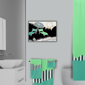
- Bathroom wall art and decor in turquoise.
- Polka dot pattern bath decor in turquoise.
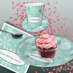
- Kids birthday party decor
- Turquoise pillows showing a hexagon pattern.
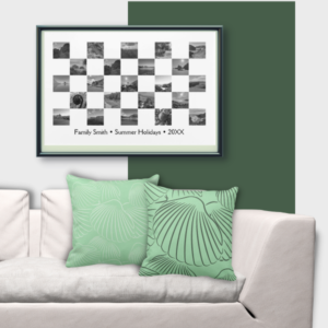
- Photo Collage with a set of two turquoise sea shell throw pillows
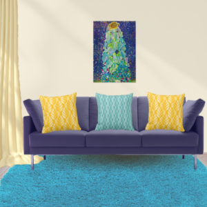
- The Sunflower, by Gustav Klimt meets turquoise and yellow throw pillows.
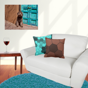
- Brown pairs with turquoise in hexagon patterned pillows complementing an animal photograph.
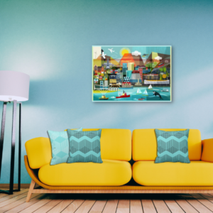
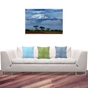
- Green and blue pillows pair with a turquoise pillow one to match an African photograph in an otherwise neutrally colored space.
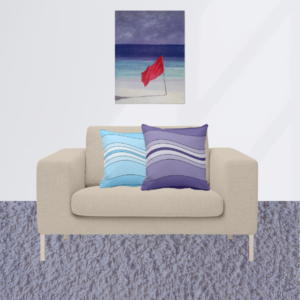
- Blue and turquoise layered wave-patterned pillows complement a coastal art by Lincoln Seligman.
Visit the KBM D3signs store on Zazzle’s Pod platform!
Each template allows you to customize the fill and element colors, as well as replace the text and image placeholders. Contact KBM D3signs for help with customization or design transfer.If you can’t find a design that aligns with your vision but are interested in influencing the design outcome, explore the Zazzle Marketplace.
Alternatively start and design from scratch!
KBM D3signs uses these color tools to match colors.
6. Images With Turquoise Color Palettes
6-1. Wave Close-up Against Midday Sun

Gainsboro #d6dddd, Keppel #3aa69b, Cadet Blue #95b9c0, Cyan Turquoise #0f7a6b, Blue-Green #064a43
6-2. Calm Tropical Waters

Sea Serpent #5dc4d2, Dark Sky Blue #91c9db, Light Periwinkle #bccfd9, Aero #47bad7, Blue-Green #158fac
6-3. Australian Shore

Light Sea Green #249ea7, Blue Sapphire #1c747d, Sea Serpant #46c5cd, Medium Sky Blue #7decef, Japanese Indigo #24484a
7. Frequently Asked Questions About “What is the Color Turquoise?”
Turquoise, a color named after the gemstone with the same name, is blue-green. It sits between blue and green on the color spectrum and is known for its vibrant and calming qualities.
RGB: In the RGB color model (used for digital screens), turquoise is represented by the combination (64.7% red, 84.3% green, 90.2% blue) with the hexadecimal code #40E0D0.
CMYK: In the CMYK color model (used for printing), it comprises 28% cyan, 0% magenta, 10% yellow, and 0% black.
RYB: In the traditional RYB model (used in painting), turquoise is made by mixing blue and green.
Turquoise is made by mixing blue and green. The exact proportions can vary to create different shades.
The complementary color of turquoise is coral, a pinkish-orange hue that sits opposite turquoise on the color wheel.
Turquoise symbolizes calmness, emotional balance, creativity, and protection. It is often associated with serenity, healing, and clear communication.
Cool Turquoise (#00CED1): A balanced blue-green.
Warm Turquoise (#40E0D0): A slightly warmer, green-leaning turquoise.
Bright Turquoise/Aqua (#00F5FF): A vibrant, almost neon shade.
Dark Cyan (#008B8B): A deep, sophisticated turquoise.
Saturated Turquoise (#30D5C8): A vivid, intense shade.
Desaturated Turquoise (#5F9EA0): A muted, soft turquoise.
The use of turquoise in interior design creates a calming and refreshing ambiance, which is ideal for bedrooms, bathrooms, and living rooms. Selecting a specific shade of turquoise allows for the creation of an invigorating or soothing backdrop, depending on the desired effect.
Turquoise conveys freshness, creativity, and reliability, making it popular in branding for wellness, travel, and tech industries. It stands out without being overwhelming, making logos and interfaces look modern and approachable.
Turquoise can evoke feelings of tranquility and balance. It can make a room feel more spacious and airy (cool shades) or cozy and inviting (warm shades).
Yes, turquoise is versatile in fashion. It adds a pop of color that can be both sophisticated and playful, suitable for casual and formal wear, and flattering on many skin tones.

-
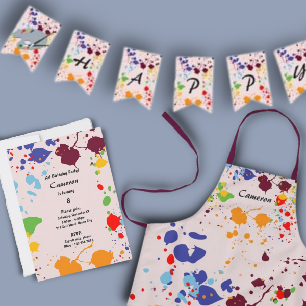
A Kids Painting Birthday Party at Home Makes Unforgettable Fun
Read the post …: A Kids Painting Birthday Party at Home Makes Unforgettable Fun -
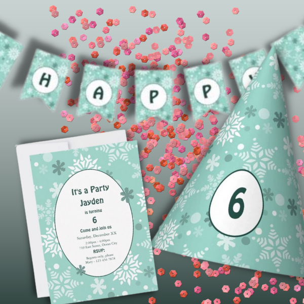
Christmas Birthday Party Invitation For Kids In Turquoise-Blue
Read the post …: Christmas Birthday Party Invitation For Kids In Turquoise-Blue -
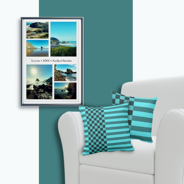
Turquoise Pillows & Photo Collage Wall Decor
Read the post …: Turquoise Pillows & Photo Collage Wall Decor