

How to Choose Brand Colors – choosing the right colors is a critical aspect of building a strong and memorable brand identity. The colors you choose for your brand can have a significant impact on consumer perceptions, influence purchase decisions, and increase brand recognition. In this comprehensive guide, we’ll explore the key considerations and steps to help you make informed decisions when selecting brand colors.

Article Content:
- A Guide on How to Choose Brand Colors
- The Basics of Color Psychology
- Defining Your Brand Personality
- Understanding Your Target Audience
- Maintaining Versatility in Your Brand Colors
- Considering Industry Standards When Choosing Brand Colors
- Testing and Iterating on Your Brand Colors Is a Critical Step
- Thinking Long-Term When It Comes to Choosing Brand Colors
- FAQ on “How to Choose Brand Colors”
1. A Guide on How to Choose Brand Colors
Understanding Color Psychology:
Before delving into the practical aspects of choosing brand colors, it’s essential to understand the basics of color psychology. Different colors evoke specific emotions and associations, and these can vary across cultures. For instance, blue is often associated with trust and professionalism, while red can evoke excitement and passion. Consider the emotions and values you want your brand to convey, and align your color choices accordingly.
Define Your Brand Personality:
Every brand has a unique personality, and your choice of colors should reflect and reinforce this identity. Whether your brand is playful, sophisticated, or bold, your color palette should align with the characteristics you want your audience to associate with your brand. Create a list of adjectives that describe your brand personality and use them as a reference when selecting colors.
Consider Your Target Audience:
Understanding your target audience is crucial in choosing colors that resonate with them. Different demographics may respond differently to certain colors, so consider the age, gender, and cultural preferences of your audience. Conducting market research or surveys can provide valuable insights into the preferences of your target demographic, helping you tailor your brand colors accordingly.
Maintain Versatility:
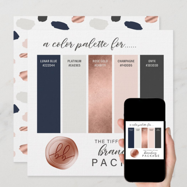
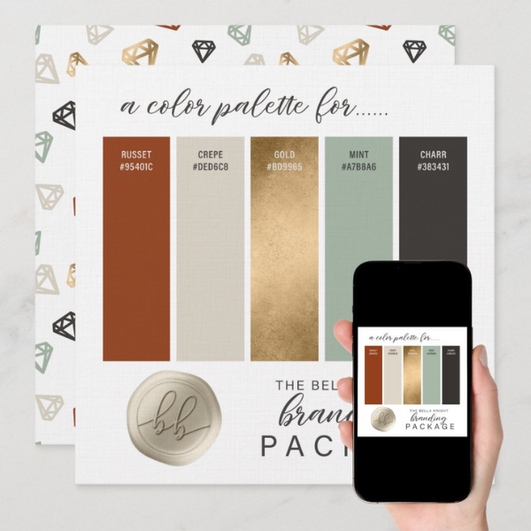
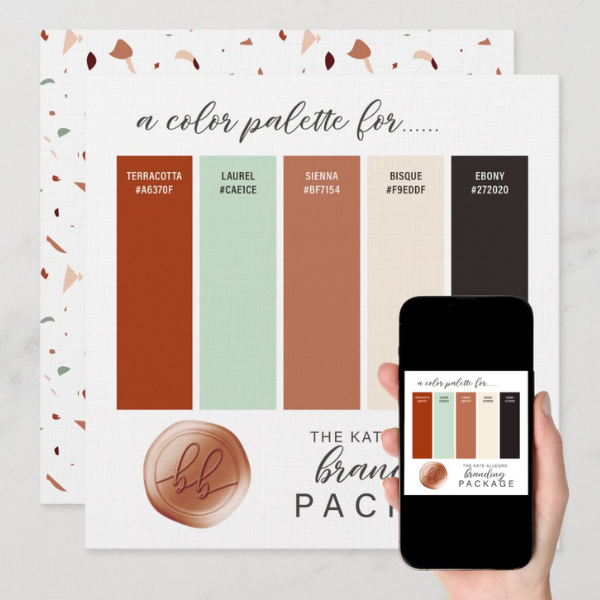
While it’s important to have a primary color palette that represents your brand consistently, it’s equally essential to consider the versatility of your chosen colors. Ensure that your colors work well across various mediums, including digital platforms, print materials, and merchandise. A versatile color palette allows for a cohesive brand experience across different touch-points.
Consider Industry Norms:
Understanding the color trends and conventions within your industry can help your brand stand out while still appearing relevant. However, this doesn’t mean you have to conform entirely to industry norms. Striking a balance between differentiation and familiarity can help your brand be both distinctive and approachable.
Test and Iterate:
Before finalizing your brand colors, conduct tests to see how they resonate with your audience. This can involve creating mockups of marketing materials, websites, or product packaging to visualize how the colors will be perceived in real-world scenarios. Gather feedback from stakeholders, customers, and design professionals to refine your color choices.
Think Long-Term:
A brand’s identity is a long-term investment, and your color choices should stand the test of time. While it’s essential to stay current and fresh, avoid chasing fleeting trends that may quickly become outdated. Aim for a timeless color palette that can evolve with your brand’s growth.
In short, choosing brand colors is a strategic process. It requires a deep understanding of your brand, your audience, and the dynamics of your industry. By considering color psychology, defining your brand personality and maintaining versatility, you can create a compelling and enduring color palette. It will reinforce your brand identity and foster a lasting connection with your audience. Remember, the colors you choose are not just a visual element. They are a powerful tool for communicating your brand’s essence and values.
2. The Basics of Color Psychology
In order to choose brand colors that effectively communicate your brand message and resonate with your target audience, an understanding of color psychology is essential. Color psychology is the study of the psychological effects of different colors on human behavior and emotions. It influences perceptions, attitudes and even purchasing decisions.
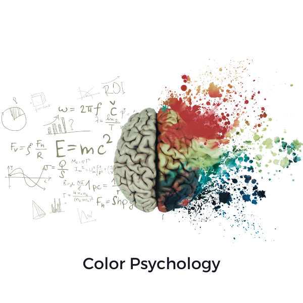
According to color theory, each color has its own unique symbolism and associations. These associations can vary widely across cultures and contexts. Here are some common associations of popular colors:
Blue:
Often associated with trust, reliability, and professionalism, blue is frequently used by brands aiming to convey a sense of stability and security. It’s also associated with calmness and tranquility, making it a popular choice for brands in industries such as finance, healthcare, and technology.
Strong. Professional. Trustworthy.

Hex: #003366 & #ffffff
This suite of business cards and marketing items is designed for flexibility—ideal for brands that rely on credibility and clean presentation, such as consultants, wellness clinics, or tech professionals.
The deep navy blue (#003366) offers a grounded, authoritative feel, while white space keeps designs modern and breathable.
⇒ Explore the collection: Blue Business Card Designs & Marketing Items
⇒ Read more: Brand Color Blue: Business Card Designs with an Edge
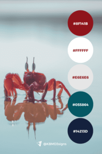
Red:
A bold and attention-grabbing color, red is often linked with passion, energy, and excitement. It can evoke a sense of urgency and stimulate appetite, which is why it’s commonly used in the food and beverage industry. Red can also convey a sense of power and importance, making it suitable for brands looking to make a strong and memorable impression.
Bold. Motivational. Purpose-Driven.
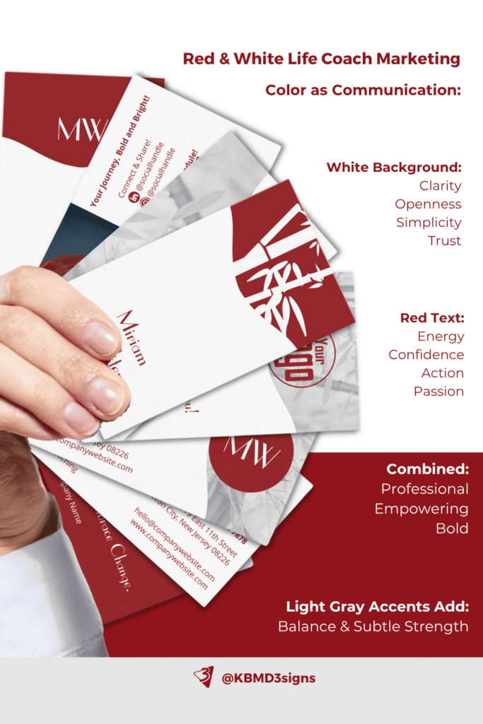
Hex: #8F141B & #ffffff
These life coach business cards use a rich, deep red to convey passion, strength, and clarity of purpose. Paired with white, the design balances energy with openness—perfect for coaches focused on transformation, mindset, or leadership.
⇒ Explore the collection: Life Coach Red & White Branding Package
⇒ Read more: How To Choose A Life Coach Business Card Template
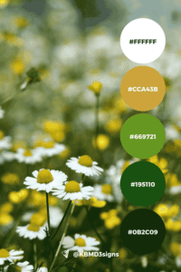
Green:
Symbolizing growth, harmony, and nature, green is often associated with health, sustainability, and wealth. It’s a versatile color that can appeal to environmentally conscious consumers and those seeking products or services related to wellness and balance. Brands in the organic food, eco-friendly, and outdoor industries frequently utilize green in their branding.
Yellow:
Bright and cheerful, yellow is often associated with optimism, happiness, and creativity. It can grab attention and convey a sense of warmth and friendliness, making it suitable for brands seeking to evoke positive emotions and stand out from the crowd. Yellow is commonly used in industries such as entertainment, childcare, and hospitality.
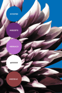
Purple:
Symbolizing luxury, sophistication, and creativity, purple is often associated with royalty and exclusivity. It can convey a sense of elegance and mystique, making it a popular choice for brands in the beauty, fashion, and upscale industries. Purple also has spiritual connotations, appealing to brands focused on mindfulness and personal growth.
Orange:
Vibrant and energetic, orange is associated with enthusiasm, vitality, and adventure. It can evoke a sense of excitement and spontaneity, making it a compelling choice for brands targeting a youthful and dynamic audience. Orange is often used in industries such as sports, entertainment, and travel.
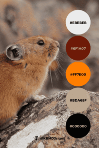
Brown:
Represents earthiness, reliability, and warmth. Often associated with nature, craftsmanship and tradition. In general, the color works well for brands that want to convey authenticity, ruggedness, or a connection to the outdoors.
Earthy. Reliable. Hands-on.
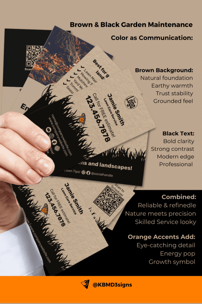
Hex: #bda68f, #000000, accent #ff7e00
This profession-specific collection is grounded in a warm brown palette that echoes nature, soil, and seasonality. Black gives it structure and formality, while the subtle orange (#ff7e00) adds energy—great for garden and lawn care businesses that want to feel both practical and proactive.
⇒ Explore the collection: Brown and Black Garden Maintenance Marketing Items
⇒ Read more: Lawn Care Business Cards & Marketing Items Throughout a Year
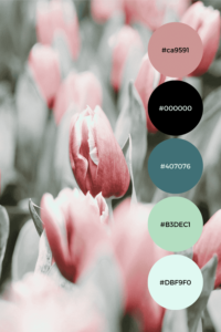
Pink:
Evokes feelings of femininity, sweetness and playfulness. Frequently used in industries that target a female audience or promote products associated with romance and beauty. Pink can also signify youthfulness and innocence, making it popular in industries such as fashion, cosmetics, and confectionery.
Professional. Grounded. Elegant.
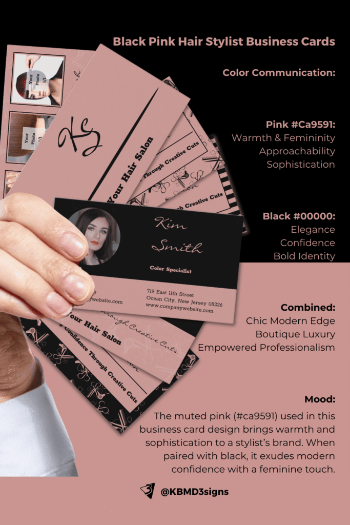
The muted pink (#ca9591) used in this business card suite brings a sense of warmth and sophistication to a stylist’s brand. Paired with black, it signals modern confidence with a feminine edge—ideal for boutique salons or personal brands that want to feel approachable but polished.
⇒ Explore the collection: Black Pink Hair Stylist Business Cards & Suite
⇒ Read more: Hair Stylist Business Card: A Step-by-Step Guide
Gray:
Symbolizes neutrality, sophistication and professionalism. Commonly used as a complementary color to enhance other tones or create a minimalist aesthetic. Suitable for brands seeking a modern, understated identity, particularly in industries such as technology, finance, and luxury goods.
Neutral. Versatile. Sophisticated.
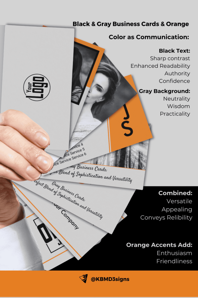
Hex: #D3D3D3, #000000, accent #E67E22
These gray-based business card designs are all about balance—perfect for businesses that want to appear modern and adaptable. The addition of orange (#E67E22) as a callout color injects just enough boldness to keep things fresh without losing elegance.
⇒ Explore the collection: Gray Business Card Designs & Marketing Items
⇒ Read more: Gray Business Cards: Perfect Blending Of Sophistication And Versatility
Black and White:
Black conveys authority, elegance and timelessness. Frequently used to create contrast or to convey refinement and exclusiveness. White represents purity, simplicity and cleanliness. Often used as a background color to enhance legibility or to convey a minimalist aesthetic.
Both black and white are versatile colors that can be paired with almost any other hue, making them fundamental elements when you choose brand colors.
Timeless. Minimal. Iconic.
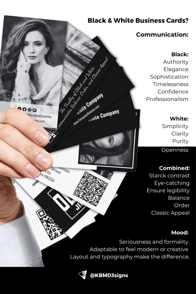
Hex: #000000 & #ffffff
This set of black and white business cards highlights how contrast can create impact. Designed for versatility across industries, these layouts are all about clarity and strong visual identity—without relying on color to do the work.
Perfect for professionals who want a bold, no-nonsense first impression.
⇒ Explore the collection: Black & White Business Card Designs & Materials
⇒ Read more: Black And White Business Card Designs – How to Stand Out
When choosing brand colors:
It’s essential to consider not only the individual associations of each color but also how they interact with one another within your color palette. The combination of colors can evoke different emotions and perceptions, so strive for harmony and balance in your color scheme.
In addition, it’s critical to consider the cultural implications of color choices, as meanings and associations can vary significantly across regions and demographics. Conduct thorough research and understand the cultural background of your target audience. This will help ensure that your brand colors are universally appealing and culturally sensitive.
By aligning your color choices with the emotions, values and perceptions you want your brand to convey, you can create a powerful and cohesive brand identity. One that resonates with your target audience on a deep and meaningful level.
3. Defining Your Brand Personality
Defining your brand personality is akin to crafting the character and essence of your brand – it’s about imbuing your brand with traits and qualities that resonate with your target audience and differentiate you from competitors. Your brand personality influences how consumers perceive and interact with your brand, shaping their emotional connection and loyalty over time. When it comes to choosing brand colors, aligning them with your brand personality is paramount for creating a cohesive and impactful visual identity.
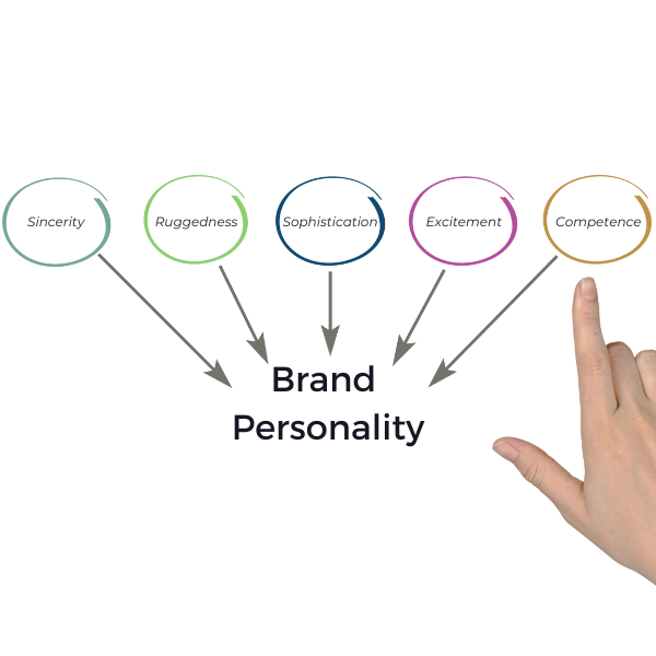
Here’s how you can further expand on defining your brand personality:
Identify Core Brand Traits:
Start by identifying the key characteristics that define your brand. Is your brand adventurous, innovative, and forward-thinking? Or perhaps it’s more traditional, reliable, and family-oriented? Consider the values, mission, and unique selling propositions of your brand to pinpoint its core traits.
Create a Brand Personality Spectrum:
Brands can exhibit a range of personality traits, much like individuals. Develop a spectrum of personality traits that represent your brand, from playful and whimsical to serious and professional. Visualize where your brand falls on this spectrum to guide your color choices.
Use Descriptive Adjectives:
To encapsulate your brand personality, brainstorm a list of descriptive adjectives that resonate with your brand’s character. These adjectives can encompass a wide range of traits, including but not limited to adventurous, sophisticated, quirky, elegant, youthful, authoritative, friendly, and energetic.
Visualize Your Brand Personality:
Envision how your brand personality would manifest in human form. Would it be a charismatic and outgoing individual, or a poised and refined professional? Visualizing your brand as a person can help bring its personality traits to life and inform your color selection process.
Consider Brand Archetypes:
Drawing inspiration from Jungian psychology, brand archetypes provide a framework for understanding and defining brand personalities. Common archetypes include the Hero, the Sage, the Innocent, the Rebel, and the Explorer. Identify which archetype aligns most closely with your brand and use it as a guiding light for selecting colors that evoke the desired emotional responses.
Conduct Stakeholder Workshops:
Engage key stakeholders, including members of your marketing team, brand strategists, and company executives, in workshops or brainstorming sessions to collectively define and refine your brand personality. Encourage open dialogue and collaboration to ensure alignment and consensus.
Create Mood Boards:
Visualize your brand personality by creating mood boards that incorporate images, colors, textures, and typography that reflect the desired aesthetic and emotional tone. Use these mood boards as a source of inspiration when selecting brand colors that evoke the desired mood and atmosphere.
By carefully defining your brand personality in detail and using it as a guiding framework for selecting brand colors, you can create a cohesive visual identity that resonates with your target audience and effectively communicates your brand’s values, mission, and unique identity. Remember that your brand personality is not static. It can evolve and adapt over time as your brand grows and matures. Therefore, revisit and refine it periodically to ensure continued relevance and alignment.
4. Understanding Your Target Audience
Understanding your audience is the cornerstone of effective branding. When it comes to connecting with and engaging your target audience, color plays a pivotal role. When considering your audience, it’s important to consider the various factors that influence color perception and preference in the context of “How to Choose Brand Colors”. Here’s how to expand on that concept:

Demographic Analysis:
Start by conducting a thorough demographic analysis of your target audience. Consider factors such as age, gender, income level, education, occupation, and geographic location. Each demographic segment may have distinct preferences and associations with certain colors based on their life experiences, cultural background, and societal norms.
Psychological Profiling:
Delve deeper into the psychological makeup of your target audience to understand their attitudes, values, lifestyles, and personality traits. Psychographic segmentation can provide valuable insights into the motivations, aspirations, and emotional triggers that drive consumer behavior. By aligning your brand colors with the psychological profile of your audience, you can create a more resonant and meaningful brand experience.
Cultural Sensitivity:
Recognize the cultural nuances and sensitivities that can influence color perceptions and preferences in different regions and ethnic groups. Colors can carry deep cultural symbolism and meaning. Therefore, research and understanding of the cultural context in which your brand operates is critical. Avoid inadvertently using colors that may have negative connotations or cultural taboos in certain communities. Strive for inclusivity and cultural sensitivity in your color choices.
Market Research and Surveys:
Gather direct feedback from your target audience about their color preferences and perceptions using market research methods such as surveys, focus groups, and interviews. Identify trends, patterns and insights that can influence brand color choices using quantitative and qualitative data. Consider demographic segmentation within your research findings to tailor your color palette to specific audience segments.
Competitive Analysis:
Analyze the color strategies of competitors targeting similar demographic groups to identify gaps, opportunities, and potential areas for differentiation. While you don’t want to mimic your competitors’ color choices outright, understanding industry norms and competitive benchmarks can provide valuable context and inspiration for your own branding efforts.
Emotional Resonance:
Consider the emotional impact and resonance of different colors on your target audience. Colors evoke visceral emotional responses and can influence mood, perception, and behavior. Leverage color psychology principles to evoke desired emotional states and reinforce brand messaging and positioning. For example, calming blues may appeal to a stressed-out demographic, while vibrant yellows may energize and uplift a youthful audience.
Test and Iterate:
Validate your color choices through testing and iteration to ensure alignment with your target audience’s preferences and perceptions. Conduct A/B testing, usability studies, and feedback sessions to gauge audience reactions to different color variations and combinations. Use data-driven insights to refine and optimize your color palette for maximum impact and effectiveness.
By carefully considering the demographics, psychographics, cultural nuances, and emotional resonance of your target audience, you can tailor your brand colors to resonate with their preferences and perceptions effectively. A deep understanding of your audience enables you to create a more authentic, relevant, and engaging brand experience that fosters lasting connections and loyalty.
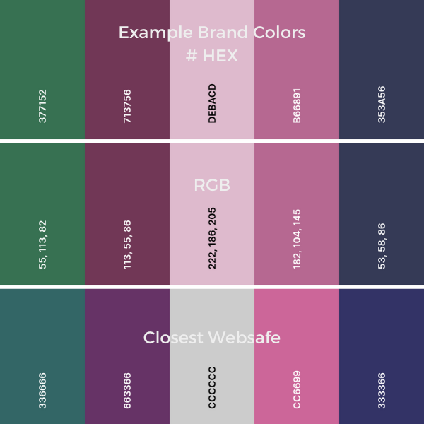
5. Maintaining Versatility in Your Brand Colors
Maintaining versatility in your brand colors is crucial for ensuring consistency and coherence across a diverse range of mediums and touch-points. Here’s an expansion on why versatility matters and how to achieve it effectively:
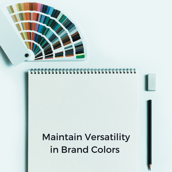
Consistent Brand Experience:
A cohesive brand experience relies on consistent visual elements, including color palette, across different channels and platforms. When your brand colors remain consistent, regardless of whether they’re viewed on a website, social media, printed materials, or physical products, it reinforces brand recognition and strengthens your brand identity. Consistency instills trust and reliability in your audience, making it easier for them to recognize and engage with your brand wherever they encounter it.
Adaptability to Various Mediums:
Different mediums and materials may present unique challenges and limitations when it comes to color reproduction. For example, colors may appear differently on digital screens compared to printed materials due to variations in color profiles and printing processes. By selecting colors that are versatile and translate well across different mediums, you can maintain visual fidelity and ensure that your brand identity remains intact across all applications.
Consideration of Color Systems:
When choosing brand colors, consider how they will be represented in different color systems, such as RGB (Red, Green, Blue) for digital screens and CMYK (Cyan, Magenta, Yellow, Black) for print. Certain colors may look vibrant and saturated in RGB but appear dull or muted when converted to CMYK. Opt for colors that retain their vibrancy and integrity across various color systems to ensure consistent representation across digital and print platforms.
Accessibility and Legibility:
Versatile brand colors should also take into account accessibility and legibility considerations, especially for digital content. Ensure that your color choices meet accessibility standards for contrast and visibility, making it easier for users with visual impairments to navigate and interact with your digital assets. High-contrast color combinations and legible text ensure that your brand message is accessible to all users, regardless of their abilities.
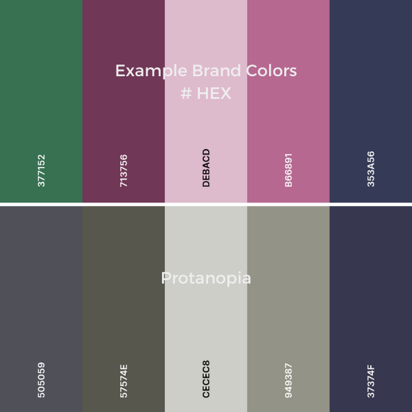 #HEEX - Protanopia
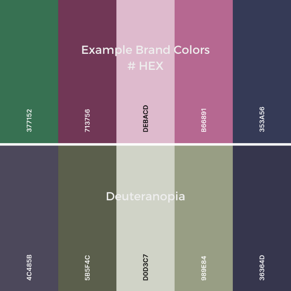 #HEEX - Deuteranopia
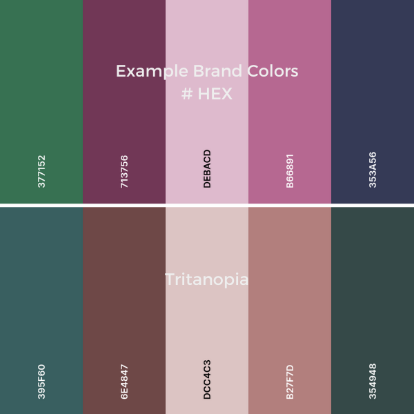 #HEEX - Tritanopia
 #HEEX - Achromatopsia
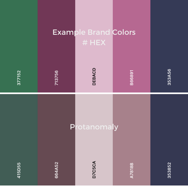 #HEEX - Protanomaly
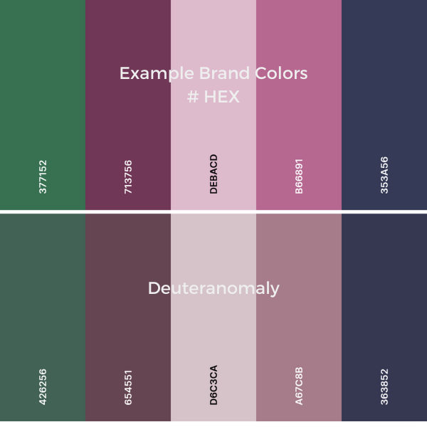 #HEEX - Deuteranomaly
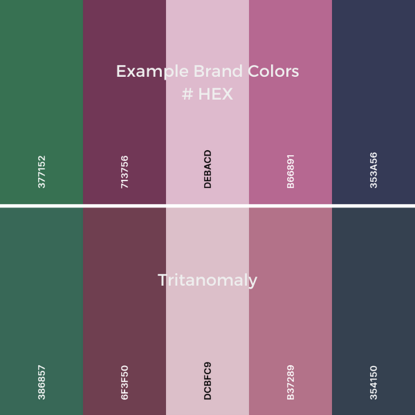 #HEEX - Tritanomaly
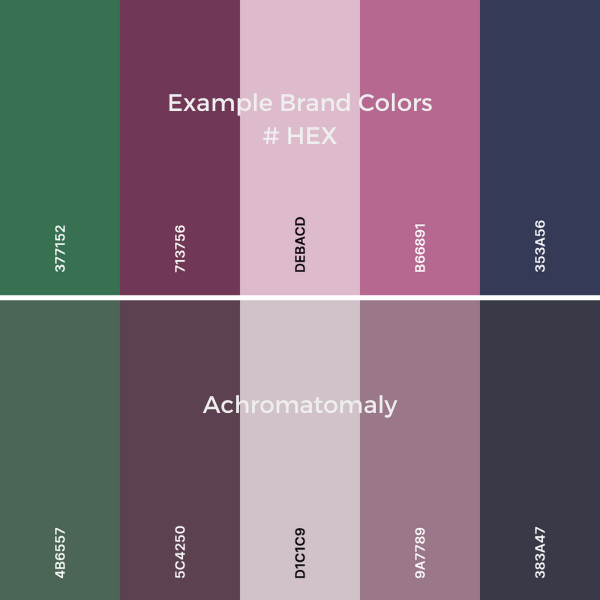 #HEEX - Achromatomaly
Test Across Different Environments:
Before finalizing your brand colors, conduct thorough testing on platforms such as Coolors.co. Also test them across different environments and mediums to assess their versatility and adaptability. Create mock-ups and prototypes of your branding materials, including websites, social media graphics, print collateral, and merchandise, and evaluate how the colors appear in each context. Make adjustments as needed to optimize color consistency and performance across all touch-points.
Flexibility for Future Growth:
As your brand evolves and expands, having a versatile color palette allows for flexibility and scalability. You may need to introduce new products, enter new markets, or adapt to changing design trends over time and seasons. A versatile color palette provides the foundation for seamless integration of new brand elements and ensures that your visual identity remains relevant and adaptable to future growth opportunities.
Brand Guidelines and Documentation:
Document your brand colors comprehensively in brand guidelines or style guides to ensure consistent usage and application across all channels and mediums. Provide specifications, color codes, and usage guidelines for each color in your palette, along with examples of correct and incorrect usage. Educate internal teams, external partners, and stakeholders on the importance of maintaining color consistency and versatility to uphold brand integrity.
By prioritizing versatility in your brand colors and considering their performance across various mediums and environments, you can create a cohesive and resilient visual identity that resonates with your audience and stands the test of time. Versatile colors facilitate seamless brand experiences and empower your brand to thrive across a multitude of channels and touch-points, fostering stronger connections and engagement with your audience.
6. Considering Industry Standards When Choosing Brand Colors
Considering industry standards when choosing brand colors is essential for positioning your brand effectively within your competitive landscape. Here’s an expansion on why understanding industry norms matters and how to strike the right balance:

Industry Relevance and Alignment:
Familiarizing yourself with color trends and conventions within your industry provides valuable context for understanding which colors resonate with your target audience and communicate industry-specific messages. Certain industries may have established color associations that reflect common themes, values, and characteristics. For example, the use of blues in finance and technology often conveys trustworthiness and professionalism. In industries such as fashion and entertainment, vibrant colors are used to convey excitement and creativity. By aligning with industry norms, you can position your brand as relevant and credible within your industry. At the same time, you can use established visual cues to effectively communicate key messages.
Standing Out in a Crowded Market:
While understanding industry norms is important, blindly conforming to them can result in your brand getting lost in a sea of sameness. To truly stand out and differentiate your brand, it’s essential to find ways to innovate and disrupt without disregarding industry conventions entirely. Look for opportunities to put a unique spin on familiar themes or challenge traditional color associations within your industry. By injecting creativity and originality into your color choices, you can capture attention, spark curiosity, and carve out a distinctive identity that sets your brand apart from competitors.
Balancing Differentiation and Familiarity:
Striking the right balance between differentiation and familiarity is key to creating a brand identity that is both memorable and approachable. While it’s important to differentiate your brand from competitors, it’s equally crucial to maintain a level of familiarity that resonates with your target audience and instills trust and confidence. Consider using industry-relevant colors as a foundation while incorporating unique accents or nuances that reflect your brand’s personality and values. This approach allows you to leverage the power of familiarity while adding elements of surprise and intrigue that capture attention and leave a lasting impression.
Audience Perception and Preference:
Ultimately, your brand colors should resonate with your target audience and evoke the desired emotional responses and associations. Conduct market research, surveys, and focus groups to gain insights into your audience’s perception of industry norms and their preferences regarding color usage. Pay attention to how different demographics respond to various color palettes and consider incorporating their feedback into your decision-making process. By aligning your brand colors with audience preferences and expectations, you can create a visually compelling identity that resonates with your target market and fosters strong brand affinity.
Evolving Trends and Adaptability:
Keep in mind that industry norms and color trends are not static and may evolve over time in response to changing consumer preferences, cultural shifts, and emerging design trends. Stay attuned to industry developments, monitor competitor branding strategies, and remain open to adjusting your color palette to stay relevant and competitive. Strive for a balance between timeless elements that endure and dynamic elements that reflect contemporary tastes and trends. By staying agile and adaptable, you can ensure that your brand colors remain fresh, engaging, and aligned with the evolving needs and expectations of your audience.
By understanding industry norms and trends while also embracing differentiation and innovation, you can create a brand identity that strikes the right balance between familiarity and uniqueness. Leveraging industry-relevant colors as a foundation while infusing your brand with distinctive elements allows you to stand out in a crowded market while remaining authentic and approachable to your target audience.
7. Testing and Iterating on Your Brand Colors Is a Critical Step
Testing and iterating on your brand colors is a critical step in the branding process, ensuring that your color choices effectively resonate with your audience and convey the desired brand message. Here’s an expansion on why testing and iteration are essential and how to execute them effectively:

Visualizing Real-World Scenarios:
Creating mock-ups of marketing materials, websites, product packaging, and other brand collateral allows you to visualize how your chosen colors will appear in real-world contexts. Consider how the colors interact with other design elements, such as typography, imagery, and layout, to ensure visual harmony and readability. Use digital tools or professional design software to generate high-fidelity mock-ups that accurately represent the intended end-user experience.
Soliciting Feedback from Stakeholders:
Engage key stakeholders, including internal team members, company executives, and brand partners, in the testing and iteration process. Gather diverse perspectives and insights to ensure that your color choices align with organizational goals, values, and objectives. Encourage open dialogue and constructive criticism to facilitate collaborative decision-making and consensus-building. Stakeholder buy-in is crucial for ensuring alignment and commitment to the chosen brand colors throughout the organization.
Incorporating Customer Feedback:
Seek feedback directly from your target audience to gauge their reactions and preferences regarding your brand colors. Conduct surveys, focus groups, usability studies, and interviews to collect qualitative and quantitative data on how the colors are perceived and interpreted by your customers. Pay attention to emotional responses, associations, and overall impressions to identify strengths and areas for improvement. Incorporate customer feedback into your color decision-making process to ensure that your brand colors resonate authentically with your audience and foster strong brand affinity.
Testing Across Different Devices and Environments:
Ensure that your brand colors maintain consistency and integrity across various devices, screen sizes, and environments. Test your color palette on different devices, including smartphones, tablets, desktop computers, and laptops, to evaluate color accuracy and rendering. Consider how your colors appear in different lighting conditions, such as natural daylight, fluorescent lighting, and dimly lit environments. Conduct usability testing to assess legibility, contrast, and accessibility of your color choices across different user interfaces and platforms.
Iterating Based on Data and Insights:
Analyze the feedback and data collected during the testing phase to identify patterns, trends, and areas for improvement. Use qualitative feedback to understand the underlying reasons behind audience preferences and perceptions, while quantitative data can provide statistical validation and support for decision-making. Iterate on your color choices based on actionable insights and recommendations, making refinements and adjustments as needed to optimize visual impact and audience engagement.
A/B Testing and Multivariate Testing:
Implement A/B testing or multivariate testing methodologies to compare different color variations and combinations and measure their impact on user behavior and performance metrics. Test multiple versions of your branding materials, websites, or marketing campaigns with subtle variations in color to determine which resonates most effectively with your audience. Use data-driven insights to identify the most effective color choices and refine your brand colors iteratively over time.
Documentation and Version Control:
Systematically document your testing process, findings, and iterations. This will help you keep track of changes and decisions made regarding your brand colors. Establish version control mechanisms to track color palette revisions and updates. This documentation will serve as a valuable reference for future branding initiatives. It will also ensure continuity and consistency in your color management practices.
Refine your color choices iteratively by systematically and rigorously testing and iterating on your brand colors. This will help you create a visually compelling and emotionally resonant brand identity. One that captivates your audience and drives meaningful engagement. Embrace feedback and leverage data-driven insights. It will inform your decision-making process. Meanwhile, it will ensure that your brand colors effectively communicate your brand message. And your brand colors will authentically resonate with your target audience..
8. Thinking Long-Term When It Comes to Choosing Brand Colors
Thinking long-term when it comes to “How to Choose Brand Colors” is essential for building a strong and enduring brand identity that stands the test of time. Here’s an expansion on why considering the longevity of your color choices matters and how to create a timeless color palette:

Brand Consistency and Recognition:
Consistency is key to building brand recognition and loyalty over time. By selecting a timeless color palette, you establish a visual identity that remains consistent across all brand touch-points, from marketing materials to product packaging to digital platforms. This consistency reinforces brand recognition and allows your audience to easily identify and connect with your brand, regardless of when or where they encounter it.
Avoiding Trend Chasing:
While it’s tempting to incorporate the latest color trends into your brand identity, chasing fleeting fads can quickly date your brand and undermine its credibility. Instead of focusing on what’s currently popular, prioritize colors that have enduring appeal and resonance. Look for hues that have stood the test of time and have universal associations that transcend passing trends. By avoiding trend-chasing, you ensure that your brand colors remain relevant and impactful for years to come.
Reflecting Brand Values and Personality:
Your brand colors should reflect the values, personality, and essence of your brand. Choose colors that align with your brand’s identity and resonate with your target audience on a deeper level. Consider the emotions and associations evoked by each color and select hues that authentically convey the essence of your brand. By staying true to your brand’s core values and personality, you create a timeless color palette that resonates with your audience over the long term.
Versatility and Adaptability:
A timeless color palette is versatile and adaptable, allowing for seamless integration across different mediums, environments, and design applications. Choose colors that work well in both digital and print formats. This ensures your brand maintains visual consistency across all channels. Select colors that complement each other harmoniously to create engaging visual compositions. Prioritize versatility and adaptability to future-proof your brand colors and enable them to evolve with your brand’s growth.
Flexibility for Evolution:
Establish a consistent brand identity while leaving room for evolution and growth over time. Your brand colors should be adaptable to changes in your brand’s positioning, target audience, and market dynamics. Choose colors that provide a strong foundation for your brand identity. But also allow for creative interpretation and evolution as your brand expands. By balancing consistency and flexibility, you can ensure that your brand colors can adapt to new opportunities and challenges while remaining true to your brand’s essence.
Testing and Validation:
Before finalizing your brand colors, conduct thorough testing and validation to ensure their longevity and effectiveness. Solicit feedback from stakeholders, customers, and design professionals to gauge their reaction to your color choices. Identify potential pitfalls and areas for improvement. Test your colors across different mediums and environments to assess their performance in real-world scenarios. By rigorously testing and validating your color choices, you can confidently select hues that will stand the test of time. These will also serve as a timeless foundation for your brand identity.
In summary, thinking long-term when choosing brand colors involves prioritizing consistency, authenticity, versatility, and adaptability. Choose timeless colors that reflect the values and personality of your brand. Avoid fads and be flexible to create a visual identity that will resonate with your audience and last a lifetime.


9. FAQ about “How to Choose Brand Colors”
Brand colors are crucial because they play a significant role in shaping consumer perceptions, evoking emotions, and enhancing brand recognition. They help establish a visual identity that distinguishes a brand from its competitors and fosters brand loyalty.
To choose brand colors that represent your brand effectively, consider factors such as your brand’s personality, target audience, industry norms, and cultural associations. Align your color choices with your brand values and desired brand image.
Color psychology explores how different colors evoke specific emotions and associations. When choosing brand colors, understanding color psychology can help you select hues that resonate with your audience and communicate your brand message effectively.
Yes, understanding your target audience is crucial in choosing brand colors. Different demographics may respond differently to certain colors, so consider factors such as age, gender, cultural preferences, and psychographic traits when selecting colors that resonate with your audience.
To ensure versatility and adaptability, choose brand colors that work well across various mediums, including digital platforms, print materials, and merchandise. Test your colors in different contexts and environments to assess their performance and adaptability.
Yes, considering industry norms can help your brand stand out while still appearing relevant. However, it’s essential to strike a balance between differentiation and familiarity to create a distinctive yet approachable brand identity.
Testing and iteration allow you to gather feedback from stakeholders, customers, and design professionals to refine your color choices. By conducting tests and iterations, you can ensure that your brand colors effectively resonate with your audience and communicate your brand message.
To ensure that your brand colors stand the test of time, aim for a timeless color palette that avoids chasing fleeting trends. Choose colors that reflect your brand’s personality and values while remaining versatile and adaptable to future growth and evolution.
Yes, documenting your brand colors in a brand style guide is essential for ensuring consistency and coherence in your brand identity. A brand style guide provides guidelines and specifications for using your brand colors across various applications and channels.
While it’s possible to change your brand colors in the future, it’s essential to consider the potential impact on brand recognition and consistency. If you decide to change your brand colors, carefully communicate the changes to your audience and stakeholders to ensure a smooth transition.

-

What Is A Brand Partnership? – A Small Business Perspective
Read the post …: What Is A Brand Partnership? – A Small Business Perspective -

What Are Business Objectives?” Perspective Of A Small Business
Read the post …: What Are Business Objectives?” Perspective Of A Small Business -

What Is A Focus Group Market Research? – SMB Perspective
Read the post …: What Is A Focus Group Market Research? – SMB Perspective