

Different shades of pink have been loved and adored by people for generations. From baby pink to fuchsia, shades of pink evoke different feelings and emotions in everyone.
There are many ways to use pink to create a warm, welcoming atmosphere. In this article, we will explore the different shades of pink, the psychology behind the color, its practical application in interior design, and what colors go well with pink.
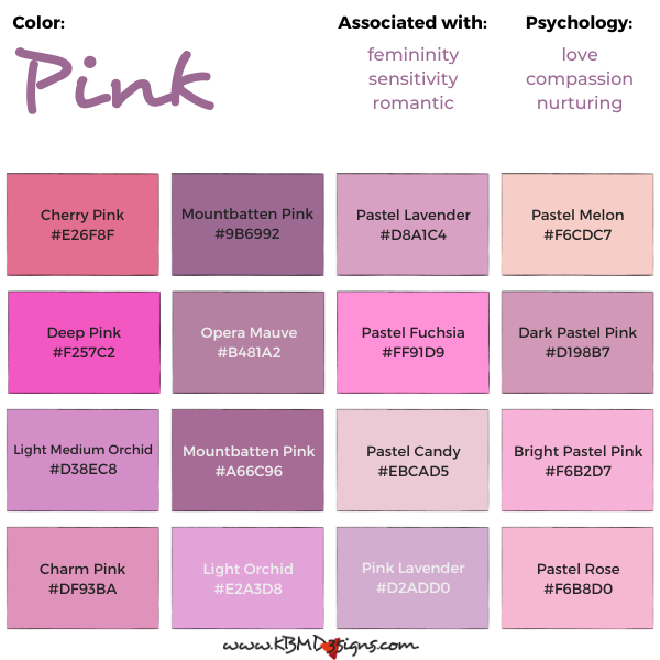
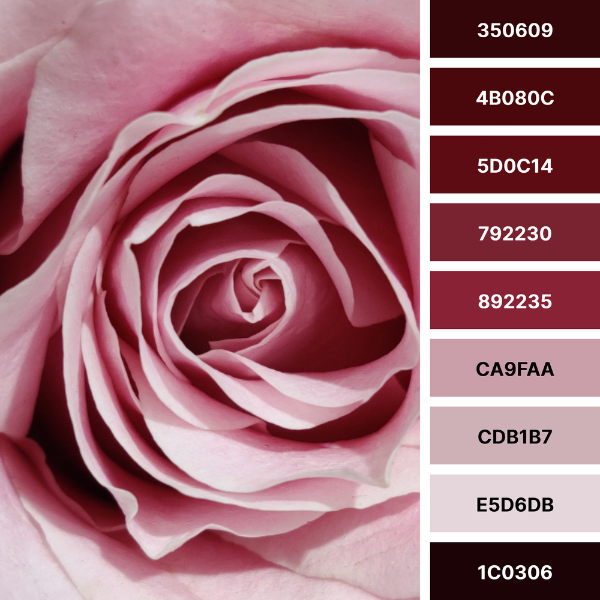
Cherry Pink #E26F8F, Mountbatten Pink #9B6992, Pastel Lavender #D8A1C4, Pastel Melon #F6CDC7, Deep Pink #F257C2, Opera Mauve #B481A2, Pastel Fuchsia #FF91D9, Dark Pastel Pink #D198B7, Light Medium Orchid #D38EC8, Mountbatten Pink #A66C96, Pastel Candy #EBCAD5, Bright Pastel Pink #F6B2D7, Charm Pink #DF93BA, Light Orchid #E2A3D8, Pink Lavender #D2ADD0, Pastel Rose #F6B8D0
What Makes the Color Pink
Before we delve into the different shades of pink, it’s important to understand what makes the color pink according to the color theory. The color pink is a mixture of red and white. In the RGB (Red Green Blue) color model, pink is created by mixing red and blue light, resulting in a warm hue with a cool undertone. In the CMYK (Cyan Magenta Yellow Black) color model, pink is created by combining magenta and yellow, resulting in a soft and feminine color. The RYB (Red Yellow Blue) color model creates pink by mixing red and white, creating a light and delicate hue.
The Psychology of Different Shades of Pink
Different shades of pink can evoke different emotions and feelings. Lighter shades of pink, such as baby pink and pastel pink, can create a soothing and relaxing atmosphere, making them ideal for bedrooms and nurseries. Warmer shades of pink, such as coral and salmon, can stimulate feelings of warmth and comfort. This makes them ideal for living rooms and dining rooms. Brighter pinks, such as fuchsia and hot pink, can create a playful and energetic atmosphere, perfect for children’s playrooms or gyms.
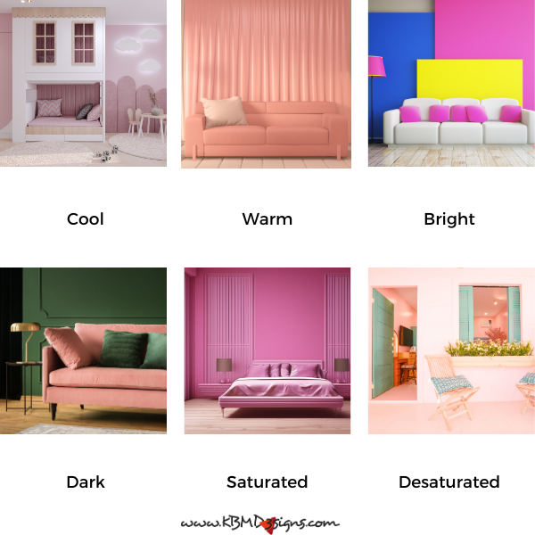
Darker shades of pink, such as magenta and raspberry, can add sophistication and elegance. They are a popular choice for formal dining rooms and home offices. Gray-pink shades, such as dusty rose and mauve, can create a sense of calm and relaxation. They are ideal for bathrooms and bedrooms.
Pink Complementary Color and What Colors Go with Pink In Interior Spaces
Pink has one complementary color, green.
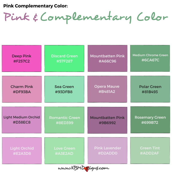
Deep Pink #F257C2 – Discard Green #57F287, Mountbatten Pink #A66C96 – Medium Chrome Green #6CA67C, Charm Pink #DF93BA – Sea Green #93DFB8, Opera Mauve #B481A2 – Polar Green #81B493, Light Medium Orchid #D38EC8 – Romantic Green #8ED399, Mountbatten Pink #9B6992 – Rosemary Green #699B72, Light Orchid #E2A3D8 – Love Green #A3E2AD, Pink Lavender #D2ADD0 – Green Tint #ADD2AF
What Colors Go With Pink
Pink also works well with other colors. Here are some popular combinations:


- Green: For a fresh and vibrant look, pink and green, is a popular choice in home decor. Pairing soft pink with leafy green plants or tropical prints makes this combination perfect for a sunroom or kitchen.
- White: Pairing pink with white creates a soft and feminine look that’s perfect for a romantic bedroom or a cozy living room.
- Black: If you’re looking for a bolder and more modern aesthetic, consider pairing pink with black. This high-contrast combination works well in graphic prints or as an accent color in a predominantly white or neutral space.
- Gray: For a soothing and sophisticated vibe, pink and gray is a classic combination that works well in any room of the house. Try pairing pale pink with soft gray for a soothing color scheme in a nursery or bedroom.
- Yellow: If you’re looking to add a touch of glamour and luxury to your decor, consider pairing pink with gold. It works well in a formal dining room or to accent a master suite.
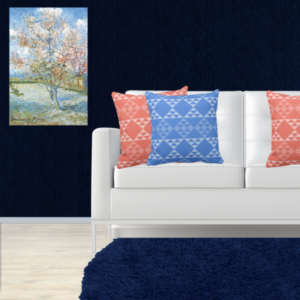
- Blue: Finally, if you’re looking to create a dreamy and peaceful atmosphere in your home, try pairing pink with blue. This combination works well in a beach or seaside-themed room and is achievable using soft pink with pale blue or turquoise accents.
KBM D3signs uses color tools to match colors and create color schemes.
Pink From Traditional To Contemporary
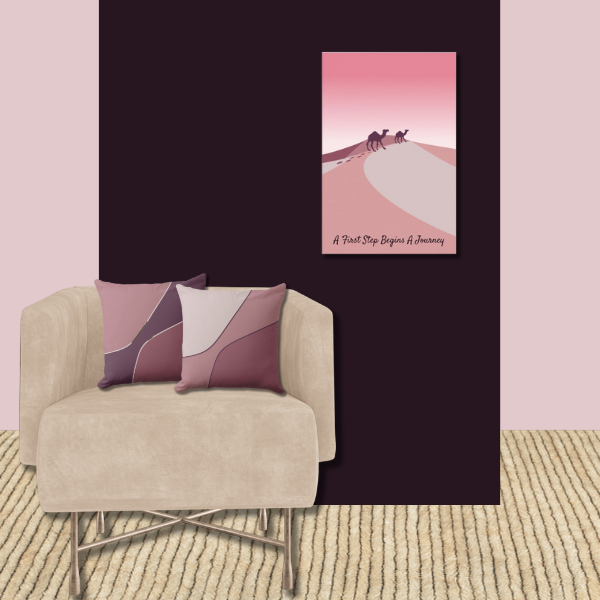
Overall, from traditional to contemporary, there are many different color combinations that work well with pink. In traditional design, pink can be paired with warm tones such as gold, brown, and cream. This creates a regal and opulent look. For a modern and minimalist look, pink can be paired with cool tones such as gray and blue. When used in accent pieces, such as pink, pink and white, or pink and black throw pillows, curtains, and rugs, pink can add a pop of color and warmth to a room without overwhelming it. Used as a main color, like a feature wall or large piece, pink can create a bold, statement look.
The Color Pink In a Nutshell
Different shades of pink can evoke different emotions and feelings. This makes it a versatile color to use in interior design. Whether you want to create a warm, cozy space or a fun, vibrant vibe, there is a pink hue that will do the trick. Pink’s complementary color, green, and its ability to blend well with other colors make it a great choice for creating color schemes. So consider adding a touch of pink to your home decor and see how it can transform your space.


Frequently Asked Questions (FAQ): The Meaning of the Color Pink
Pink often represents femininity, sensitivity and love. Depending on the cultural context, it can also represent youth, marriage, and several other meanings.
In Japan, pink is primarily associated with youth and is often used to represent the vibrancy and freshness of young individuals.
In China, the color pink symbolizes marriage. And in wedding ceremonies, pink decorations often represent love and commitment.
In Western cultures, pink has historically been the color to promote various causes, including breast cancer awareness.
Wearing the pink ribbon shows support for those affected by breast cancer. It has become a symbol of solidarity and awareness of the disease.
Pink has also raised awareness for the LGBTQ+ community, with the color representing inclusivity and support for LGBTQ+ rights.
Pink often represents qualities such as love, compassion and nurturing, making it an attractive choice for companies and causes that align with these values.
While pink is generally associated with positive qualities, it’s essential to consider cultural and individual variations. Some may associate pink with stereotypes, but its meanings can vary widely.
Yes, the meaning of pink can evolve over time and can vary in different cultural, historical, and social contexts. It is a color with versatile symbolism.
Inspired by Pink
-

Hair Stylist Business Card: A Step-by-Step Guide to One
Read the post …: Hair Stylist Business Card: A Step-by-Step Guide to One -

Pink and White Color Palette Applied in Home Decor
Read the post …: Pink and White Color Palette Applied in Home Decor -
Pink Wall Art: Embrace Elegance and Creativity while Transforming Your Home Decor
Read the post …: Pink Wall Art: Embrace Elegance and Creativity while Transforming Your Home Decor -
Black and Pink Color Palette in Nature-Inspired Home Decor, Explore, and Enchant!
Read the post …: Black and Pink Color Palette in Nature-Inspired Home Decor, Explore, and Enchant! -
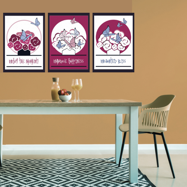
Pink And White Wall Art For The Dining Room
Read the post …: Pink And White Wall Art For The Dining Room -
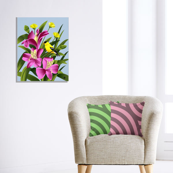
Pink And Green Pillows As Sets of 2 Meet With Art By Liz C
Read the post …: Pink And Green Pillows As Sets of 2 Meet With Art By Liz C