

Different shades of blue color evoke calm, serenity, and tranquility. It is a favorite among interior designers for its versatility and ability to create a range of moods depending on the shade used.
In this article, we will explore blue in its different shades and their psychological effects on people in interior design.
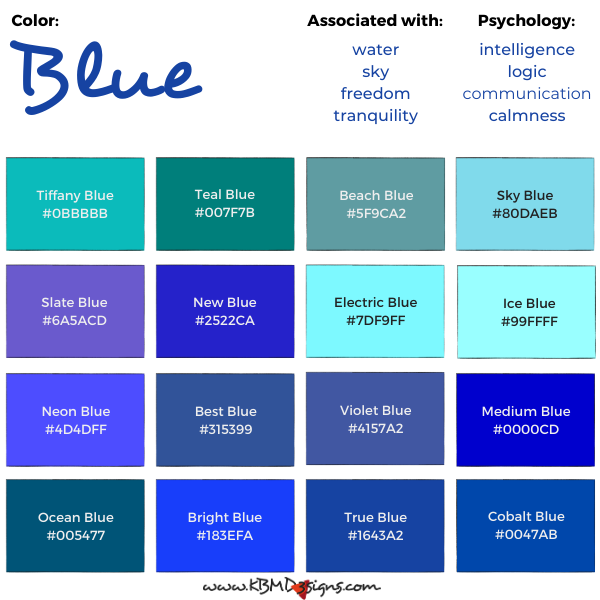
Tiffany Blue #0BBBBB, Teal Blue #007F7B, Beach Blue #5F9CA2, Sky Blue #80DAEB, Slate Blue #6A5ACD, New Blue #2522CA, Electric Blue #7DF9FF, Ice Blue #99FFFF, Neon Blue #4D4DFF, Best Blue #315399, Violet Blue #4157A2, Medium Blue #0000CD, Ocean Blue #005477, Bright Blue #183EFA, True Blue #1643A2, Cobalt Blue #0047AB
Definition of Blue:
Blue is a primary color often described as a cool and calming hue. Its hues are abundant in nature, including the sky and the sea.
What Makes the Color Blue:
In terms of the color theory the RGB (Red, Green, Blue) color model, an additive model, creates colors by mixing different intensities of these three primary colors of light. Blue makes it possible to create a wide range of colors. These are in the blue to purple part of the visible spectrum. And on digital displays such as computer monitors, televisions, and smartphones, blue combined with red and green yields millions of color variations.
The process of creating colors in the CMYK color model relies on subtractive color mixing. And it involves adding pigments to a white surface to create different colors.
In order to create blue in the CMYK color model, the printer applies a mixture of cyan and magenta pigments to the white surface. Therefore, blue becomes a secondary color in this model. The blend works by subtracting certain wavelengths of light. Namely from the white light reflected off the surface, hence resulting in the perception of blue. Specifically, cyan ink absorbs red light and magenta ink absorbs green light. The combination of these two subtractive processes results in the removal of enough red and green light to create the perception of blue.
In other words, the amount of ink applied to the surface affects the amount of certain wavelengths of light. These then get absorbed and reflected, resulting in the perceived color. By varying the amount of ink applied, different colors can be created in the CMYK model.
Traditional art uses the RYB color model. And there blue is a primary color.
Light-Blue Color Names and #Hex Code
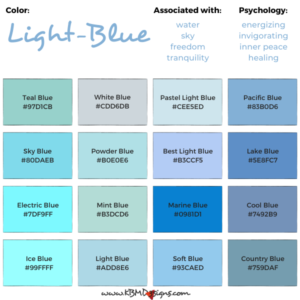
Teal Blue #97D1CB, White Blue #CDD6DB, Pastel Light Blue #CEE5ED, Pacific Blue #83B0D6, Sky Blue #80DAEB, Powder Blue #B0E0E6, Best Light Blue #B3CCF5, Lake Blue#5E8FC7, Electric Blue #7DF9FF, Mint Blue #B3DCD6, Marine Blue #0981D1, Cool Blue #7492B9, Ice Blue #99FFFF, Light Blue #ADD8E6, Soft Blue #93CAED, Country Blue #759DAF
Blue-Grey Color Names and #Hex Code

Cool Blue #7492B9, Silver Blue #8A9A9A, Dusty Blue #65737E, Ice Blue Grey #717787, Light Blue Grey #C0C8CF, Mohair Soft Blue Grey #97B2B7, Steel Blue Grey #436175, Holbein Blue Grey #547D86, Light Blue Gray #A3AABE, Bird Blue Grey #7F92A0, Satin Soft Blue #9CADC7, Gravel Grey Blue #637A82, Petrel Blue Grey #A0AEBC, Hazy Blue #BCC8CC, Dark Grey Blue #424952, Stone Blue #3D5168
Dark-Blue Color Names and #Hex Code

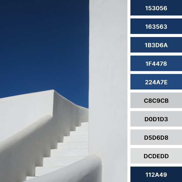
Dark Blue #2E4764, Dark Teal Blue #215D6E, Classic Blue #0F4C81, Sea Blue #006994, Winter Blue #253559, Best Blue #315399, Medium Blue #0000CD, French Blue #0055A4, Midnight Blue #191970, Royal Blue #002366, Deep Blue #072A6C, Steel Blue #4682B4, Navy Blue #2D2363, True Blue #1643A2, Metallic Blue #1B3D81, China Blue #00838D
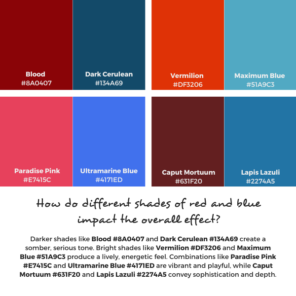
Blue and Its Complementary Color:
Orange is the complementary color of blue, meaning they are opposite each other on the color wheel. Using blue and orange wall art and pillow designs, by KBM D3signs, together can create a striking and bold contrast in interior design.
The overall effect depends greatly on the hues of each color, as well as the general design and style of the room. To ensure that the color and amount of color will work well, create an offline or online mood board. This is the easiest way to get clarity. If you choose to do it online, you can even get feedback from family and friends. Find here beautiful nature-inspired blue and orange color palette collage ideas with #Hex codes.
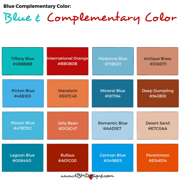
Tiffany Blue #0BBBBB- International Orange #BB0B0B, Madonna Blue #71B5D1 – Antique Brass #D18D71, Picton Blue #45B1E8 – Mandarin #E87C45, Mineral Blue #187194 – Deep Dumpling #943B18, Mosaic Blue #47B7DC – Jelly Bean #DC6C47, Romantic Blue #AAD1E7 – Desert Sand #E7C0AA, LagoonBlue #0084A0 – Rufous #A01C00, German Blue #049BE5 – Persimmon #E54E04
They can create a strong, visually striking contrast when used together. With cooler blues offsetting warmer oranges to create a dynamic and energetic feeling.
However, using complementary colors in equal amounts can also create a sense of tension and discord. For this reason, often complementary colors find use in a 60-30-10 ratio, with one as the dominant, one as the secondary, and the third as an accent color. For example, a room with blue walls might use orange as a secondary color for throw pillows or drapes, and white or beige as an accent color for trim or decorative accents.
It is important to consider the specific hues of blue and their complementary colors. Lighter shades of blue, such as the sky or baby blue, can create a sense of calm and serenity when paired with a warm complementary color. On the other hand, darker shades of blue, such as navy blue, can create a more formal and sophisticated atmosphere when paired with a complementary color.
In summary, using blue and its complementary color in a room can create a striking visual contrast, but it is key to consider the specific shades and proportional use to achieve the desired effect.
Different Shades of Blue – Blue Interior Design:
Blue is a popular color choice for interior design because of its calming and soothing effect. Lighter shades of blue, such as baby blue or powder blue, often appear in nurseries and bedrooms to create a tranquil atmosphere. In contrast, darker shades of blue, such as navy or midnight blue, can add a sense of luxury and sophistication to a room.

From bright and bold to muted and subdued, each shade of blue has its own unique effect on the mood and atmosphere of a room. For example, a bright and vibrant shade of blue, such as turquoise, can create a lively and energetic vibe. While a softer shade of blue, such as sky blue, can instill a peaceful and relaxed atmosphere.
Colors That Go with Blue:
Many colors work well with patterned pillows by KBM D3signs in blue, blue and white, and blue and black. White and blue, for example, can provide a crisp and clean contrast. While blue and gray can create a calming and subdued atmosphere. Blue and yellow or gold can exude warmth and vibrancy. And blue and green, and blue and brown can return a natural and earthy vibe. KBM D3signs uses color tools to match colors. Find examples of color palettes in blue and black occurring in nature and the environment.
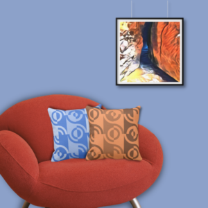


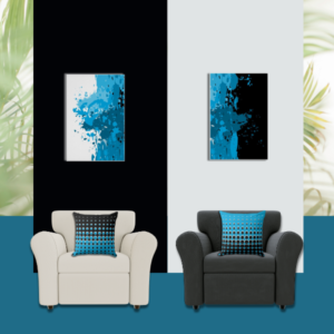
- Orange and blue home decor with a square wall art
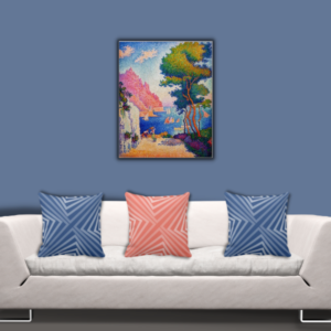
- Pink and blue throw pillows meet impressionist Paul Signac
- Red and blue accent pillows and art print
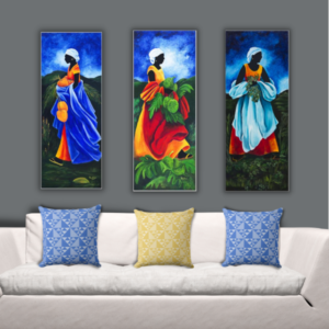
- Yellow and blue pillows and art by Patricia Brintle
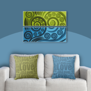
- Set of 2 pillows in green and blue with two paneled art print
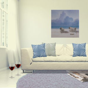
- Brown and blue set of two pillows with square seascape print
- Gray and blue pillows meet contemporary art by Lincoln Seligman
- Black and blue wall art by KBM D3signs meets throw pillows
Overall, shades of blue are an excellent choice for interior design because of their versatility and calming effect. From a light and airy baby blue to a rich and luxurious navy, blue has the power to transform a room. And create a mood that is unique to each hue. So the next time you think about adding a splash of blue to your home, consider the many shades of blue and the effect they can have on your space.
Professional interior designers use a mood board to communicate color and texture compositions. Creating a mood board online or offline helps validate design ideas. And when you create one using online tools and share your ideas with others, you can incorporate their feedback.
Find home and wall decor by KBM D3signs in blue. Most of our designs work as templates and allow in addition to replacing images and text color customization. Learn how to match color using a color tool or create one that works with your existing color scheme.
Feelings of calm, serenity, and stability find themselves often expressed through the color blue. A color connected to peace and relaxation, it calms the mind and body. That is one reason why it is a popular choice for interior spaces such as bedrooms, living rooms, and bathrooms.
Blue also has associations with nature, especially water, and the sky. Associations that potentially evoke a sense of vastness and freedom, as well as a sense of peace and tranquility.
In addition to its calming effect, blue relates to intelligence, logic, and communication. So it naturally finds a place in corporate logos and brands to convey professionalism, dependability, and trust. Like it is important for a financial planner, for example.
However, it is valuable to note that the psychological effects of blue can vary. And depending on the hue and tone used. For example, darker shades of blue can translate into feelings of sadness or depression. Brighter and more vibrant hues, on the other hand, potentially energize and invigorate. In addition, when combined with additional colors, the psychological effects of each color surface influence the atmosphere of the space.
Blue has many symbolic connotations, including:
Calm and serenity: Blue is often associated with feelings of peace, relaxation, and calmness. It soothes the mind and body.
Stability and dependability: Blue is often used to convey a sense of stability, dependability, and reliability. It also finds its way into corporate logos, branding, and blue business cards as a sign of trustworthiness and professionalism.
Intelligence and wisdom: Blue is often associated with intelligence, logic, and wisdom. It’s a popular color for educational institutions because of its ability to stimulate mental activity and enhance learning.
Loyalty and Trust: Blue often symbolizes loyalty, trust, and honesty. It is popular for political parties and social organizations because of its ability to create a feeling of unity and solidarity.
Serenity and Spirituality: Blue is often associated with spirituality, inner peace, and emotional healing. It is used in meditation and relaxation practices to create a sense of serenity.
Masculinity and professionalism: Often used in men’s fashion and accessories, blue is considered a masculine color. It is also used in professional settings, such as business suits and uniforms, to create a sense of formality and professionalism.
It is important to note that the symbolic meanings of blue can vary depending on the cultural and social context in which it is used.
-
Red and Blue Color Palette: A Blend of Passion and Tranquility
Read the post …: Red and Blue Color Palette: A Blend of Passion and Tranquility -
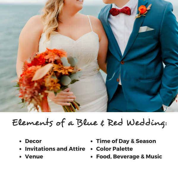
Red and Blue Wedding Theme – Unique Charm and Personal Flair
Read the post …: Red and Blue Wedding Theme – Unique Charm and Personal Flair -

Blue Business Cards For Various Professions
Read the post …: Blue Business Cards For Various Professions -
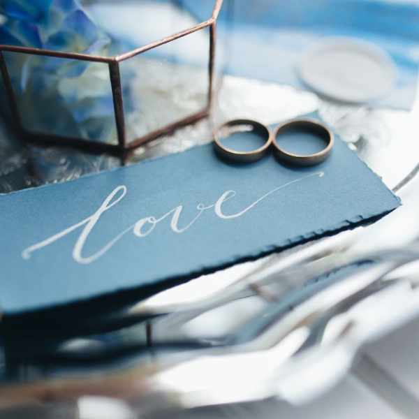
How to Incorporate Shades of Blue Into Your Wedding Theme
Read the post …: How to Incorporate Shades of Blue Into Your Wedding Theme -
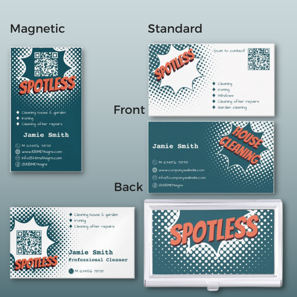
Cleaning Service Business Card & Marketing Collateral in Blue and White
Read the post …: Cleaning Service Business Card & Marketing Collateral in Blue and White -
Blue and White Color Palette Transform Your Home With Seaside Charm
Read the post …: Blue and White Color Palette Transform Your Home With Seaside Charm
I’m impressed, I have to admit. Rarely do I come across a blog
that’s equally educative and amusing, and let me tell you, you’ve hit the nail on the head.
The problem is something that too few folks are
speaking intelligently about. Now i’m very happy I came across this during my hunt for something regarding this.
Thank you so much for your kind words! I’m thrilled to hear that you found the blog both educative and amusing. It’s always gratifying to know that the content resonates with readers like you. I appreciate your recognition of the importance of addressing the problem and the need for more intelligent discussions on the matter.
If you have any specific thoughts or questions related to the content or if there’s anything else you’d like to see covered, feel free to share. I’m here to provide valuable and engaging information, and I’m glad you stumbled upon the blog during your search for relevant content. Your feedback is truly encouraging, and I look forward to continuing to provide content that interests and informs you.