

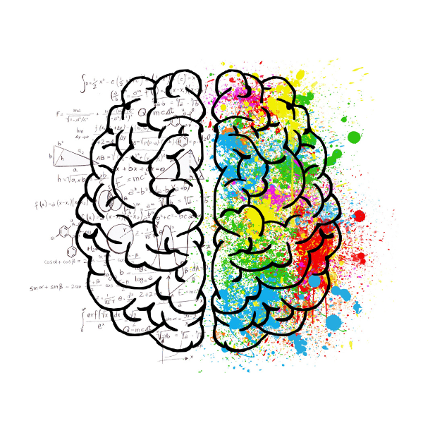
Color is more than decoration — it’s a tool for shaping mood, guiding attention, and telling a story.
Whether you’re styling a home or building a brand, understanding color theory and how to choose brand colors gives you the clarity and confidence to make impactful design choices.
What is color theory?
Color is one of the most important elements of interior design. It has the power to transform a space, set the mood, and create an atmosphere that reflects the homeowner’s personality and style.
But what is color, exactly?
Altogether, color is a visual perception created by the brain in response to light waves of different wavelengths. It is an essential part of our lives, and its effects on our emotions and behaviors are well-known. In this article, we will explore the world of color from the perspective of interior design, including color theory and the psychological effects colors have on people.
Article content:
- Quote by Marc Chagall
- Foundational Elements Of Color Theory
- Color Wheel Based On The RYB Color Model
Difference Of Hue, Value, And Chroma
Distinction Of Shade, Tint, And Tone
Understand Color Temperature
Harmonious Color Schemes - The Psychology of Color | Colors Affect Humans
- Meaning of Colors
- Colors and Emotions
- Understanding The Psychology Of Color
- Frequently Asked Questions About “What is Color Theory?”
Quote by Mark Chagall
This quote by Mark Chagall beautifully sums up the relationship between color as the theory of color is taught in art classes.
All colors are the friends of their neighbors
and the lovers of their opposites.
Marc Chagall
…
Foundational Elements Of Color Theory
One of the foundational elements of color theory is the understanding of color models. There are various color models, but the most commonly used in interior design are the RGB (Red, Green, Blue) and CMYK (Cyan, Magenta, Yellow, Key) models.
The RGB model is based on light and is used for digital displays, while the CMYK model is based on pigments and is used for printed materials.

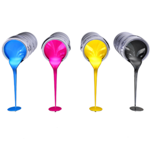

The RYB (Red, Yellow, Blue) model, based on the primary colors traditionally used in color mixing, is another color model commonly used in art and design.
Color Wheel Based On The RYB Color Model
A key tool in color theory is the color wheel. The color wheel is a visual representation of the relationships between colors. Designers use it to choose and combine colors effectively in interiors and brand colors.
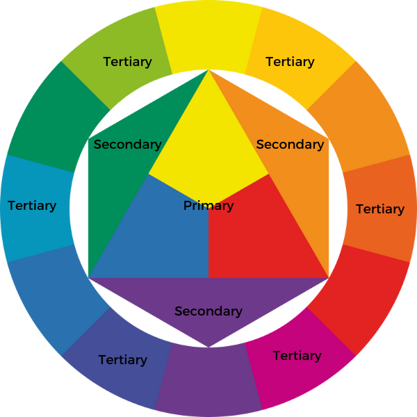
It consists of twelve colors, including three primary colors (red, blue, and yellow), three secondary colors (green, purple, and orange), and six tertiary colors (red-orange, yellow-orange, yellow-green, blue-green, blue-purple, and red-purple). The color wheel was first invented by Sir Isaac Newton in 1666, and it remains a fundamental tool in color theory to this day.
Difference Of Hue, Value, And Chroma
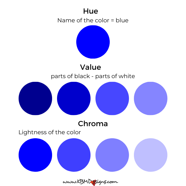
Three common terms to describe the characteristics of color are hue, value, and chroma. Hue is the name of the color, while value refers to the lightness or darkness of the color, and chroma describes the saturation or intensity of the color.
Distinction Of Shade, Tint, And Tone

Shade, tint, and tone describe variations of a color. A shade derives by adding black to a color, while a tint ensues by adding white to a color. And a tone comes from adding gray to a color.
Understand Color Temperature
Color temperature is another important aspect of color in interior design. It refers to the warmth or coolness of a color.
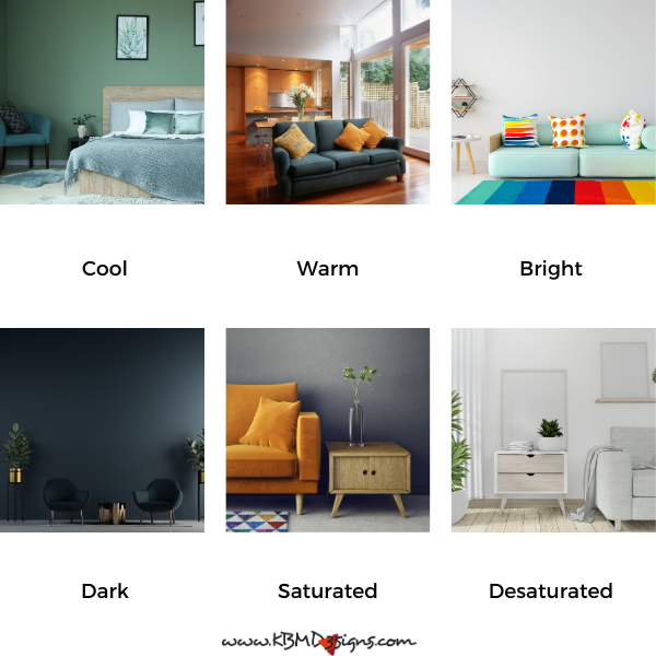
Cool colors, such as blue and green, have a calming effect and find often use in bedrooms and bathrooms. Warm colors, such as red and orange, have a stimulating effect and spearhead the color palette in living rooms and dining rooms. Bright colors are bold and vibrant, while dark colors create a sense of depth and sophistication. Saturated colors are intense and vibrant, while desaturated colors appear more subdued and muted.
Harmonious Color Schemes
Color schemes are combinations of colors that create a harmonious and pleasing effect. Overall, several types of color schemes appear in interior design, including monochromatic color schemes, analogous color schemes, complementary color schemes, split complementary color schemes, triad color schemes, and tetradic color schemes.
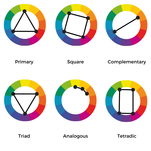
Monochromatic color schemes use different shades, tints, and tones of the same color. Analogous color schemes use colors that are next to each other on the color wheel. Complementary color schemes use colors that are opposite each other on the color wheel. Split complementary color schemes use one color and two colors that are adjacent to their complement. Triad color schemes use three equally spaced colors on the color wheel. Tetradic color schemes use two pairs of complementary colors.
Here are color tools that serve well to match colors to existing color schemes, color palette ideas, and colors by #Hex codes and names.
Psychology of Color | Colors Affect Humans
The psychology of color is the study of how color affects human behavior and emotions. It is an important consideration in interior design. Because the colors used in a space can have a significant impact on the people who use it. Different colors can evoke different emotions and moods, and it’s important to choose colors that create the desired effect.
Meaning of Colors
Colors have different meanings and associations in different cultures and contexts. For example, in Western culture, red represents love and passion. In Chinese culture, on the other hand, it brings luck and wealth. Blue is often associated with calm and serenity, while yellow is associated with happiness and joy. Green stands for nature and growth, purple for royalty and luxury.
Colors and Emotions
Different colors can evoke different emotions in people, so it is important to choose colors carefully when designing a space. For example, warm colors such as red, orange, and yellow can create a sense of excitement, energy, and warmth. In contrast, cool colors such as blue, green, and purple can create a sense of calm, relaxation, and serenity. Bright colors such as hot pink or neon green can create a bold and fun atmosphere. Darker colors such as navy blue or deep purple can create a sense of elegance and sophistication. Saturation also plays a role in the emotional response to color. More saturated colors are associated with excitement and intensity, while desaturated colors are associated with calmness and relaxation.
Understanding The Psychology Of Color
Understanding the psychology of color can help designers create spaces that evoke specific emotions and feelings. For example, blue is often associated with trust and reliability, making it a popular color for corporate settings. Nature and Health often automatically relate to green, making it a great choice for medical or wellness spaces. Yellow associates often with happiness and optimism, making it a popular choice for playful or creative environments. By carefully selecting and combining colors, designers can create a space that not only looks beautiful but also feels good to be in.
In Conclusion, What Is Color?
In conclusion, color is an essential component of interior design. Understanding color theory and how color can affect people’s emotions and perceptions is critical to creating a visually appealing and functional space. By using the color wheel, understanding color temperature and exploring different color schemes, designers can create harmonious and balanced spaces. And match these on mood boards with their client’s personality and style. Before putting their idea into action.
The psychology of color also plays an important role in design. Different colors can evoke different emotions and associations. By considering the meaning of color and how it affects people’s emotions, designers can use color to create a mood or atmosphere that aligns with their client’s goals. Ultimately, color is a powerful tool. It’s often used to transform any space into a beautiful and functional environment.
Frequently Asked Questions About “What is Color Theory?”
Color theory is a set of principles and guidelines concerning the use of color in art and design. It explores how colors interact with each other and how they can be combined to create harmonious or contrasting effects.
Color theory is important because it helps artists, designers, and creators understand how colors work together and how they can evoke different emotions or moods. It provides a framework for making informed decisions about color in various applications.
Primary colors are the fundamental colors from which all other colors are derived. In traditional color theory, they are red, blue, and yellow. These colors cannot be created by mixing other colors together.
Secondary colors are created by mixing equal parts of two primary colors. The secondary colors are orange (red + yellow), green (yellow + blue), and purple (blue + red).
Tertiary colors are created by mixing a primary color with a neighboring secondary color on the color wheel. For example, red-orange and yellow-green are tertiary colors.
The color wheel is a circular diagram that shows the relationships between colors. It typically includes primary, secondary, and sometimes tertiary colors arranged in a way that illustrates their chromatic relationship.
Warm colors (like red, orange, and yellow) tend to evoke warmth, energy, and vibrancy. Cool colors (like blue, green, and purple) evoke calmness, tranquility, and sometimes sadness.
A monochromatic color scheme uses variations in lightness and saturation of a single color. It creates a harmonious and unified look without using other colors from the color wheel.
An analogous color scheme uses colors that are adjacent to each other on the color wheel. This creates a cohesive and harmonious color palette.
A complementary color scheme uses colors that are opposite each other on the color wheel. This creates a strong contrast and can be used to make elements stand out.
The psychology of color studies how different colors can affect human emotions, moods, and behaviors. It explores how color choices in design can influence perceptions and reactions.
You can use color theory by understanding basic color relationships, experimenting with different color combinations, and considering the emotional impact of colors on your audience or users.

-
Gray Business Cards: Perfect Blending Of Sophistication And Versatility
Read the post …: Gray Business Cards: Perfect Blending Of Sophistication And Versatility -

Brand Color Blue : Business Card Designs with an Edge
Read the post …: Brand Color Blue : Business Card Designs with an Edge -
Black And White Business Card Designs – How to Stand Out
Read the post …: Black And White Business Card Designs – How to Stand Out