How to match colors with the following color tool. Coolors is my favorite color palette generator among many other features. These include a color combination generator, a color picker from an image, a contrast checker, and a collage maker.
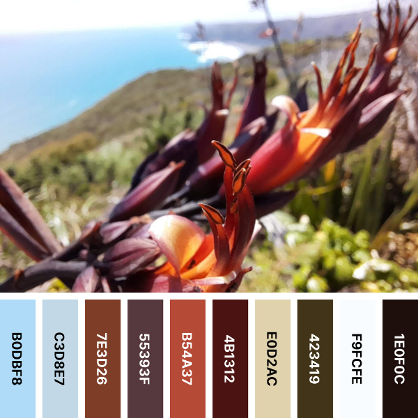
And that is only a small part. Check out Coolors and explore all it has to offer. The random color generator is an easy place to start. It returns a palette of five colors for the free tool and ten for the Pro Color tool. This particular one is the basis for the curl pattern and the koru pattern. You can find it in a home and wall decoration design by KBM D3signs.
All KBM D3signs designs on the Zazzle platform allow for color customization. Coolors is a wonderful color tool to find the right color for your purpose.
To learn more about how to match colors, go to the color picker and enter its #Hex code. Here you will find the color’s shades, tints, and tones according to color theory. Next, look at hues and color temperatures. Then follow the harmonic color palettes of the color from analogous, complementary, split complementary, triadic, tetradic to square. You’ll even learn how color blindness affects the perception of the chosen color. Finally, you’ll finish this section by finding its contrast value on a white or black background.
Finally, check the closest color match within other known color systems such as RAL, HKS, Copic, and Prismacolor.
Are you in color exploration mode?
Then you will find an additional Coolors tool. For example, you can use the Contrast Checker for a colored font on a colored background. This is a very useful tool for ensuring readability.
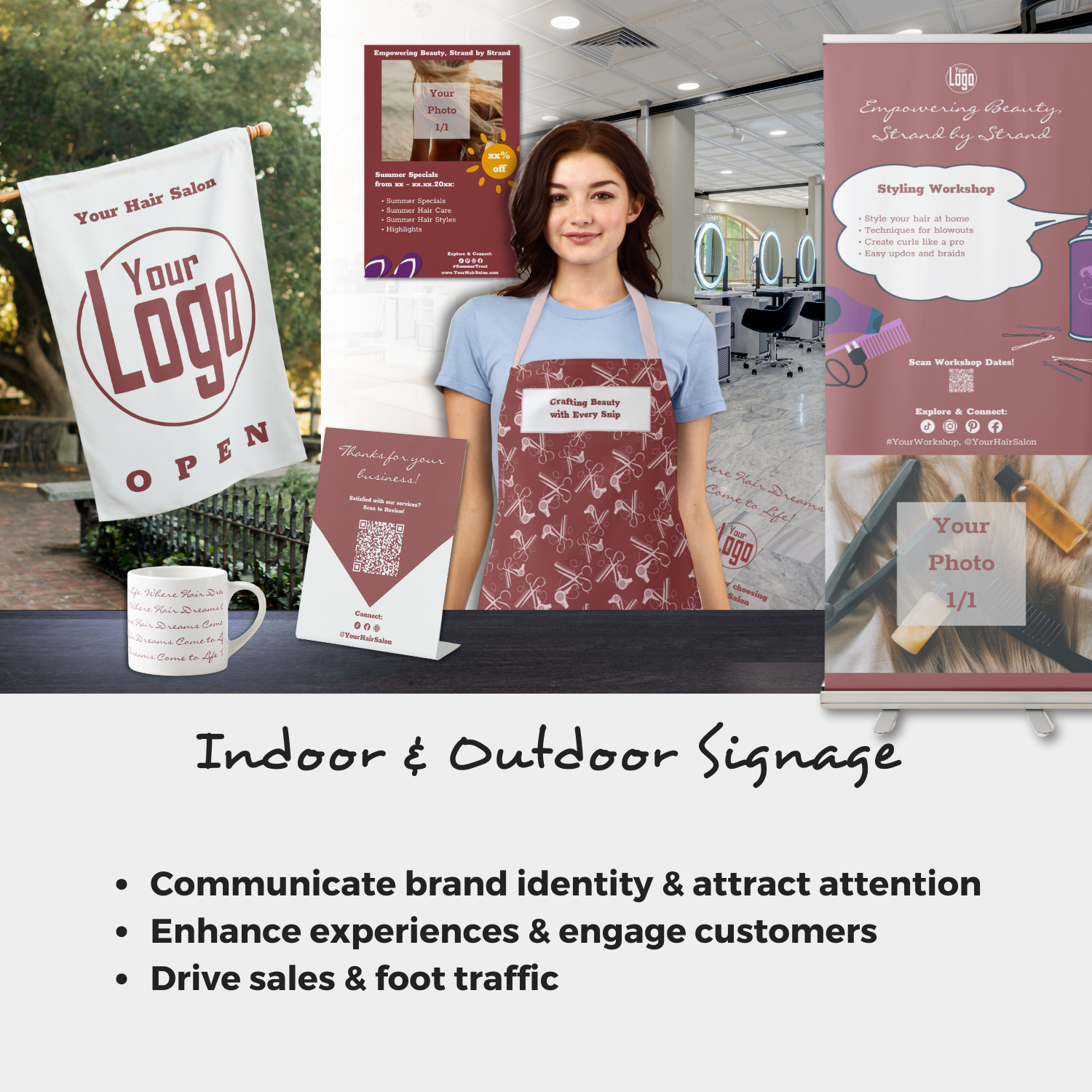
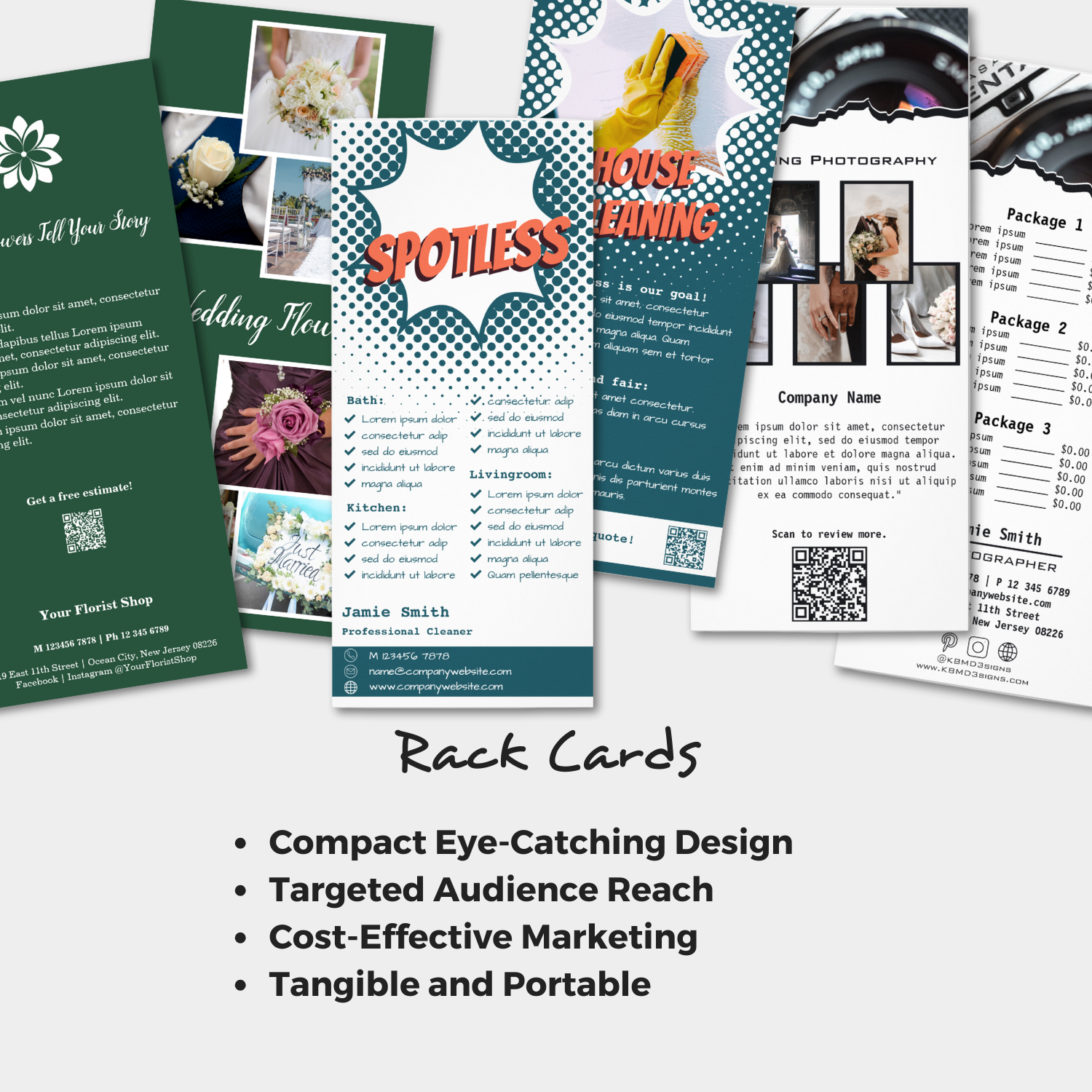
KBM D3signs uses it regularly to design children’s birthday party invitations, small business marketing materials, and wedding invitations.
What is the HKS color system?
What is the HKS color system?
The HKS color system is a proprietary color-matching system used in the printing industry. It was developed in the 1970s by the German company Hostmann-Steinberg Druckfarben, and the name “HKS” is derived from the initials of the company’s founders: Helmut Hostmann, Wilhelm Küster and Franz Steinberg.
The HKS color system is based on a set of 88 spot colors, each identified by a unique HKS number. These colors are formulated using a combination of process colors (CMYK) and additional pigments to achieve specific hues. The HKS system is designed to provide a consistent and accurate method for reproducing colors in printed materials such as brochures, packaging, and other marketing materials.
In addition to the 88 standard colors, the HKS system includes a number of metallic and fluorescent colors, as well as special colors for use on non-standard substrates such as plastic or metal.
The HKS color system is widely used in the European printing industry, particularly in Germany and Switzerland, and is also used by some printers in other parts of the world. However, it is less common in North America, where other color systems such as Pantone and CMYK are more widely used.
What is the Copic color system?
What is the Copic color system?
The Copic Color System is a marker-based color system used by artists and designers to create illustrations, designs and other artwork. The system is based on a set of markers that come in over 350 colors, each identified by a unique code consisting of a letter and a number.
The Copic color system is known for its versatility and ease of use. The markers are alcohol-based and can be blended to create smooth transitions between colors. They are also refillable and have replaceable nibs, making them a popular choice for artists who use markers frequently.
The Copic color system is organized into different color families, including yellows, oranges, reds, pinks, violets, blues, greens, browns, grays, and blacks. Within each color family, there are different shades and tones that are identified by the number component of the marker code. For example, a marker with the code YR02 is a yellow-orange color with a midtone.
The Copic color system is widely used in the illustration and design industries, especially in Japan, where the markers were first developed. They are also used by hobbyists and enthusiasts for various crafts and DIY projects. Copic markers are known for their high quality and are considered one of the top choices for artists and designers who use markers in their work.
What Is The Prismacolor System?
What Is The Prismacolor System?
The Prismacolor system is a pencil-based color system used by artists, designers and hobbyists to create illustrations, sketches and other artwork. Prismacolor is a brand of colored pencils known for their high quality and rich, vibrant colors.
The Prismacolor system includes a wide range of colored pencils, each identified by a unique color name and number. The pencils are available in more than 150 colors, including various shades of red, blue, green, yellow, brown and gray. Metallic and neon colors are also available.
Prismacolor pencils are known for their soft, smooth leads that allow for easy blending and shading. They are also lightfast, meaning they resist fading over time, and are designed to be durable and long-lasting.
In addition to colored pencils, the Prismacolor system includes a range of other art supplies such as markers, watercolor pencils and art markers. These products are designed to be used with the colored pencils to create a wide range of artistic effects and styles.
How To Match Colors With A Color Picker From Image
An image color picker lets you match colors to an existing color scheme in nature or your home. Select the Image Picker and upload a photo that shows the color scheme you favor.
The color tool will return the colors found within. In addition, the Collage Maker allows you to create a collage of the image and download the result.
In total, there are many more tools available under the free color tool. Even more, are available if you use Coolors paid services. It is especially useful when working with color palettes of up to ten colors.
The Pro version offers several advantages. It is ad-free, stores unlimited palettes, colors, gradients, projects, and collections, selects specific colors from images, and much more. That makes it helpful in any design process.
What To Do When You Have A Color Name?
The Color-Name.com site allows you to search by name or #Hex code. If you want to match colors with a color name, this is a good place to find color information. And if you have a #Hex code, it is also helpful. A click on the found color field turns into a color palette generator.
The short information snipped also provides RGB values, CMYK color codes, and the HSV scale. Further, the text includes the closest web-safe #Hex code and the closest Pantone and Ral number.
It gives you the complementary palette, the analogous palette, the split-complementary palette, the triadic palette, the tetradic palette, the square palette, and a matching rainbow palette. You will also find tints, tones, and shades.
What Does Web-safe Mean?
What Does Web-safe Mean?
Web safe #Hex codes refer to a set of 216 colors that are considered safe for use on the Web. These colors were originally established when computer monitors were limited in their ability to display color. They could not accurately reproduce many shades of color. In order to ensure that colors are displayed consistently across different types of monitors and browsers, the Web Safe color palette was developed.
The Web Safe color palette contains 216 colors that are defined by their #Hex codes, which are six-digit codes that represent specific colors. Each #Hex code consists of three pairs of characters, with each pair representing the intensity of one of the primary colors: red, green, and blue. For example, the Web Safe #Hex code for pure red is #FF0000, which means that the red component of the color is at its maximum intensity (FF in hexadecimal), while the green and blue components are at their minimum intensity (00 in hexadecimal).
While the web-safe color palette is no longer as relevant as it once was, as modern monitors and browsers are now capable of displaying a much wider range of colors, it can still be useful in some situations, such as when designing for older devices or for users with visual impairments. It should be noted, however, that using a limited color palette can limit your design options and may not be necessary for most modern web design projects.
What Does RAL Mean?
What Does RAL Mean?
RAL is a color matching system used in many industries, especially in Europe. RAL stands for “Reichs-Ausschuß für Lieferbedingungen”, which translates to “Imperial Commission for Delivery Conditions”. The RAL system is maintained by RAL gGmbH, a non-profit organization based in Germany.
The RAL system assigns a unique number to each color in the system, with the number typically consisting of four digits. For example, RAL 5015 is a shade of blue, while RAL 3020 is a shade of red. Each RAL color is defined by a specific set of colorimetric values that allow for consistent reproduction of the color across different manufacturing processes and materials.
In industries such as automotive, construction and product design, where it is important to match colors accurately, the RAL system has its place. RAL colors are used to specify the colors of paints, coatings, plastics and other materials and are often used in architectural and industrial design projects.
While widely used in Europe, the RAL system is less common in other parts of the world. In the United States, for example, the Pantone Color Matching System is more common for color matching.
What Does Pantone Mean?
What Does Web-safe mean?
Pantone is a company best known for its Pantone Color Matching System. This system is widely used in the printing and design industries to ensure that colors are accurately matched and reproduced. The Pantone Color Matching System is a proprietary system. The system identifies and matches specific shades.
Pantone was founded in 1962 by Lawrence Herbert, who was then working part-time for a printing company. Herbert noticed that the color matching process was inconsistent and unreliable. He saw an opportunity to develop a more accurate and standardized system for color matching. He developed the Pantone Color Matching System, which quickly became popular with designers, printers and manufacturers.
Today, the Pantone Color Matching System is used in a wide range of industries, including graphic design, fashion, product design and packaging. The system includes more than 1,800 standardized colors, each identified by a unique Pantone Color Number. Pantone also offers a range of color-related products and services, including color guides, swatch books and digital color matching and specification tools.
In addition to its color products and services, Pantone is also known for its Color of the Year. This is an annual announcement that identifies a color that is expected to be popular in the coming year. The Color of the Year is often influential in the worlds of fashion, design and marketing. It can have an impact on trends and consumer behavior.