

Shades of orange can range from cool to warm, bright to dark, and everything in between. Orange is a color that is both bold and warm.
In this article, we will explore the different shades of orange and their practical application in interior design. We will also delve into the psychology of the color and its symbolism.
Definition of Orange
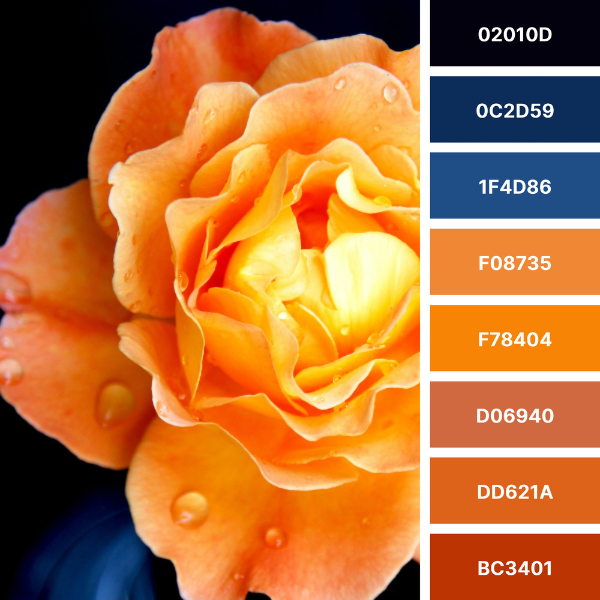
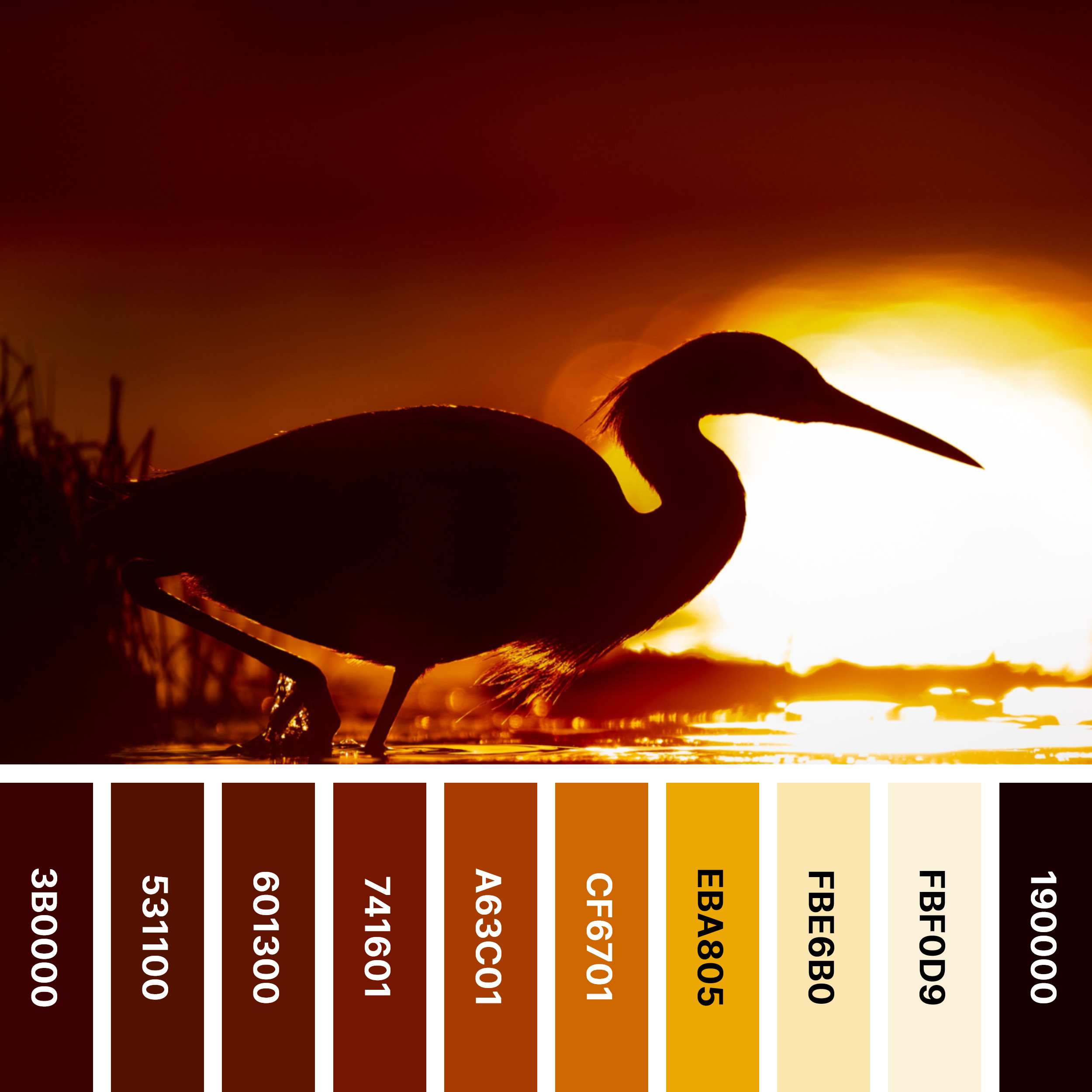
The image shows different shades of orange color and their #HEX numbers:

Topaz: #00004D, Pastel Orange: #FFB347, Navajo White: #FFDEAD, Deep Peach: #FFCBA4, Peach Orange: #FFCC99, Portland Orange: #FF5A36, Outrageous Orange: #FF6E4A, Neon Carrot: #FFA343, Salmon: #FF8C69, Pumpkin: #FF7518, Orange Peel: #FF9F00, Dark Orange: #FF7F00, Safety Orange: #FF6700, International Orange: #FF4F00, Mango Tango: #FF8243, Orange Red: #FF4500
Orange is a secondary color created by combining equal parts of red and yellow. It is a bright and vibrant color associated with warmth, energy, and happiness. It is also a color often used to represent fall and harvest time.
What makes the color orange?
Orange is a secondary color, which means that it is created by mixing two primary colors. In the world of color theory, there are three primary color models: RGB (red, green, and blue), CMYK (cyan, magenta, yellow and key), and RYB (red, yellow, and blue).
With RGB, orange is a combination of equal amounts of red and green light. In CMYK, equal amounts of magenta and yellow ink are mixed to produce orange. In RYB, orange is created by mixing equal parts of red and yellow ink.
This means that orange lies on the color spectrum between its primary colors: red and yellow. As a result, orange can have warm and cool undertones, depending on which primary color is more dominant in the mix.
Understanding the science behind color creation can help designers make informed decisions about color selection and how different shades of orange will work in a given space. It will also allow you to gain a deeper appreciation for the complexity and beauty of color.
Orange Complementary Color
The complementary color to orange is blue. Complementary colors are colors that are opposite each other on the color wheel. When paired together, they create a high contrast and can create a dynamic and energetic look. Pairing orange with blue can balance the warmth of orange with the coolness of blue, creating a harmonious color scheme. Other examples of complementary colors are red and green, and yellow and purple.

Supreme Orange #EA871E – Bleu De France #1E81EA, Bronze Orange #C67D1C – Denim #1C65C6, Romantic Orange #FEA948 – Brilliant Azure #489DFE, Orange-Red #FF5349 – Electric Blue #49F5FF, Burnt Orange #FF7034 – Picton Blue #34C3FF, Thanksgiving Orange #F17D08 – Azure #087CF1, Yellow-Orange #FFAE42 – Brlliant Azure #4293FF, Luxury Orange #EC7D3C- Picton Blue #3CABEC
Orange in Interior Design
Orange is a warm and energetic color that can add vibrancy and excitement to an interior design scheme. Here are some ways you can incorporate orange into your home’s interior design:
- Accent Wall: Consider painting an accent wall in a bright shade of orange. This can create a focal point in the room and add warmth and energy.
- Accessories: Use orange, orange and white, or orange and black accessories, such as throw pillows, curtains, and area rugs to add pops of color to your space. Orange can work well with a variety of colors, including blues, greens, and grays.
- Furniture: Consider incorporating orange furniture, such as a sofa or armchair, into your design. This can add a bold statement to your room and create a warm and inviting atmosphere.
- Artwork: Use artwork with orange accents to add color and interest to your walls. This can be a painting, photograph, or print.
- Lighting: Incorporate orange lighting fixtures, such as table lamps or pendant lights, into your space. This can add warmth and create a cozy atmosphere.
It’s important to note that orange appears as a bold and intense color, so it’s best to use it in moderation. Orange is a great addition to your interior design scheme when paired with neutral or complementary colors.
Cool, Warm, Bright, And Dark Orange Color
Adding a small amount of blue to orange creates a cooler orange color. This creates a more muted and subdued shade of orange. It can be used in interior design to create a calming and relaxing atmosphere.

A warm orange color is the result of adding a small amount of red to the orange color. This results in a more vibrant and energetic shade of orange. It creates a welcoming and inviting atmosphere in interior design.
Bright orange is a bold and vibrant color. When used in interior design, it makes a statement. Used sparingly so as not to overwhelm the space, it can add energy and excitement to a room.
Used to create a cozy and inviting atmosphere, dark orange is a rich and warm hue. It adds depth and dimension to a room when used as an accent color.
Colors that Go with Orange
Orange is a vibrant and energetic color that pairs well with a variety of other colors to create a beautiful and harmonious color scheme. Here are some colors that go well with orange:
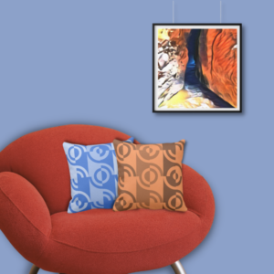


- Blue and orange throw pillows meet a square wall decor
- Green and orange set of two pillows meet an insect photo print
- Brown and orange accent pillows
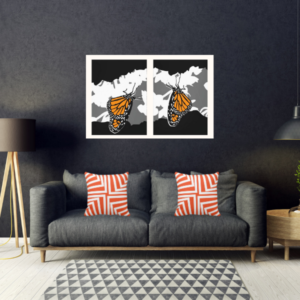
- Orange and white pillows meet a Monarch butterfly wall decor
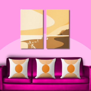
- Orange accessories on pink couch
- Purple and orange home accessories
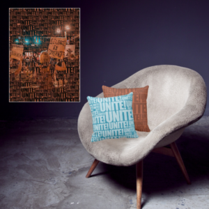
- Unite! typography patterned turquoise and orange pillows
- Yellow and orange accent pillows meet art by Paul Klee
Frequently Asked Questions FAQs on Orange Color Combinations
Complementary colors are hues that are opposite each other on the color wheel. Blue and orange are complementary because they create a dynamic and energetic contrast when paired together.
Navy blue, sky blue, and turquoise are all great options to pair with orange.
Green is a calming and natural color that pairs well with orange. Shades like olive green, sage green, and forest green work beautifully with orange.
Yes, brown is a warm and earthy color that can help ground an orange color scheme. Light brown, beige, and taupe are suitable choices to pair with orange.
White is a neutral color that balances the intensity of orange. It helps orange stand out, creating a fresh and modern look. White also balances the striking color duo of orange and black.
Yes, pink complements bright orange. Coral pink, blush pink, and dusty rose are excellent options when pairing pink with orange.
When incorporating orange or its combinations, consider the intensity of the shade and the overall mood you want to create. Using neutral tones alongside bold and vibrant colors can help create a balanced and cohesive look.
Color Tools To Create An Orange Color Palette
The orange color palette is extended and varied, ranging from warm to cool, and everything in between. Warm orange tones tend to have more yellow and red undertones, while cooler hues usually have some blue added. KBM D3signs uses color tools to match colors.
What Does Orange Color Mean?
Orange is a color associated with warmth, energy and happiness. Often associated with creativity and inspiration. In color psychology, orange is a stimulant for creativity and a stimulant for a sense of adventure.
Psychology of Orange
Overall, the psychology of orange is complex and can have different effects on different people. Broadly speaking, orange promotes energy, enthusiasm and warmth. They also promote creativity and inspiration.
Orange as a Symbol
In many cultures and contexts, orange is a color that often serves as a symbol. Orange is the color of the Dutch royalty and the Protestants of Northern Ireland. Also often used for Halloween and autumn.
In short, the various shades of orange can have a profound impact on interior design. Whether used sparingly as an accent color or as the main color in a room, orange can add warmth and vibrancy to a space. Additionally, understanding the psychology and symbolism of the color can help you make informed design decisions and create a space that evokes the desired emotions and feelings. So, consider incorporating shades of orange into your next interior design project and see how it can transform the space.
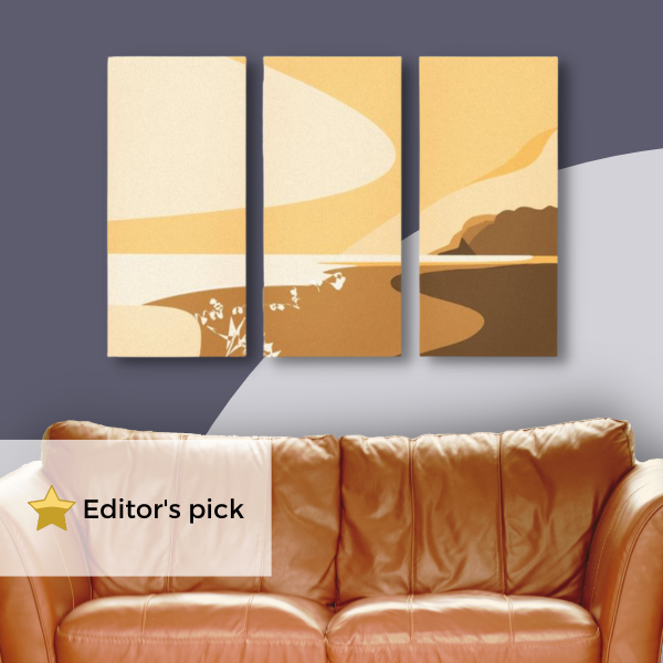
Orange Inspirations
-
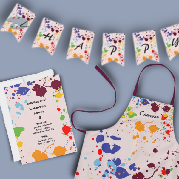
A Kids Painting Birthday Party at Home Makes Unforgettable Fun
Read the post …: A Kids Painting Birthday Party at Home Makes Unforgettable Fun -
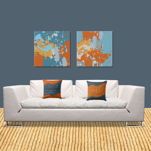
Blue and Orange Wall Art to Enhance Your Home Decor
Read the post …: Blue and Orange Wall Art to Enhance Your Home Decor -
Blue and Orange Color Palette, Embrace Vibrancy and Transform Your Home
Read the post …: Blue and Orange Color Palette, Embrace Vibrancy and Transform Your Home -
Vibrant Orange Wall Art Prints to Energize Your Space
Read the post …: Vibrant Orange Wall Art Prints to Energize Your Space -
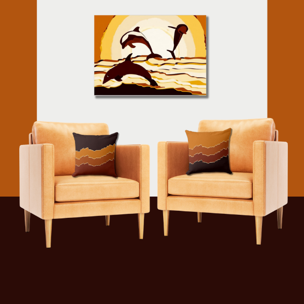
Orange and Black Color Palette Ideas for Home Decor by Embracing Nature’s Beauty
Read the post …: Orange and Black Color Palette Ideas for Home Decor by Embracing Nature’s Beauty -
Orange Wall Decor, What Digital Seascape Print to Choose?
Read the post …: Orange Wall Decor, What Digital Seascape Print to Choose?