

In this article, we will explore the different shades of gray, the complementary color of gray, the meaning of the color gray, and how to use gray in interior design. Gray is an incredibly versatile color that can evoke different emotions and feelings depending on its hue and context. From cool, dark tones to warm, light hues, the color gray is a popular choice in interior design because of its ability to add depth and sophistication to any space.
Shades of Gray
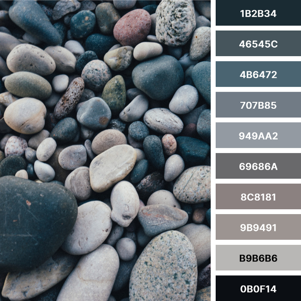
Gray is a neutral color that is a combination of equal parts black and white. In the world of color theory, gray is an achromatic color, meaning it has no hue. Adjusting the amount of black and white in the mixture produces a wide range of grays.
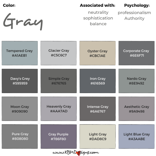
Tempered Grey #A1AEB1, Glacier Gray #C5C6C7, Oyster Gray #CBC1AE, Corporate Gray #6E6F71, Davy’s Grey #595959, Simple Gray #676765, Iron Gray #616569, Nardo Gray #8E9492, Moon Gray #909090, Heavenly Gray #AAA7AD, Intense Gray #6A6767, Aesthetic Gray #9A9498, Pure Gray #808080, Gray Purple #786F80, Light Gray #DAD8C9, Light Blue Gray #A3AABE
Digital design often uses RGB (red, green, blue) values to represent grays. The RGB values associated with grays can range from 0, 0, 0 (black) to 255, 255, 255 (white), with varying degrees in between. In the world of printing, gray is often represented using CMYK (cyan, magenta, yellow, black) values, while in the world of traditional painting, gray is represented using RYB (red, yellow, blue) values.
Complementary Color of Gray
The complementary color of gray is a matter of interpretation, as gray is not technically a hue. However, many designers consider the complementary color of gray to be yellow. Yellow is a warm, bright color that can add a pop of energy and vibrancy to a space when paired with gray. Check out gray and yellow throw pillows.
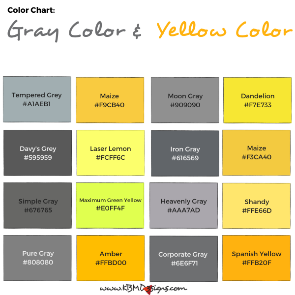
Tempered Grey #A1AEB1 – Maize #F9CB40, Moon Gray #909090 – Dandelion #F7E733, Davy’s Grey #595959 – Laser Lemon #FCFF6C, Iron Gray #616569 – Maize #F3CA40, Simple Gray #676765 – Maximum Green Yellow #E0FF4F, Heavenly Gray #AAA7AD – Shandy #FFE66D, Pure Gray #808080 – Amber #FFBD00, Corporate Gray #6E6F71 – Spanish Yellow #FFB20F
Gray Interior Design
Gray is a popular choice in interior design due to its versatility and sophistication. Cool, dark grays can create a sense of calm and relaxation, while warm, bright grays can add energy and vibrancy to a space. Bright, saturated grays can create a modern, sleek look, while desaturated, muted grays can add a sense of vintage charm.

When designing with gray, it is important to consider the other colors in the space. Gray can be paired with almost any other color, from bright, bold hues to soft, muted tones. Gray color combinations can create a range of moods and emotions, from calm and soothing to vibrant and energizing.
Meaning of the Color Gray
Gray is often associated with neutrality, sophistication, and balance. It is a popular color choice in corporate settings for its ability to convey a sense of professionalism and authority. However, gray can also be associated with negative emotions such as sadness, boredom, and apathy when used in excess.
Practical Application of Gray in Interior Design
When using gray in interior design, it is important to consider the mood and emotion you want to convey. Cool, dark grays are great for creating a sense of calm and relaxation in spaces such as bedrooms and bathrooms. Warm, bright grays can add energy and vibrancy to spaces such as kitchens and living rooms.
Gray works well as a backdrop for other colors in a room or as a standalone color. In a monochromatic design scheme, different shades of gray can create depth and interest while maintaining a sense of unity.
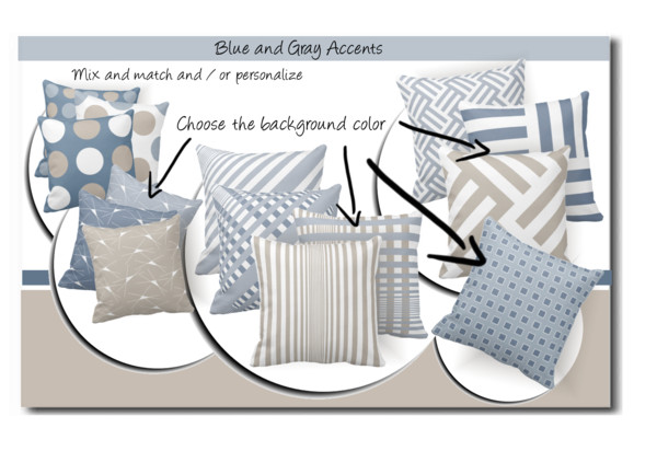
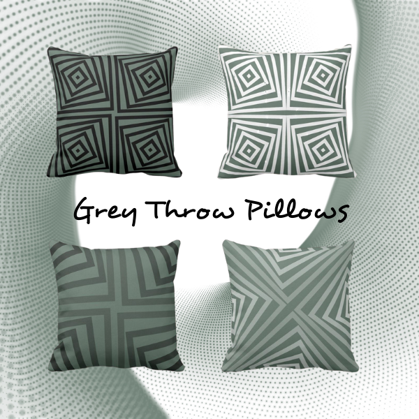
In addition to walls, gray can be used in a variety of ways in interior design. Gray furniture and textiles can add texture and depth to a space, while gray accents such as gray throw pillows and artwork can add a pop of color and interest.
Wall Art & Throw Pillows


- Splatter art and gray and pink throw pillows with a pixel pattern
- Instagram collage (23 images) and gray set of two pillows with a diamond pattern
- Square coastal photo print and gray and brown pillows with an angular pattern
- Taranaki Cliffs art print by Diana Adams and gray and green throw pillows with a layered pattern
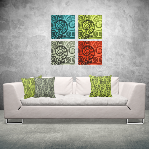
- Set of four-colored stylized fern art and yellow-green and grey curl patterned cushions
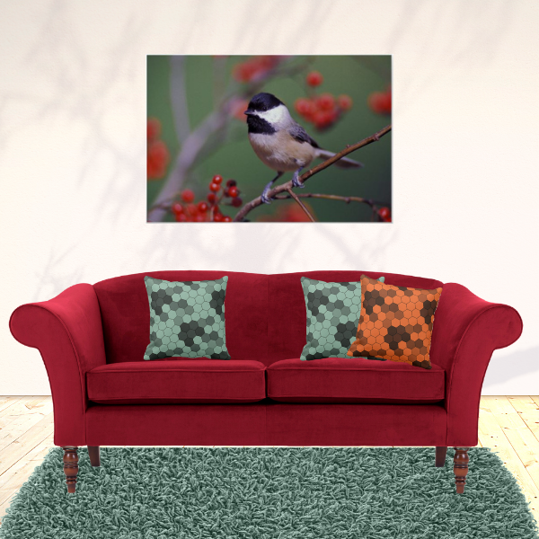
- Carolina Chickadee photo print and an orange and a grey hexagon-patterned pillow
In Conclusion:
The color gray is an incredibly versatile and sophisticated choice for interior design. Whether you choose cool, dark greys or warm, bright hues, gray can add depth and interest to any space. By understanding the different shades of gray, complementary colors, and the meaning of the color gray, you can create a space that evokes the emotions and feelings you desire. So next time you’re designing a space, don’t overlook the power of gray!
Frequently asked Questions (FAQs) The Power of Gray in Interior Design
Gray is versatile because it serves as a neutral backdrop that pairs well with various color schemes and design styles. Its neutrality allows it to adapt to both cool and warm aesthetics.
Gray comes in a spectrum of shades, from cool and muted to warm and rich. Lighter shades of gray can make a space feel open and airy, while darker shades add depth and coziness. Choosing the right shade depends on your design goals and the ambiance you want to create.
Gray is often associated with sophistication, elegance, and neutrality. Lighter grays can convey a sense of calm and serenity, while darker grays can evoke coziness and intimacy. Emotions and sensations vary according to hue and combination with other colors and design elements.
Yes, it is. Gray is a timeless color in interior design. Its versatility and ability to adapt to various design trends make it a reliable choice for both classic and contemporary interiors. Whether used as the main color or as an accent, gray has enduring appeal.
Gray pairs well with a wide range of colors, including soft pastels like blush pink and mint green, bold accents like navy blue and emerald green, and earthy tones like beige and brown. Popular combinations often depend on the desired style and feel of the room. So experimenting will help you find the perfect match.
-

Gray Wall Art: Elevate Your Home Decor With Subtle Sophistication
Read the post …: Gray Wall Art: Elevate Your Home Decor With Subtle Sophistication -
A Gray Color Palette to Transform Your Home
Read the post …: A Gray Color Palette to Transform Your Home -
Neutral Home Decor In Blue, Brown, Red, And Green Has Potential
Read the post …: Neutral Home Decor In Blue, Brown, Red, And Green Has Potential -
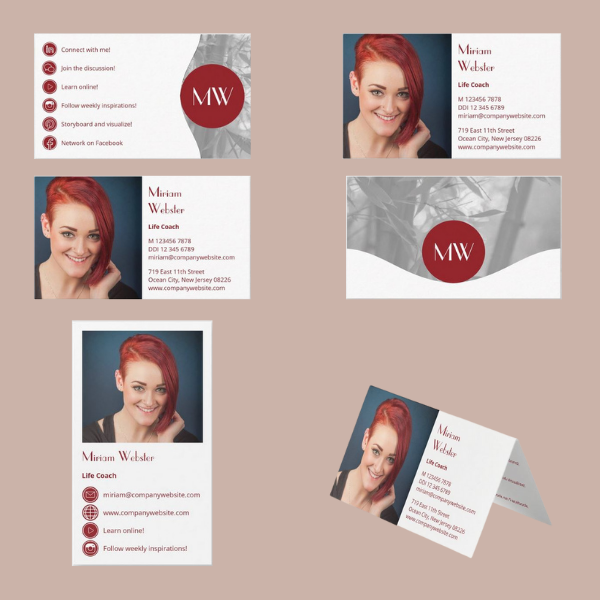
Life Coach Business Card With A Photo And Marketing Items In Red And Grey
Read the post …: Life Coach Business Card With A Photo And Marketing Items In Red And Grey -
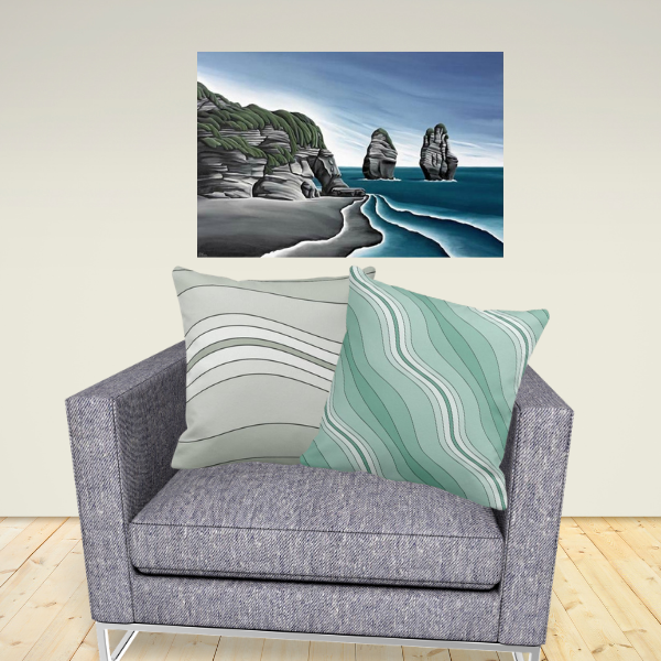
Taranaki Cliffs Art-print by Diana Adams – Art Meet Pillow
Read the post …: Taranaki Cliffs Art-print by Diana Adams – Art Meet Pillow -
Team-up Grey Throw Pillows With A Vibrant Colored One
Read the post …: Team-up Grey Throw Pillows With A Vibrant Colored One