

Different shades of red are bold, eye-catching colors that can add warmth, energy, and drama to any interior. But not all reds are equal. In general, shades of red can have different psychological effects on people. These range from warmer to cooler, lighter to darker, and more gray. With this in mind, red has several practical applications in interior design.
What Makes The Color Red
According to color theory, the composition of red is as follows. In RGB (Red-Green-Blue), red is created by mixing 100% red, 0% green, and 0% blue. In CMYK (Cyan-Magenta-Yellow), it’s a combination of 0% cyan, 100% magenta, 100% yellow, and 0% black. As in the RGB model, in the traditional RYB (Red-Yellow-Blue) model, red is a primary color.
What Is The Color Complementary To Red?
The complementary color of red is green. On the traditional color wheel, red and green are directly opposite each other, making them complementary colors. When used together as red and green throw pillows, these two colors create a strong visual contrast that can be very effective. This complementary color pairing is often seen in nature, such as red flowers against green leaves. This can be a source of inspiration for design projects.

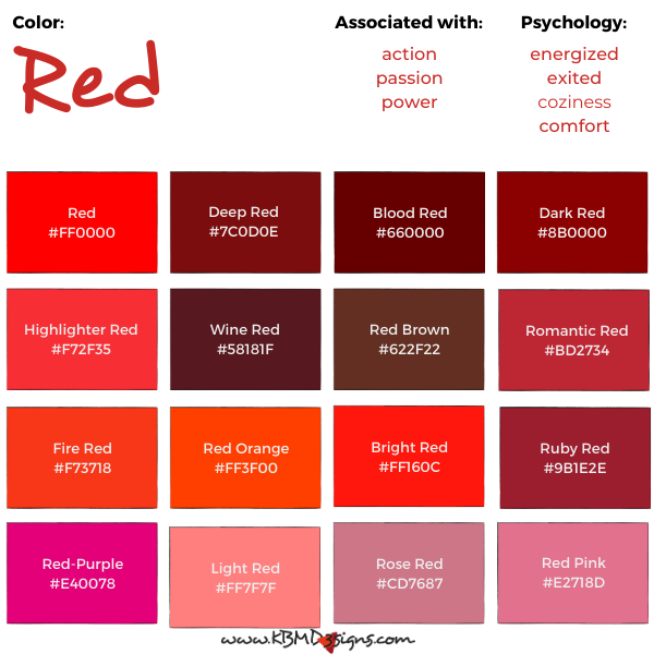
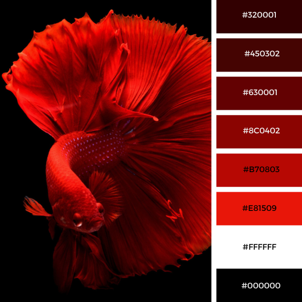
Red: #FF0000, Deep Red: #7C0D0E, Blood Red #660000, Dark Red #8B0000, Highlighter Red #F72F35, Wine Red #58181F, Red Brown #622F22, Romantic Red #BD2734, Fire Red #F73718, Red Orange #FF3F00, Bright Red #FF160C, Ruby Red #9B1E2E, Red-Purple #E40078, Light Red #FF7F7F, Rose Red #CD7687, Red Pink #E2718D
The Meaning Of The Color Red
The meaning of the color red varies from culture to culture and context to context. In Western cultures, it’s often associated with passion, love, and danger. In Eastern cultures, it symbolizes happiness, fortune, and celebration. From excitement and energy to warmth and comfort, red can evoke a range of emotions in interior design.
Color Red Interior Design
Red is a bold and stimulating color that can add a lot of energy and vibrancy to an interior design scheme. However, it’s important to use red strategically, as too much of it can be overwhelming and make a room feel too intense.
Here are some tips for incorporating red into interior design:
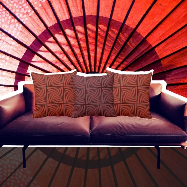
Use red as an accent color: Red can be a great accent color to add interest and energy to a room. Consider using red throw pillows, curtains, or a statement piece of red furniture to add some boldness to a neutral color scheme.
Use red in small doses: If you want to use red as a wall color, consider using it only on an accent wall or in a small space such as a powder room or entryway. This prevents the red to become overwhelming.
Pair red with complementary colors: Red works well with cool colors like blue and green, as well as warm neutrals like beige and brown. Consider incorporating these colors into your design scheme to balance the intensity of red.
Use different shades of red: If you’re worried about using too much red, consider using different shades of the color to create depth and interest. A darker red like burgundy can be subdued and sophisticated, while a brighter red like cherry is playful and energetic.
Overall, when using red in interior design, it’s important to consider the overall mood you want to create. Then use the color strategically to achieve that goal.
Colors That Go With Red
Red pillows, red and black pillows, and red and white pillows are strong and bold, making an impact in every space. When choosing colors to pair with red, it’s important to choose colors that complement and balance its intensity. Here are some colors to match red:
Neutrals: Black, white, and gray are classic colors with red. These neutral colors help balance the intensity of red and create a sleek and modern look.
Blues: A soothing blue paired with red creates a nice contrast. A navy or light blue can work well with red, creating a bold yet sophisticated look.
Greens: A refreshing green pairs well with red. Using a green such as olive or sage can create a natural and earthy feel. And complements the intensity of red.
Yellows: When paired with red, yellow is a bright and sunny color that can add warmth and energy to a room. A pale yellow or mustard yellow can work well with red to create a playful and vibrant look.
Red Color Combinations


- Black, white, and red living room decor
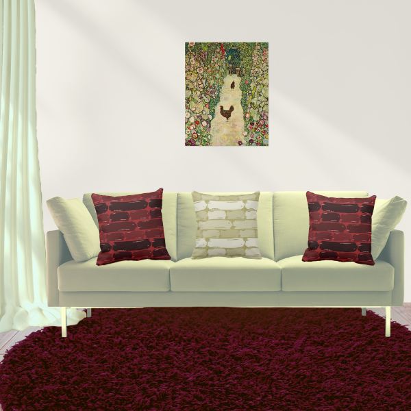
- Brown and red pillows meet art by Gustav Klimt
- Blue and red throw pillows and art by Vladyslava Mounassir
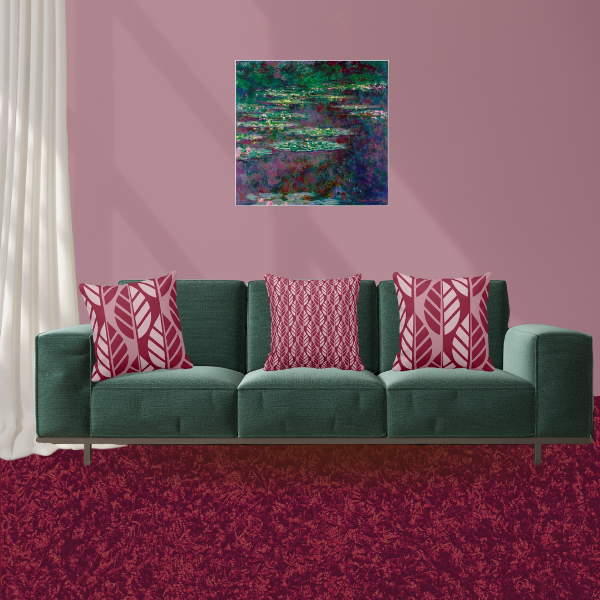
- Red pillows meet art by Claude Monet
- Yellow and red leaves patterned pillows
- Orange and red pillows
Metallics: Metallic colors like gold, silver, and bronze can add glamour and sophistication to a room with red. These colors help balance the intensity of red and create a luxurious and chic look.
When pairing colors with red, it’s important to consider the overall mood you want to create. Choose colors that complement and balance the intensity of red. KBM D3signs uses color tools to match colors and create color schemes.
Red Color Psychology
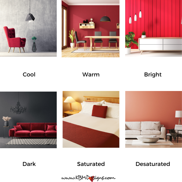
When it comes to the psychological effects of red, it’s important to note that different shades can have different impacts on people. Brighter, warmer shades of red can increase heart rate and blood pressure, making people feel more energized and excited. Cooler, darker shades of red can have a calming effect and create a sense of coziness and comfort.
In summary, different shades of red can have various psychological effects on people. They can also be used in a variety of practical ways in interior design. Red is a powerful color that can add warmth, energy, and drama to any space. However, it should be used carefully and in moderation. Paired with neutrals or used in the right shade and context, red is a great addition to any interior design project.
Frequently Asked Questions (FAQs): The Power of Red in Interior Design
Different shades of red can have different effects on the mood of a room. Bright reds, such as scarlet or cherry, can create a vibrant and energetic atmosphere, while deeper reds, such as burgundy or maroon, can add a sense of luxury and comfort. Lighter shades of red, such as pink, can add a touch of playfulness and romance to a room.
There are a number of ways in which red can be a great addition to your home decor. Consider using it as an accent color through furniture, throw pillows, curtains or artwork. You can also use red as a statement wall color to create a focal point in a room. Red kitchen cabinets or bathroom tiles can add a bold and contemporary touch to your home.
While red can be a powerful addition, it should be used in moderation. Too much red can be overwhelming and overstimulating. Often, it’s best to pair red with neutrals such as white, grey or beige to create a balanced and harmonic appearance. Also, consider the function of the room; for example, bright red may not be ideal for a bedroom where relaxation is key.
Red can be part of a variety of interior design styles, but its appropriateness may be different. It can work well in contemporary, eclectic or Asian-inspired designs. However, it may need to be used more sparingly in traditional or minimalist spaces. The key is to match the hue and intensity of red to the overall style and mood you want to achieve in your interior design project.
-
Sienna Red Wedding Invitation With Entwined Hearts a Symbol of Unity
Read the post …: Sienna Red Wedding Invitation With Entwined Hearts a Symbol of Unity -
A Magic Show Birthday Party Makes For Spellbinding Fun
Read the post …: A Magic Show Birthday Party Makes For Spellbinding Fun -
A Kids Painting Birthday Party at Home Makes Unforgettable Fun
Read the post …: A Kids Painting Birthday Party at Home Makes Unforgettable Fun -
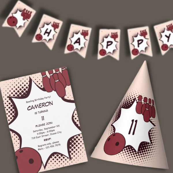
Kids Bowling Birthday Party, Plan the Perfect Strike of Fun
Read the post …: Kids Bowling Birthday Party, Plan the Perfect Strike of Fun -
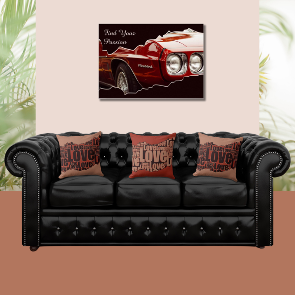
Black and Red Wall Art to Achieve a Bold and Striking Home Decor
Read the post …: Black and Red Wall Art to Achieve a Bold and Striking Home Decor -
The Bold Elegance of a Black and Red Color Palette & Adding White as a Counterbalance in Home Decor
Read the post …: The Bold Elegance of a Black and Red Color Palette & Adding White as a Counterbalance in Home Decor