

In this article what is the color purple, we will explore what two colors make purple, the complementary color to purple, purple interior design, purple color combination, and the meaning of the color purple.
What is the Color Purple?
Used in art, fashion, and interior design for centuries, it is a stunning color. It is a color that combines the stability of blue with the energy of red. And allows for creating a beautiful balance that is perfect for instilling a sense of calmness and luxury in any space.
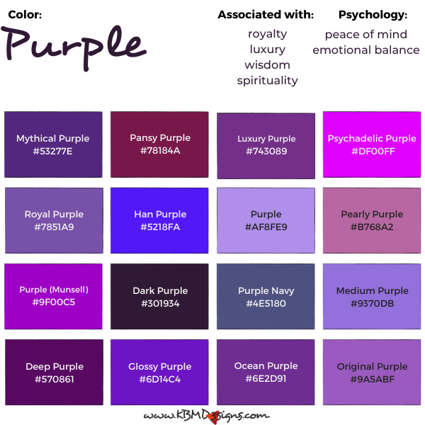
Mythical Purple #53277E, Pansy Purple #78184A, Luxury Purple #743089, Psychadelic Purple #DF00FF, Royal Purple #7851A9, Han Purple #5218FA, Purple Color #AF8FE9, Pearly Purple #B768A2, Purple (Munsell) #9F00C5, Dark Purple #301934, Purple Navy #4E5180, Medium Purple #9370DB, Deep Purple #570861, Glossy Purple #6D14C4, Ocean Purple #6E2D91, Original Purple #9A5ABF
What Two Colors Make Purple?
Blue and red are the two primary colors that make up purple. Blue represents stability and calm, while red represents energy and passion. Combining these two colors creates a perfect balance which is perfect to create a relaxing and luxurious ambiance.
According to color theory, in the RGB (red, green, blue) color model, purple is created by combining red and blue light at full intensity, while green light is at minimum strength. In the CMYK (cyan, magenta, yellow, black) model, violet is a combination of magenta and cyan. Purple is a secondary color created by mixing red and blue in the traditional RYB (red, yellow, blue) color model used by artists.
The Complementary Color of Purple
Purple’s complementary color is yellow. These two colors are opposite each other on the color wheel, creating a bold and striking contrast. When used together in interior design, they create a sense of vibrancy and excitement.
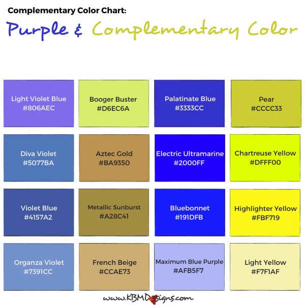
Light Violet Blue #806AEC – Booger Buster #D6EC6A, Palatinate Blue #3333CC – Pear #CCCC33, Diva Violet #5077BA – Aztec Gold #BA9350, Electric Ultramarine#2 000FF – Chartreuse Yellow #DFFF00, Violet Blue #4157A2 – Metallic Sunburst #A28C41, Bluebonnet #191DFB – Highlighter Yellow #FBF719, Organza Violet #7391CC – French Beige #CCAE73, Maximum Blue Purple #AFB5F7 – Light Yellow #F7F1AF
Purple Interior Design
It is a beautiful color to use in interior design as it has a calming effect on the mind and body. It is perfect to bring luxury and sophistication to any room. When using purple in interior design, it is important to balance it with other colors to prevent it from becoming overwhelming. Combine it with white, black, grey, or even other violets to create a stunning color palette.

Here are some tips for incorporating purple accents into your home decor:
Start small: If you’re not sure about using a bold hue like purple, start with small accents like purple, purple and white, and purple and black throw pillows, curtains, or a rug. This will give you a sense of how the color works in your space without overwhelming the room.
Mix it up: Purple pairs well with many other colors, so don’t be afraid to mix and match. For example, purple and gray, purple and green, and purple and pink all create unique and interesting combinations.
Use it as a statement piece: If you’re feeling brave, use purple as a statement piece in your room. This could be a purple sofa, a painted accent wall, or a bold piece of artwork.
Balance it out: To avoid an overly dramatic or dark feel, balance out the purple with light or neutral colors. For example, pair a purple sofa with white or cream walls, or use purple accent pieces in a room with light-colored furniture.
Consider different shades of purple: There are many shades of purple to choose from, ranging from deep and dark to light and airy. Consider the mood you want to create in your space and choose a shade of purple that reflects that.
Purple Color Combination
Create unique and beautiful color combinations by combining purple with a variety of colors. It works well with green to achieve a fresh and natural look, and with pink to create a soft and romantic atmosphere. Yellow and purple create a bold and striking contrast, while orange and purple create a warm and cozy atmosphere. KBM D3signs uses color tools to match colors and create color schemes.
Purple Color Combinations
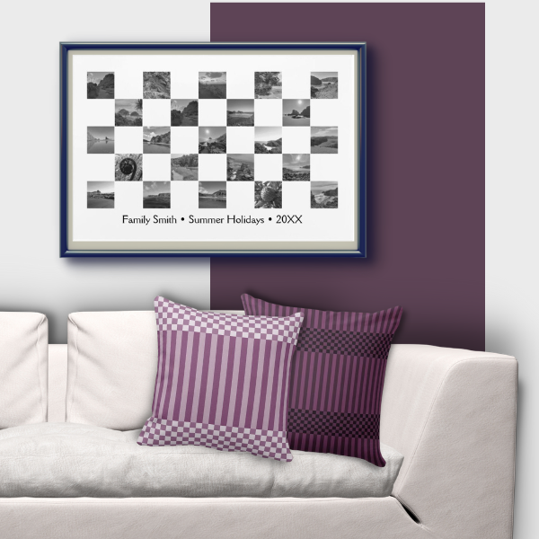


- Purple throw pillows, checker and stripes pattern on a white couch
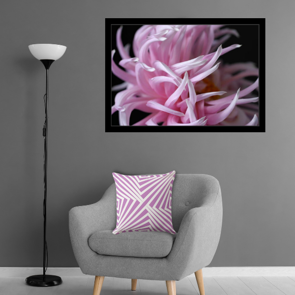
- The grey armchair and throw pillow in light purplish-pink with a nested angular pattern
- Set of two blue and purple-red wavy stripes patterned throw pillows
- Orange love typography patterned pillows accenting dark purple couch
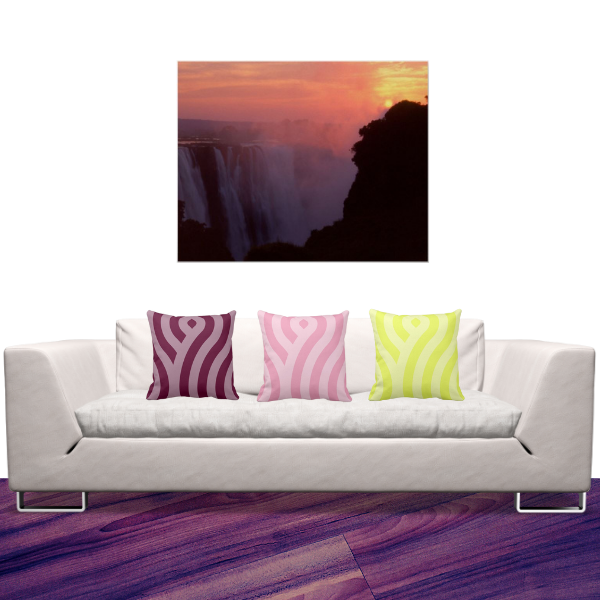
- Red-purple, pink and yellow set of three pillows accessorizing a white sofa
- Purple, grey, and green set of three throw pillows on a neutral-colored couch
Meaning of Purple Color
The color has many meanings, including royalty, luxury, wisdom, and spirituality. It is often associated with creativity and imagination and is said to promote peace of mind and emotional balance. In interior design, purple can be used to create a sense of calm and relaxation. That makes it perfect for bedrooms, bathrooms, and other spaces where relaxation is a priority.
In conclusion, purple is a beautiful color that can add a touch of luxury and elegance to any interior design. By understanding what the color purple is, what two colors make up purple, the complementary color of purple, purple interior design, purple color combination, and the meaning of the color purple, you can use this majestic hue to create a stunning and harmonious space that promotes relaxation and emotional balance.
FAQs on Incorporating this Luxurious Color in Interior Design
The color purple is a mixture of two primary colors, red and blue, in various proportions. It can range from a deep, rich purple to a lighter lavender, depending on the ratio of red to blue.
The complementary color of purple is yellow. When used in interior design, pairing purple with yellow can create a visually striking and balanced contrast. This combination can add vibrancy and energy to a space.
Purple is often associated with relaxation and emotional balance. To incorporate it effectively, consider using soft shades of purple, such as lavender or lilac, in bedroom or meditation spaces. Additionally, use purple accents in areas where you want to create a calming atmosphere, such as through throw pillows, artwork, or curtains.
Inspired by Purple
-
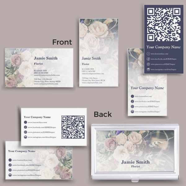
How to Create a Florist Business Card That Will Make a Lasting Impression
Read the post …: How to Create a Florist Business Card That Will Make a Lasting Impression -
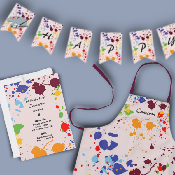
A Kids Painting Birthday Party at Home Makes Unforgettable Fun
Read the post …: A Kids Painting Birthday Party at Home Makes Unforgettable Fun -
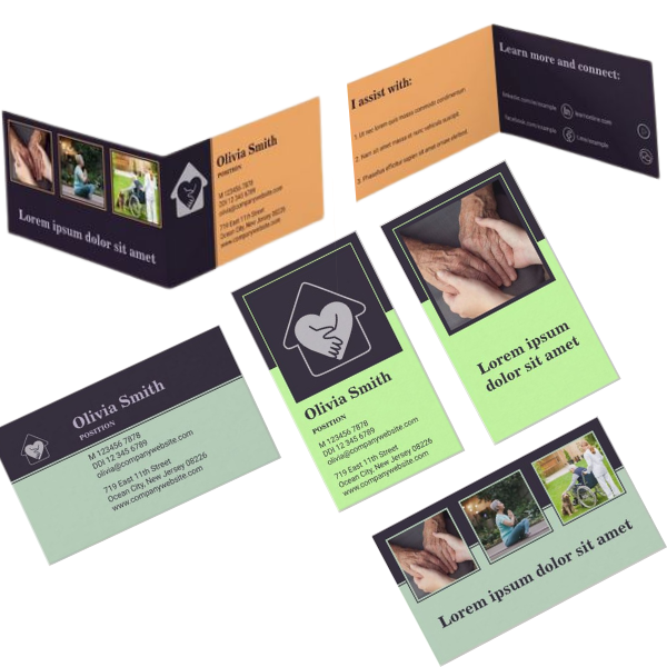
Professional Home Care Business Card And Marketing Materials
Read the post …: Professional Home Care Business Card And Marketing Materials