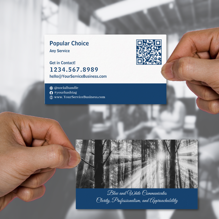
The brand color blue, among countless color combinations, is a perennial favorite for business cards due to its versatility and ability to convey professionalism, trust and stability. However, business cards are often the first impression a company or individual makes, making their design a critical aspect of branding. Blue business cards, especially when paired with white and subtle black accents, can give your brand a unique and memorable edge. Let’s explore the nuances of this design choice and its implications.
Article Content
- The Psychology of the Brand Color Blue and White in Business Cards
- Fonts and Their Role in Design
- The Role of Black Accents
- Communicating Through Layouts
- Who Benefits from Blue Brand Color in Business Cards?
- Extending the Blue Brand Color Beyond Business Cards
- KBM D3signs: The Brand Color Blue for Business Card Designs & Marketing Items
- Three Nature-Inspired Color Palette Examples Reflecting the Blue, White, and Black Brand Theme
- Frequently Asked Questions About the Brand Color Blue in Business Cards
1. The Psychology of the Brand Color Blue and White in Business Cards
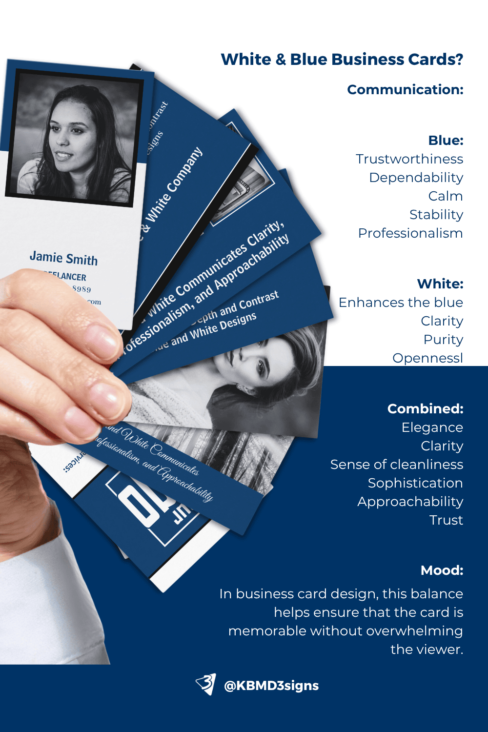
The combination of blue and white is timeless. Blue, particularly darker shades like #003366, is associated with trust, dependability, and authority. Meanwhile, white conveys purity, clarity, and simplicity. Together, they communicate a clean, professional, and approachable aesthetic. When used in business cards, this color balance suggests confidence and reliability without overwhelming the viewer.
The Effect of Color Balance
A well-balanced design ensures that neither color dominates but instead creates harmony. A blue-dominant design with white text or accents can evoke authority and professionalism.
Meanwhile, a white-dominant design with blue text or borders feels more approachable and minimalist. By adjusting the balance, designers can subtly shift the tone to suit specific industries or personal branding goals.
2. Fonts and Their Role in Design
When designing with a blue (#003366) and white (#ffffff) palette, typography plays a vital role in reinforcing the brand’s identity. The font pairing of Abhaya Libre Med for body text and Bell Centennial for titles or names offers an elegant yet modern look. To add a touch of sophistication or personalization, the script font Great Vibes can be used sparingly for taglines or initials.
Why These Fonts Work:
- Abhaya Libre Med: Its clarity and legibility make it ideal for conveying detailed information, such as contact details or services.
- Bell Centennial: Designed for bold statements, it creates a strong focal point for titles and names.
- Great Vibes: As a script font, it provides a creative flourish without overwhelming the overall design.
3. The Role of Black Accents
Adding black as an accent color introduces contrast, depth, and modernity. For instance:
- Black borders or typography can frame information elegantly, ensuring readability.
- Using black sparingly for icons or minimalist elements can highlight key details without detracting from the blue-and-white core.
When to Use Black Accents:
- Formal or Luxury Branding: Black adds a premium feel to blue-and-white cards, perfect for industries like law, finance, or high-end consulting.
- Highlighting Details: It’s ideal for emphasizing specific sections, like contact details or a tagline.
- Differentiation in Layouts: Black can create visual hierarchy, helping certain elements stand out in complex designs.
4. Communicating Through Layouts
The layout of blue-and-white business cards determines what they communicate to the recipient:
- Minimalist Layouts: Centered text with ample white space creates an uncluttered, modern appearance, suggesting innovation and simplicity.
- Traditional Layouts: Classic layouts with structured sections exude professionalism and trustworthiness, ideal for corporate or formal industries.
- Dynamic Layouts: Asymmetrical designs with bold blue shapes or gradients imply creativity and forward-thinking, suiting industries like technology or design.
5. Who Benefits from Blue Brand Color in Business Cards?
The combination of blue and white is universally appealing but particularly beneficial for:
- Corporate Professionals: Blue’s trustworthiness aligns with industries like banking, law, and consulting.
- Healthcare Providers: White adds a sense of cleanliness and care, complementing blue’s calm and professional tone.
- Creative Agencies: Dynamic blue layouts with touches of black exude confidence and creativity.
Blue and White with Black Accents
Industries that emphasize exclusivity or authority, such as luxury brands, high-tech startups, and boutique firms, benefit from adding black accents to their blue-and-white cards. This combination feels modern yet timeless, appealing to audiences who value sophistication.
6. Extending the Blue Brand Color Beyond Business Cards
Business cards are only one aspect of a cohesive brand identity. To support offline promotions, blue branding can extend to:
- Stationery: Letterheads, envelopes, planners, binders, and notepads in matching blue and white designs.
- Brochures and Flyers: Consistent use of blue brand color reinforces recognition.
- Branded Merchandise: Pens, notebooks, calendar magnets, and folders with blue accents ensure daily visibility.
- Event Displays: Banners, posters, and signage in blue-and-white create a cohesive presence.
Overall, blue business cards are more than just a design choice—they’re a strategic tool for branding. The combination of blue brand color with white communicates trust, professionalism, and clarity, while black accents can add a sophisticated edge. By carefully selecting layouts, fonts, and complementary marketing materials, businesses can create a cohesive identity that stands out both in print and in person. Whether you’re building trust, emphasizing creativity, or exuding authority, blue business cards offer the versatility to convey the right message with style.
7. KBM D3signs:
The Brand Color Blue for Business Card Designs & Marketing Items
Our commitment to our mission is reflected in our exceptional marketing materials designed by KBM D3signs. We strive to simplify the customization process by offering easily customizable templates within our marketing package. Our belief is rooted in the idea that everyone should have the freedom to choose their preferred colors for a selected design, ensuring that it perfectly matches your vision and needs.
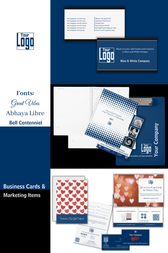
The above sample images above are part of a larger branding package using the brand color blue with white and design dependent accents in black.
Here’s a closer look:
- Standard Landscape Format (3.5” x 2.0”)
Clean and simple, this format suits most industries. - Portrait Business Card
A vertical layout that’s perfect for standing out. - Square Business Card (2.5” x 2.5”)
A modern take on the classic design. - Slim Business Card (3.5” x 1.75”)
Ideal for a sleek and minimalist aesthetic.
All KBM D3signs templates use these key elements:
- Colors: Blue (#003366), White (#FFFFFF), Black (#000000).
- Fonts: Abhaya Libre Med (Body Text), Bell Centennial (Title/Name), Great Vibes (Taglines/Initials).
- Features: Placeholder sections for text, QR codes, or images can be edited along with colors using Zazzle’s tools.
If you need additional assistance customizing or transferring designs to different products, or if you have a unique vision that requires a custom design, we are just a message away. At Designs by KBM D3signs, we go beyond providing marketing materials; we empower you to shape and showcase your brand with creativity and personalization.
Shop at Zazzle Store
Cocoon It! – Blue Business Cards & Marketing Items
Show off your personal style or post a review!
8. Three Nature-Inspired Color Palette Examples Reflecting the Blue, White, and Black Brand Theme
Nature often serves as the perfect muse for design, offering harmonious combinations of colors that evoke the same sense of balance and intrigue found in the blue, white, and black color palette. Here, we explore three breathtaking examples where nature reflects this aesthetic with precision and elegance.
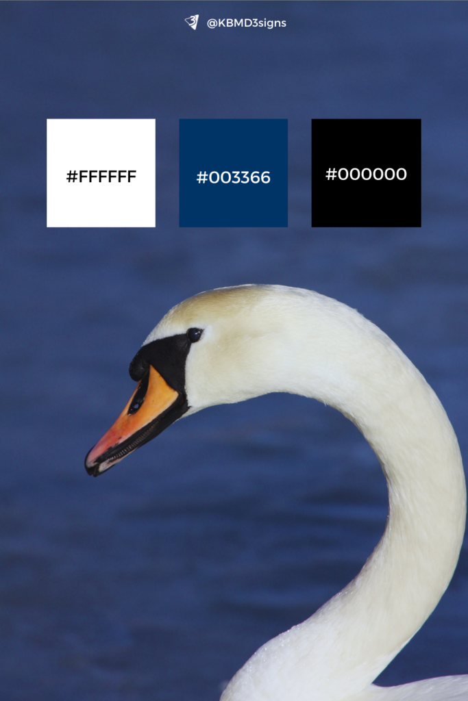
8-1. The Graceful Swan on a Deep Blue Lake
Imagine a serene swan gliding effortlessly across a deep blue lake with a calm, reflective surface. This image captures the essence of the brand palette:
Blue: The dark, tranquil lake mirrors the stability and depth associated with blue.
White: The swan’s elegant neck stands out in sharp contrast, evoking purity and clarity.
Black Accents: The subtle black detailing of the swan’s beak and the area around its eyes provides a striking focus, adding sophistication and depth to the composition.
A close-up view of the swan’s neckline against the shimmering water emphasizes the seamless interplay of these colors, demonstrating harmony in motion.
8-2. The Intricate Beauty of a Snowflake
A magnified view of a snowflake showcases the breathtaking gradients from white to dark blue, with shadows that verge on black. The delicate structure of the snowflake exemplifies nature’s precision and creativity:
White: The icy purity of the snowflake highlights clarity and simplicity.
Blue: Subtle gradients of blue lend depth and dimension to the crystalline structure.
Black Shadows: Shadows close to black create a sense of contrast and intricacy, making the snowflake’s geometry stand out.
This example celebrates the interplay of light and shadow, where each element enhances the other, reflecting the brand’s core themes of elegance and balance.
8-3. A Baby Seal Resting on an Ice Floe
The serene image of a baby seal resting on an ice floe offers a delicate yet impactful representation of the brand palette. This natural scene combines softness and contrast in a harmonious balance:
White: The pristine ice floe dominates the frame, reflecting clarity and purity.
Blue: The icy environment transitions from pale gray-blue in the foreground to deeper navy hues in the background, conveying depth and serenity.
Black Accents: The baby seal’s large, expressive black eyes draw immediate focus, while the soft, silvery-gray fur subtly reflects the surrounding light. In the distance, the edge of the floe blurs into nearly black water, adding a dynamic contrast that grounds the scene.
This composition celebrates the interplay of softness and strength, with the seal embodying innocence and adaptability, and the shadows and distant darkness introducing a layer of intrigue and balance to the imagery.
Overall, these three nature-inspired examples—featuring a swan, a snowflake, and a seal pup—beautifully encapsulate the balance and intrigue of the blue, white, and black brand palette. Each scene highlights the interplay of these colors, offering inspiration for designs that are as harmonious and striking as the natural world itself.
9. Frequently Asked Questions About the Brand Color Blue in Business Cards
Blue is widely associated with trust, professionalism, and stability—qualities that many businesses aim to convey. It has a calming and reliable energy that helps establish a sense of dependability and competence. Blue is also versatile and pairs well with other colors, making it a popular choice for business cards across various industries.
Blue often communicates the following:
– Trustworthiness: It fosters a sense of reliability and dependability.
– Professionalism: It reflects competence and expertise.
– Calmness and Focus: It evokes feelings of serenity and concentration, making it appealing for industries like healthcare, finance, and education.
The choice of blue depends on your brand identity:
– Dark Blue (e.g., #003366): Conveys authority, tradition, and professionalism. Ideal for law firms, corporate businesses, and financial institutions.
– Light Blue: Suggests approachability, friendliness, and calmness. Suitable for creative industries, wellness brands, and childcare services.
– Bright Blue: Reflects energy, innovation, and modernity, making it great for startups and tech companies.
Some of the best pairings include:
– White (#ffffff): Creates a clean, crisp look that highlights professionalism and clarity.
– Black: Adds sophistication and authority when used as an accent.
– Gray or Silver: Suggests modernity and elegance.
– Gold: Adds a luxurious feel for premium brands.
Font choices depend on the tone you want to convey:
– Serif Fonts (e.g., Abhaya Libre): Enhance professionalism and elegance.
– Sans-serif Fonts (e.g., Bell Centennial): Communicate clarity and modernity.
– Script Fonts (e.g., Great Vibes): Add personality and flair when used sparingly for initials or taglines.
Yes, the shade of blue can impact readability:
– Dark blues (e.g., #003366) contrast well with white or light text, ensuring excellent readability.
– Lighter blues may require dark or bold text to maintain legibility. Always test your color combinations to ensure text remains clear and accessible.
Black accents can elevate a blue business card by adding depth and contrast. They are particularly effective for:
– Highlighting key information, like a company name or logo.
– Conveying authority and sophistication in industries like finance, law, or luxury goods. However, black should be used sparingly to avoid overpowering the calming nature of blue.
Blue business cards work well across many industries, but they are particularly effective in:
– Professional Services: Accounting, law, and consulting.
– Technology: Startups and IT companies, where blue symbolizes innovation and reliability.
– Healthcare: Hospitals and wellness brands, leveraging blue’s calming qualities.
– Education: Schools and tutors, where blue’s association with trust and focus is beneficial.
Yes! While blue is often associated with professionalism, pairing it with bold layouts, creative fonts, and unique textures can make it highly appealing for creative industries. Bright or unconventional shades of blue can convey innovation and originality.
Not necessarily. Blue can be a dominant background color or used as an accent. If your brand identity includes other colors, blue can complement them rather than dominate. For instance:
– A white card with blue typography feels clean and modern.
– A primarily gray card with blue accents adds a touch of vibrancy.
Blue inspires confidence and trust, making customers feel secure in their decision to engage with the business. It also communicates stability and reliability, fostering long-term loyalty. This perception makes blue especially effective for industries where trust is critical, such as finance, healthcare, and education.
Consider these layout strategies:
– Centered Layouts: Ideal for a classic and balanced look.
– Asymmetrical Layouts: Add modernity and a dynamic feel.
– Minimalist Designs: Use ample white space to emphasize simplicity and elegance.
– Creative Text Placement: Combine blue backgrounds with unique font alignments for a bold statement.
Both finishes work well with blue but convey different effects:
– Matte Finish: Enhances blue’s calming and professional qualities, creating a subdued and elegant look.
– Glossy Finish: Makes the blue appear more vibrant and eye-catching, ideal for creative or tech-focused industries.
Absolutely! Many printing companies offer eco-friendly options, such as recycled paper or soy-based inks, which work beautifully with blue designs. Blue is a forgiving color on textured and natural paper finishes, maintaining its visual appeal even in sustainable formats.
Common pitfalls to avoid include:
– Overloading with colors: Adding too many accent colors can dilute blue’s impact.
– Inconsistent Fonts: Using mismatched fonts can make the design appear chaotic.
– Poor Contrast: Using light blue with white text or dark blue with black text can reduce readability.
– Overuse of Black Accents: Too much black can make the design feel heavy and overpower the calming qualities of blue.
-
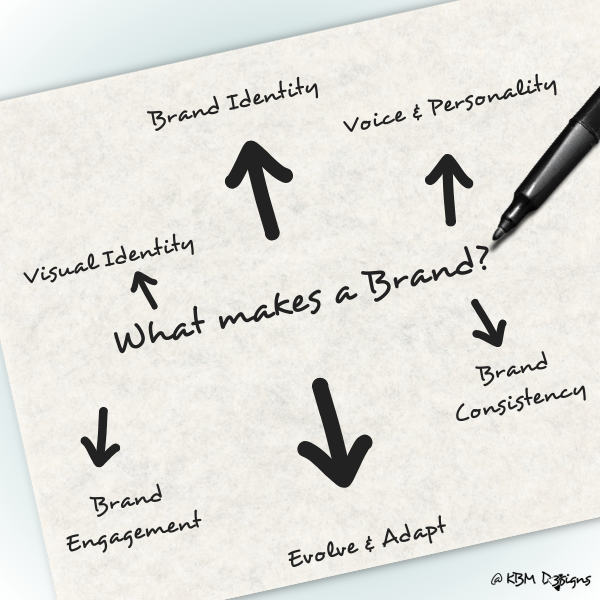
How to Make a Brand? – A Guide for Small Businesses
Read the post …: How to Make a Brand? – A Guide for Small Businesses -

How to Choose Brand Colors – A Comprehensive Guide
Read the post …: How to Choose Brand Colors – A Comprehensive Guide -

A Brand Style Guide & A Brand Mood Board & How to Differentiate
Read the post …: A Brand Style Guide & A Brand Mood Board & How to Differentiate


