

Green business cards and why it can be a powerful choice for making a lasting impression. In this article, we will explore the use of the color green. In the world of business, every detail matters. From your logo and branding to the font you choose for your marketing materials, every element plays a crucial role in shaping your company’s image. One often overlooked aspect of business branding is the color of your business cards.

Green Business Cards, Nine Unique Designs in Shades of Green
Nine unique business card designs, each for a different profession. Each one has a short summary of the perception.
- The Psychology of Green
- Yoga Business Card
- Home Cleaning Business Card
- Web Designer Business Card
- Realtor Business Card
- Wedding Photographer Business Card
- Contract Lawyer Business Card
- Lawn Care Service Business Card
- Personal Trainer Business Card
- Senior Care Business Card
- Practical Tips for Using Green
- FAQs about Green Business Cards
The Psychology of Green
Before delving into the practical aspects of using green on your business cards, let’s first consider the psychology behind this color. Green is often associated with nature, growth, harmony, and renewal. It’s a color that conveys feelings of freshness, tranquility, and balance. In the business world, these associations can have a significant impact on how your brand is perceived.
Health and Wellness
In industries related to health and wellness, such as spas, organic food stores, and yoga studios, green business cards can communicate a sense of well-being and natural goodness. It aligns perfectly with businesses that prioritize the physical and mental health of their clients.
Financial and Environmental Responsibility
Green is also commonly associated with financial and environmental responsibility. This makes it an ideal choice for businesses in the finance sector or those that emphasize their commitment to sustainability. Using green on your business card can suggest that your company is not only financially stable but also environmentally conscious.
Growth and Ambition
Green is the color of growth and ambition, making it a great choice for startups and entrepreneurs looking to convey their aspirations for success and development. It can symbolize new beginnings and the potential for growth, which can be particularly powerful when making first impressions.
1. Yoga Business Card – Green
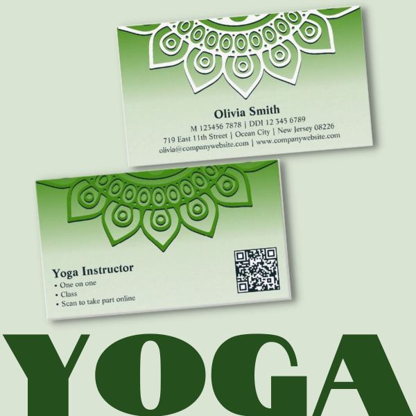
Mandala Design – Card Features:
- Format: Landscape
- Features: Mandala
Personalize your business card template:
- Front
Text: Professional title, professional services, QR code - Back side
Details: Name, phone, address, email, website
A green and white yoga business card can invoke several emotions and associations, which can be beneficial for a yoga business. Here are some emotions and feelings that this color combination can evoke:
- Tranquility and Calmness: Green is often associated with tranquility and inner peace, making it an ideal choice for a yoga business. The combination of green and white can create a sense of serenity and calm, which aligns with the core principles of yoga.
- Freshness and Renewal: Green symbolizes growth and renewal, mirroring the physical and spiritual growth that practitioners seek through yoga. This combination can convey a sense of new beginnings and positive change.
- Cleanliness and Purity: White is often associated with purity and cleanliness. When combined with green, it can represent a holistic approach to health and well-being, both physically and spiritually.
- Balance and Harmony: Green and white together can create a harmonious and balanced visual appeal. This reflects the balance and harmony that yoga aims to bring to one’s life and body.
- Nature and Connection: Green is strongly linked to nature, and combining it with white can reinforce the idea of a strong connection to the natural world. This can appeal to individuals seeking a closer bond with nature through practices like outdoor yoga.
- Professionalism and Simplicity: The green and white combination can also convey professionalism and simplicity, which is crucial in the business world. It suggests that your yoga business is organized and dedicated to helping clients achieve a balanced and harmonious lifestyle.
In Conclusion
A green and white yoga business card can evoke feelings of tranquility, freshness, purity, balance, and a strong connection to nature. It can also convey professionalism and simplicity, making it a suitable choice for a yoga business that seeks to promote holistic well-being and personal growth.
2. Home Cleaning Service Business Card – Green
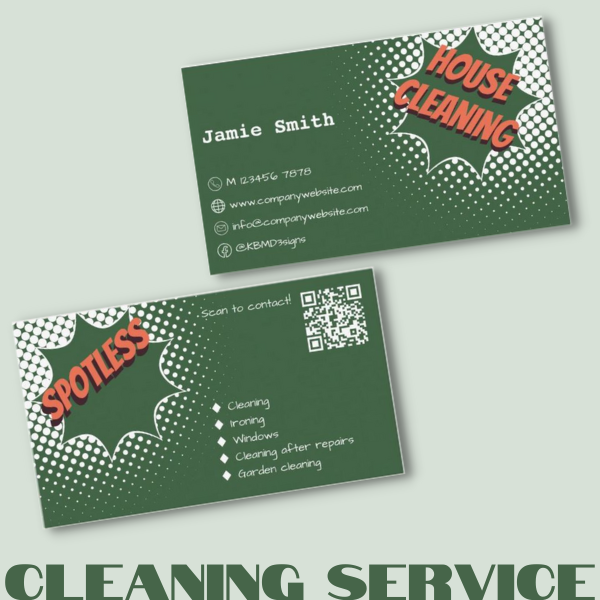
Burst Design – Card Features:
- Format: Landscape
- Features: CTA, QR code, diamond shaped bullets, list of service strengths, word logo, word slogan, contact icons
Personalize your business card template:
- Front
Text: Tag word, CTA (call to action) QR code details - Back side
Details with Icons: Name, phone, website address, email, Facebook handle
Follow the link to find an alternative coloring of the Burst design in blue and white with the full marketing suite.
A green and white color scheme with a splash of orange on a house cleaning service business card can evoke a variety of emotions and associations, which can be beneficial for a cleaning business. Here are some emotions and feelings that this color combination can invoke:
- Cleanliness and Freshness: Green and white, in combination, typically represent cleanliness and freshness, which are essential attributes for a house cleaning service. The presence of these colors can immediately convey the idea of a spotless and tidy home.
- Professionalism and Trustworthiness: The use of a clean and balanced color scheme can communicate professionalism and reliability. This is crucial for a service-based business, as it assures clients that their homes will be in capable and trustworthy hands.
- Safety and Well-being: The splash of orange can add a touch of vibrancy and energy to the design. It can also evoke feelings of safety, as orange is often associated with hazard signs and visibility. In the context of a house cleaning service, it suggests that safety and well-being are a priority.
- Warmth and Friendliness: Orange, when used sparingly, can bring a sense of warmth and friendliness to the overall design. It can make clients feel comfortable and welcomed when inviting your team into their homes.
- Efficiency and Organization: Green and white symbolize order and structure. When complemented by a splash of orange, it can suggest that your house cleaning service is efficient and well-organized, emphasizing the ease and convenience of working with your company.
- Environmental Responsibility: The green and orange combination can also be associated with environmental responsibility, conveying that your cleaning service uses eco-friendly or sustainable cleaning practices.
In Summary
A green and white color scheme with a splash of orange on a house cleaning service business card can invoke feelings of cleanliness, professionalism, safety, warmth, and efficiency. It can also suggest environmental responsibility, making it a suitable choice for a cleaning business that wants to convey trustworthiness and a commitment to well-being and the environment.
3. Web Designer Business Card – Green

www Symbol Design – Card Features:
- Format: Landscape
- Features: CTA, QR code
Personalize your business card template:
- Front
Text: Company Name, professional title, CTA (call to action) QR code details - Back side
Details: Name, professional title, phone, address, website address, email
A web designer business card with a Brunswick green and white color scheme can evoke various emotions and associations, which can be beneficial for a web design business. Here are some emotions and feelings that this specific color combination can invoke:
- Professionalism and Sophistication: Brunswick green is a deep, rich color associated with tradition and professionalism. The combination with white can create a sophisticated and elegant appearance, signaling to clients that your web design services are high-quality and reliable.
- Stability and Trust: The deep green color suggests stability and trustworthiness. Clients may feel secure and confident in your ability to provide a stable and reliable online presence for their businesses.
- Creativity and Innovation: White, when combined with Brunswick green, can create a clean and modern look. This can reflect your creativity and innovative approach to web design, showing that you’re up-to-date with the latest design trends.
- Clarity and Transparency: White represents clarity and transparency. In the context of web design, it can convey your commitment to clear and user-friendly design, making it easy for users to navigate and understand websites.
- Balance and Harmony: The green and white combination can create a sense of balance and harmony. It suggests that your web design services aim to strike the right balance between aesthetics and functionality, ensuring a harmonious user experience.
- Natural and Sustainable: The reference to “Brunswick green” can evoke associations with nature and sustainability. It can indicate that your web design business has an eco-friendly or nature-inspired approach, which may appeal to environmentally conscious clients.
In Short
A Brunswick green and white color scheme on a web designer business card can invoke emotions of professionalism, stability, creativity, clarity, balance, and a touch of eco-friendliness. This color combination can effectively convey your commitment to delivering sophisticated and innovative web design services with a strong focus on trustworthiness and clarity.
4. Realtor Business Card – Green

Photo, House Symbol Design – Card Features:
- Format: Landscape
- Features: House symbol, tagline, CTA, QR code, service specialization, tick bullet points, profile photo, Social icons, @handle
Personalize your business card template:
- Front
Text: Company Name, tagline (Move to What Moves You), CTA (call to action: Scan to contact!) QR code details, three job specializations - Back side
Details: Profile photo, name, professional title, phone, address, website address, email, two icons, social handle
A realtor business card in shades of spring green with white accents can evoke a variety of emotions and associations that are beneficial for a real estate professional. Here are some emotions and feelings that this color combination can invoke:
- Freshness and New Beginnings: Spring green is associated with the season of renewal and growth. Using this color can evoke a sense of freshness and new beginnings, aligning with the idea of a new home purchase or sale.
- Tranquility and Peace: Lighter shades of green, like spring green, can create a calming and tranquil atmosphere. It can convey a sense of peace and harmony, which can be appealing to clients who may be navigating the often-stressful process of buying or selling a home.
- Positive Energy and Optimism: Spring green is a vibrant and lively color that can bring a positive energy to your business card. It can suggest optimism and a “can-do” attitude in helping clients with their real estate needs.
- Balance and Growth: Green is often associated with balance and growth, reflecting the stable and progressive nature of real estate investments. It can indicate that you are a reliable and experienced professional who helps clients achieve their real estate goals.
- Clean and Organized: The combination of spring green and white can create a clean and organized look. It suggests that you approach real estate transactions with a sense of clarity and order, making the process smooth and efficient.
- Nature and Environment: Green, especially in the context of real estate, can be associated with the natural environment. It may indicate a commitment to environmentally conscious real estate practices or properties in green and eco-friendly settings.
In Summary
A realtor business card in shades of spring green with white accents can invoke emotions of freshness, tranquility, positive energy, balance, cleanliness, and a connection to nature. This color combination can effectively convey your dedication to helping clients find the right home or sell their property in a peaceful and efficient manner, while also hinting at environmentally friendly options if applicable.
5. Wedding Photographer Business Card – Green

Camera Symbol Design – Card Features:
- Format: Portrait
- Features: Camera symbol
Personalize your business card template:
- Front
Text: Company Name, tagline (Every Picture Tells a Story), three service describing photos - Back side
Details: CTA (Review Portfolio!), QR code details, name, professional title, phone, email, address, three round icons, social handle, website address
A wedding photography business card with Pakistan green (which is typically a shade of dark green) and white font and accents can evoke various emotions and associations suitable for a wedding photography service. Here are some emotions and feelings that this color combination can invoke:
- Elegance and Sophistication: Dark green with white can create an elegant and sophisticated look, making it ideal for wedding photography. This combination suggests a high level of professionalism and attention to detail.
- Timelessness and Tradition: Dark green has a timeless and traditional quality, perfect for capturing the classic moments of a wedding. It conveys a sense of longevity and endurance, which are important qualities in the photography industry.
- Nature and Growth: Green, in general, is associated with nature and growth. For a wedding photographer, it can symbolize the growth of love and the natural beauty of wedding settings.
- Seriousness and Reliability: Dark green can be seen as a serious and reliable color, indicating that your wedding photography service is dependable and dedicated to capturing the most important moments on a couple’s big day.
- Clean and Elegant Aesthetics: The white font and accents provide a clean and elegant aesthetic, reflecting the purity and clarity of a wedding day. It indicates that your photography style is unobtrusive and focused on highlighting the beauty of the occasion.
- Cultural Significance: In the context of Pakistan, green is a color with cultural and national significance. Using this color may resonate with clients who appreciate the local traditions and cultural elements incorporated into their wedding photography.
In Conclusion
A wedding photography business card in Pakistan green with white font and accents can invoke emotions of elegance, timelessness, reliability, nature, cleanliness, and cultural significance. This color combination can effectively convey your commitment to capturing the most precious moments of a wedding with a touch of sophistication and respect for cultural traditions.
6. Lawyer Business Card – Green

Scale Symbol Design – Card Features:
- Format: Portrait
- Features: Half scale symbol, QR code, social icons, @handle
Personalize your business card template:
- Back side
Details: QR code details, name, professional title, phone, address, four round icons (email, www, LinkedIn, Twitter)
A contract lawyer business card in Hunter green with white can evoke several emotions and associations that are well-suited for the legal profession. Here are some emotions and feelings that this color combination can invoke:
- Professionalism and Authority: Hunter green is a deep and authoritative color often associated with professionalism. Using this color on your business card can convey a strong sense of authority and competence in contract law.
- Stability and Trustworthiness: The deep green hue suggests stability and trustworthiness. It can reassure clients that you are a reliable and dependable contract lawyer who can handle their legal matters with care.
- Sophistication and Elegance: Hunter green, when combined with white, creates an elegant and sophisticated look. It reflects a high level of professionalism and attention to detail in legal services.
- Seriousness and Dedication: This color combination can convey a serious and dedicated approach to the legal profession. It indicates your commitment to resolving contract-related issues with precision and diligence.
- Timelessness and Tradition: Hunter green has a timeless quality, suggesting a respect for legal traditions and principles. It can indicate that you provide legal services with a deep understanding of the law’s historical and traditional aspects.
- Balance and Neutrality: The combination of Hunter green and white can create a balanced and neutral visual appeal. It signifies your ability to provide unbiased legal advice and maintain a fair and just perspective.
In Summary
A contract lawyer business card in Hunter green with white can invoke emotions of professionalism, stability, trustworthiness, sophistication, seriousness, and tradition. This color combination effectively conveys your competence and dedication to contract law, reassuring clients that you are a reliable and authoritative legal professional with a keen eye for detail.
7. Lawn Care Service Business Card – Green

Card Features of the Lawn Design :
- Format: Portrait
- Features: Lawn & Butterfly, slogan, tick bullets for services, CTA, QR code, social icons
Personalize your business card template:
- Front
Text: Tagline (Best for gardens and landscapes!), four service strengths, CTA (Call to action: Scan for free quote!) QR code details - Back side
Details: Name, professional title, phone, address, three round icons, email, website address, Facebook link
A lawn care service business card in dark green and electric blue with white accents can evoke a range of emotions and associations that are suitable for a lawn care and landscaping business. Here are some emotions and feelings that this color combination can invoke:
- Nature and Freshness: Dark green is a color closely associated with nature, making it an ideal choice for a lawn care service. The combination with electric blue can amplify the sense of freshness and vitality, emphasizing the rejuvenation of outdoor spaces.
- Professionalism and Reliability: Dark green and electric blue together can create a professional and reliable image. It suggests that your lawn care service is committed to delivering high-quality and trustworthy landscaping solutions.
- Vibrancy and Energy: Electric blue is a vibrant and energetic color that can convey a sense of vitality and enthusiasm. It implies that your lawn care team is dynamic and passionate about transforming outdoor spaces.
- Balance and Harmony: The combination of dark green and electric blue can evoke a sense of balance and harmony in outdoor design. It indicates your ability to create well-organized and aesthetically pleasing landscapes.
- Innovation and Modernity: Electric blue, when combined with dark green, can create a modern and innovative look. It suggests that your lawn care service is up-to-date with the latest landscaping trends and techniques.
- Cleanliness and Precision: The white accents provide a clean and precise appearance, emphasizing your attention to detail in lawn maintenance and landscaping.
In Short
A lawn care service business card in dark green and electric blue with white accents can invoke emotions of nature, professionalism, vibrancy, balance, innovation, and cleanliness. This color combination effectively communicates your commitment to providing fresh, reliable, and modern lawn care solutions with a strong emphasis on harmonious outdoor design.
8. Personal Trainer Business Card – Green

Fitness Word Logo Design – Card Features:
- Format: Portrait
- Features: Word logo, 8 diamond bullet points service strengths, CTA, QR code, photo, icons
Personalize your business card template:
- Front
Text: Fitness (word logo), eight service strengths, CTA (Call to action: Scan & Inquire!) QR code details - Back side
Details: Service describing photo, Name, professional title, phone, address, two round icons, email, website address
A personal trainer business card in lime green and black can evoke a variety of emotions and associations that are relevant to the fitness and personal training industry. Here are some emotions and feelings that this color combination can invoke:
- Energy and Vitality: Lime green is a vibrant and energetic color that can convey a strong sense of vitality and enthusiasm. This is ideal for a personal trainer, as it suggests an active and dynamic approach to fitness and health.
- Motivation and Positivity: Lime green, being a bright and positive color, can inspire feelings of motivation and positivity. It implies that your personal training services are designed to uplift and empower clients.
- Youthfulness and Fun: Lime green is often associated with youth and fun. Using this color can create a sense of playfulness and enjoyment in the pursuit of fitness goals.
- Balance and Health: The combination of lime green and black can symbolize balance and health. It suggests a well-rounded and balanced approach to fitness and overall well-being.
- Professionalism and Focus: Black is a classic and professional color. When combined with lime green, it can convey a focused and disciplined approach to personal training, indicating a commitment to helping clients achieve their fitness objectives.
- Fresh and Modern: Lime green and black together create a fresh and modern appearance. This is particularly suitable for personal trainers who are up-to-date with the latest fitness trends and techniques.
In Summary
A personal trainer business card in lime green and black can invoke emotions of energy, motivation, youthfulness, balance, professionalism, and a modern approach to fitness. This color combination effectively communicates your dedication to providing vibrant and empowering personal training services with a focus on health and vitality.
9. Senior Care Business Card – Green

Photo & Home Care Symbol Design – Card Features:
- Format: Portrait
- Features: Photo, care symbol, slogan
Personalize your business card template:
- Front
Text: Service describing photo, slogan, - Back side
Details: Senior care logo, name, professional title, phone, email, address, website address
Branded senior care marketing items for every need year-round. Promote your services locally or on the road. Say thank you or send holiday greetings.
A care service business card in light green and dark purple can evoke a range of emotions and associations that are suitable for a business focused on the well-being of people. Here are some emotions and feelings that this color combination can invoke:
- Calmness and Comfort: Light green and dark purple together can create a sense of calm and comfort. It suggests a nurturing and caring environment for people, emphasizing their well-being and peace of mind.
- Compassion and Empathy: These colors can evoke feelings of compassion and empathy, indicating that your senior care services are provided with a deep understanding of the unique needs and challenges faced by older adults.
- Health and Wellness: Light green is associated with health and well-being, making it a suitable choice for a senior care business. It implies a commitment to promoting the physical and emotional health of people.
- Respect and Dignity: The combination of light green and dark purple can signify respect and dignity for people. It implies that your senior care services are designed to honor the independence and individuality of each senior.
- Stability and Trust: Dark purple adds a sense of stability and trustworthiness to the design. It suggests that your senior care business is dependable and reliable in providing essential services.
- Wisdom and Experience: Purple is often associated with wisdom and experience. This can convey the idea that your staff has the expertise and knowledge required to provide comprehensive senior care.
In Conclusion
A senior care business card in light green and dark purple can invoke emotions of calmness, compassion, health, respect, stability, and wisdom. This color combination effectively communicates your commitment to providing compassionate and respectful senior care services that prioritize the well-being and dignity of older adults.
Practical Tips for Using Green
Now that we understand the psychological implications of green, let’s discuss some practical tips for using this color effectively on your business cards:
- Balance and Contrast: Green, like any color, needs to be balanced with other colors to ensure readability and visual appeal. Consider using white or a complementary color for the text and logo on your business card to create a pleasing contrast.
- Shades of Green: You’re not limited to a single shade of green. Experiment with different shades and hues to find the one that best represents your brand’s identity. A darker, more subdued green might convey a sense of professionalism, while a bright green can add a touch of vibrancy.
- Logo and Branding: Ensure that your logo and branding elements are designed to harmonize with the chosen shade of green. The overall look and feel should be cohesive and reflect your brand’s values and personality.
- Simplicity: Keep your business card design clean and uncluttered. The color green can be dominant, so simplicity in design will help maintain a professional and elegant appearance.
- Paper Quality: Consider using high-quality paper stock for your business cards. A sturdy, matte-finish paper can enhance the appearance and feel of your green business cards, making them even more memorable.
In Short
The color green has the power to convey a range of emotions and associations that can positively impact your business’s image. Whether you’re aiming to communicate health and wellness, financial responsibility, or ambition, green can be a versatile and effective choice for your business cards. When used thoughtfully and with consideration for your brand’s identity, green business cards can leave a lasting impression on potential clients and partners, making them an essential component of your branding strategy. So, don’t underestimate the power of green – it might just be the right choice to help your business grow and flourish.
Shop at Zazzle Designs by KBM D3signs
Green Business Cards
What Sets Our Professional Business Cards Apart?
Each business card in our collection serves as a customizable template, providing you with the flexibility to incorporate your unique words, images, logo, and color scheme. This empowers you to present your small business in a manner that perfectly aligns with your brand identity.
Assistance in Customizing Your Professional Business Cards
To help you find the ideal shade of green and its complementary color or to ensure proper contrast, we leverage the tools provided by Coolors. Get more insights into how we utilize these color tools.
Step-by-Step Guidance for Customization
If you’re interested in a particular design from our Zazzle store Cocoon It! but need hands-on assistance with product customization or seek a custom design, our team is here to support you. Furthermore, we value your feedback and would be delighted to see how you’ve personalized your templates.

Frequently Asked Questions (FAQs) about Green Business Cards
Green is associated with nature, growth, and harmony, making it a versatile and powerful choice for business cards. It can convey a sense of well-being, financial responsibility, and ambition, depending on your brand’s identity and values.
Balance and Contrast: Use a complementary color or white for text and logos to ensure readability.
Shades of Green: Experiment with different shades to find the one that best represents your brand.
Simplicity: Keep the design clean and uncluttered.
Paper Quality: Use high-quality paper stock for a professional look and feel.
Green can work well in various industries, but it’s particularly suitable for businesses related to health and wellness (e.g., spas, organic food stores), finance (conveying financial responsibility), and startups (emphasizing growth and ambition). However, with the right design and branding, green can be adaptable to many other fields as well.

-

What Is A Brand Partnership? – A Small Business Perspective
Read the post …: What Is A Brand Partnership? – A Small Business Perspective -
What Are Business Objectives?” Perspective Of A Small Business
Read the post …: What Are Business Objectives?” Perspective Of A Small Business -

What Is A Focus Group Market Research? – SMB Perspective
Read the post …: What Is A Focus Group Market Research? – SMB Perspective
Your blog post on “green business cards” is an excellent read for those looking to make eco-conscious choices. The idea of using metallic business cards naturally within this context is innovative and appealing. It’s a clever way to blend sustainability with a touch of elegance, making a lasting impression while being environmentally responsible. Great insight!
Thank you for your thoughtful comment! We’re delighted to hear that you found our blog post on “green business cards” appealing and innovative.
Green, as a color, holds a unique and versatile place in branding across various professions.