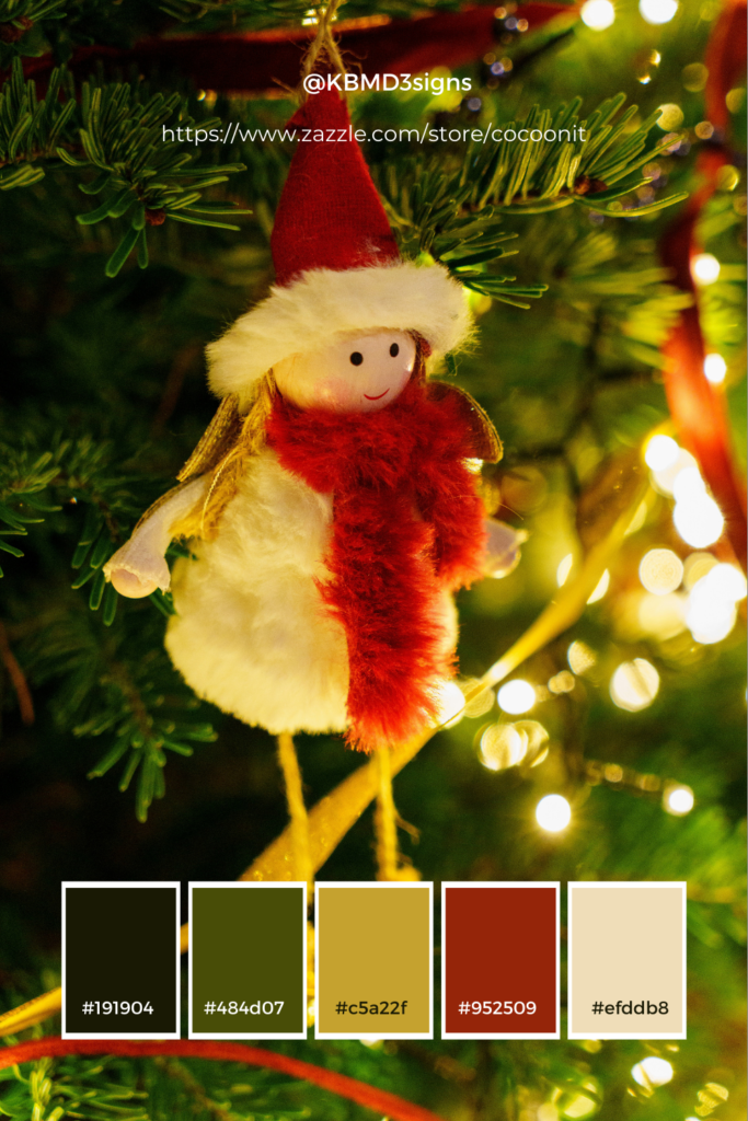
As the year comes to a close, we at KBM D3signs want to take a moment to thank all our readers, clients, and supporters for an incredible year. Your engagement and trust inspire us to keep creating and sharing insights that help small businesses thrive. The Christmas season is a time of connection, joy, and gratitude, and design plays an essential role in conveying these emotions. Today, we’re exploring how Christmas colors can help small businesses strengthen their brand identity while staying authentic to their unique style.
Red and Blue Color Palette: A Blend of Passion and Tranquility
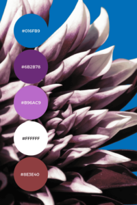
The red and blue color palette, here we explore its characteristics, cultural significance, impact of different shades and practical uses, summarized in a FAQ.
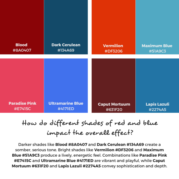
The interplay of red and blue in design and art creates a dynamic and versatile palette that has been used across cultures and time. Each color carries its own set of psychological associations and aesthetic qualities, making their combination both compelling and effective in numerous applications.
Article Content:
1. The Psychology of Red and Blue
Continue reading “Red and Blue Color Palette: A Blend of Passion and Tranquility”Black and White Color Palette Its Various Uses
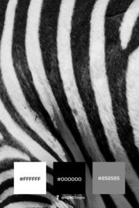
The classic black and white color palette remains a perennial favorite in the ever-evolving world of design, where trends come and go. One timeless duo stands unyielding against the tide of passing fads.

This enduring combination, with its simplicity and sophistication, has long been revered by artists, designers, and creators across various disciplines. From fashion runways to interior décor, from photography to graphic design, the black and white duo holds a unique allure that transcends time and culture.
Article content:
A Symbol of Contrast and Balance
Continue reading “Black and White Color Palette Its Various Uses”Blue and White Color Palette: A Timeless Anchor for Design and Branding
The blue and white color palette is more than a classic in home decor—it’s a foundation for thoughtful, impactful design across personal and professional projects. Whether you’re planning a brand launch, designing offline marketing materials, decorating a home, or curating event themes, blue and white offer a versatile and serene canvas that adapts across industries and styles.
This article explores the emotional impact and enduring appeal of the blue and white palette, and connects you to resources and designs that show how color choices can shape mood, messaging, and memory.
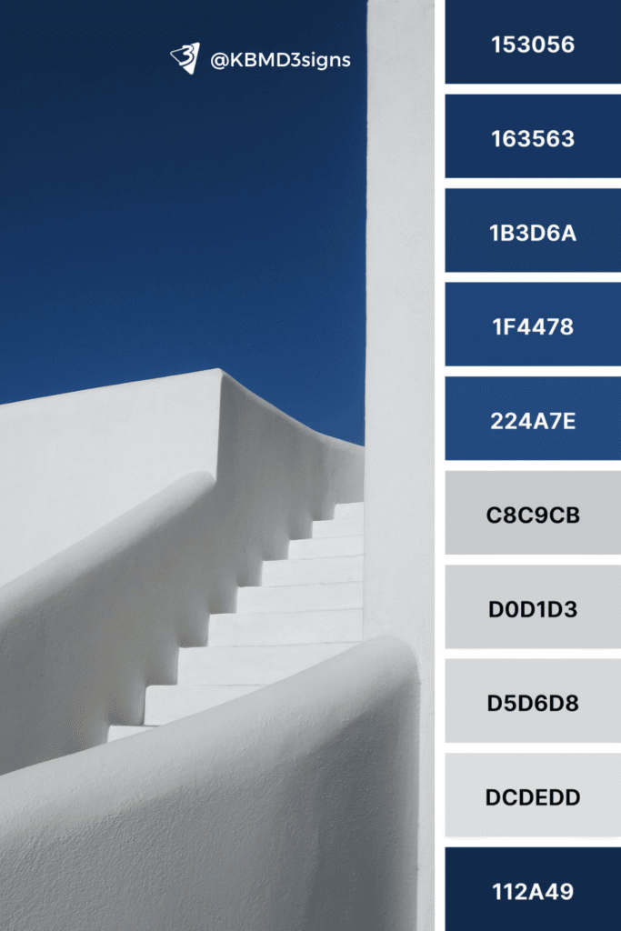
Greek White Stairs Against a Blue Sky
A traditional, elegant scheme evoking travel, clarity, and bright ideas.
Article Content:
Pink and White Color Palette Applied in Home Decor
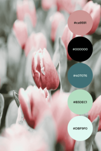
The pink and white color palette embraced in home decor. In this article, we will explore the appeal of using this elegant color scheme in your living spaces and provide creative ideas on how to incorporate it.
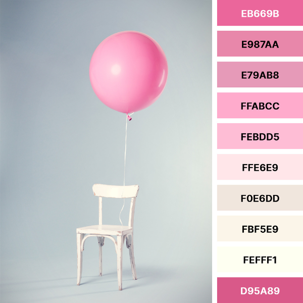
Color is a powerful tool that can evoke emotions, set moods and transform spaces in the world of interior design. Among the myriad of color palettes, the combination of pink and white stands out as a timeless and enchanting choice. This delicate duo is a popular trend that has homeowners and designers alike in raptures.
Four Reasons to Introduce a Pink and White Color Palette
Continue reading “Pink and White Color Palette Applied in Home Decor”Yellow and Blue Color Palette in Home Decor
The yellow and blue color palette remains a favorite in the ever-evolving world of interior design, where trends come and go. However, some classic color palettes, such as the yellow and blue color combination, continue to stand the test of time and captivate homeowners and interior designers alike. In this article, we’ll explore the enduring appeal of yellow and blue in home decor and offer creative ideas for incorporating them. Their combination offers a delightful vibrancy and serenity to enhance your living spaces.
The Irresistible Appeal
Yellow and blue exude a timeless charm that effortlessly infuses any home with warmth, positivity and serenity. The secret to its appeal lies in the complementary nature of the two hues. Blue, often associated with the soothing vastness of the sky and sea, provides a serene backdrop that soothes the mind. In contrast, yellow brings a burst of sunshine and energy, symbolizing joy and optimism. Together, these colors create a harmonious balance that instantly enhances the ambiance of any space.
Nature and Environment Inspired Color Scheme Examples with Color Codes
Color is all around us, and we can use it to our advantage. When we come across a harmonious color combination that catches our eye and makes us say, “I like that“. Take the following four examples.
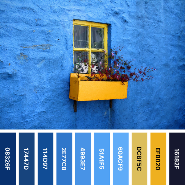
First: The Stunning Contrast of a Blue House Wall With Yellow Window
#Hex codes:
#08326F Ateneo Blue, #17447D Dark Cerulean, #114D97 Yale Blue, #2E77CB Celtic Blue, #4993E7 Tufts Blue, #51A1F5 Blue Jeans, #60ACF9 Blue Jeans, #DCBF5C Sunray, #EFB020 Orange-Yellow, #16182F Dark Gunmetal.
Continue reading “Yellow and Blue Color Palette in Home Decor”Blue and Green Color Palette Unleashing Its Beauty in Your Home
The blue and green color palette is a harmonious blend. A captivating combination that infuses tranquility, freshness, and a touch of sophistication.
In the realm of interior design, color plays a pivotal role in shaping the ambiance and character of a living space. The right color palette can evoke various emotions and set the mood for every room.
By incorporating this captivating duo into your home decor, you can create an enchanting sanctuary that exudes elegance and serenity. Let’s explore six scenes from nature to get ideas for combining blue and green. Then follow some exciting ideas for using a blue-green palette to decorate your living space. Finally, learn about the meaning and possibilities of the six-digit coders on the color palette collages.
Six Blue and Green Color Palettes Found in Nature
The enchanting northern lights
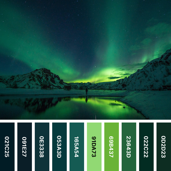
One of nature’s most awe-inspiring phenomena, the Northern Lights, or aurora borealis, paints the sky with vibrant blues and greens. The dancing lights against a dark backdrop create a magical atmosphere.
Picked from the image, #Hex codes:
#021C25 Dark Green, #091E27 Dark Jungle Green, #0E3338 Medium Jungle Green, #053A3D Rich Black, #165A54 is Brunswick Green, #91DA73 Pistachio, #69B437 Green, #23643D Mughal Green, #022C22 Dark Green, #0D2D23 is Phthalo Green.
The serenity of sunlit grass
Continue reading “Blue and Green Color Palette Unleashing Its Beauty in Your Home”Blue and Orange Color Palette, Embrace Vibrancy and Transform Your Home
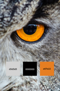
A blue and orange color palette, this energetic duo brings together cool serenity and warm vibrancy, resulting in a visually striking and balanced aesthetic. In this article, we will explore how incorporating a blue and orange color palette can breathe new life into your home, from walls and furniture to accessories and accents.
Using color in interior design can significantly affect the overall feel and mood of a room. One captivating combination that has gained popularity in recent years is the dynamic blue and orange color palette.
Orange Rose Color Palette
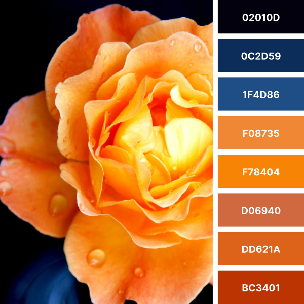
#Hex codes: #02010D Rich Black, #0C2D59 Prussian Blue, #1F4D86 Dark Cornflower Blue, #F08735 Cadmium Orange, #F78404 University Of Tennessee Orange, #D06940 Medium Vermilion, #DD621A Vivid Red-Tangelo, #BC3401 Mahogany.
Continue reading “Blue and Orange Color Palette, Embrace Vibrancy and Transform Your Home”A Gray Color Palette to Transform Your Home
By embracing a gray color palette, you can effortlessly elevate your space to new heights of sophistication. Gray is a versatile and sophisticated color. It has taken the interior design world by storm. Its understated elegance and timeless appeal make it the perfect choice for creating a calming and stylish ambiance in any home. Let’s explore the many hues of gray and how to use them to transform your home.
Five Nature-inspired Gray Palette Collages With #Hex Codes
The five harmonious nature-inspired gray color palettes feature pebbles, an elephant, a drop of water, a pile of stones next to water, and sardines. Each color palette collage reflects different shades of gray chosen from the image. It also includes their #Hex numbers.
Pebbles Color Palette
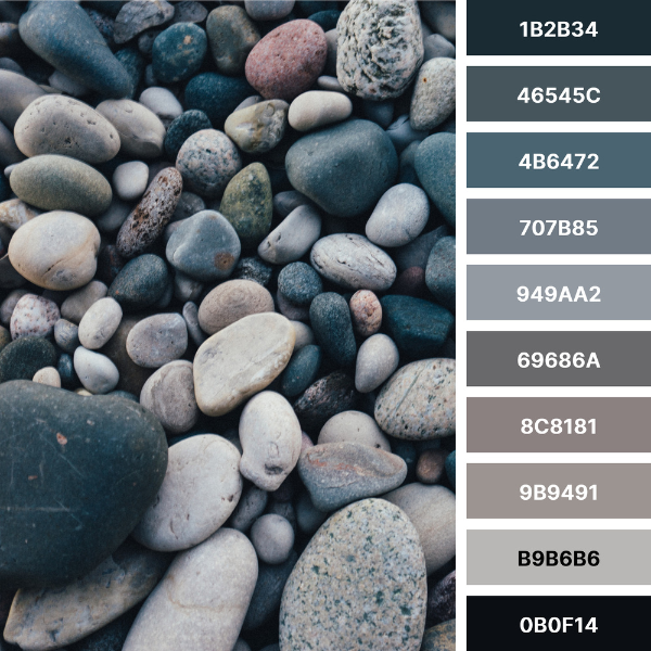
#Hex codes: #1B2B34 Dark Gunmetal, #46545C Feldgrau, #4B6472 Deep Space Sparkle, #707B85 AuroMetalSaurus, #949AA2 Manatee, #69686A Dim Gray, #8C8181 Rocket Metallic, #9B9491 Spanish Gray, #B9B6B6 Philippine Silver, #0B0F14 Chinese Black.
Continue reading “A Gray Color Palette to Transform Your Home”

