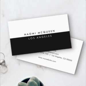
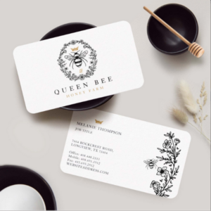
When it comes to black and white business card designs, leveraging the subtle power of these colors can make a significant impact. Here’s an in-depth look at how to make such designs stand out, how color balance affects communication, and what professions can particularly benefit from this aesthetic.
All business cards come in the standard 3.5″ x 2.0″ size.
Article Content:
- Communication of Black and White
- Effect of Color Balance
- Small Business Perspective
- Layouts and Their Communication
- Professions That Excel with Black and White Business Cards
- Tips for Designing an Impactful Black and White Business Card
- How To Determine What Black & White Business Card Is Right
- Choosing The Right Black & White Marketing Package For Your Small Business
- Mood Board: Black & White Business Cards & Marketing Items, by KBMD3signs
- Year-Round Adaptations: Refreshing Black & White Brand Identity
Winter: Bold Frost
Valentine’s Day: Heartfelt Contrast
Mother’s Day:: Radiant Meadow - Natural Brand Color Inspiration, 3 Color Palettes
- Frequently Asked Questions (FAQs) About Black and White Business Card Designs
1. Communication of Black and White
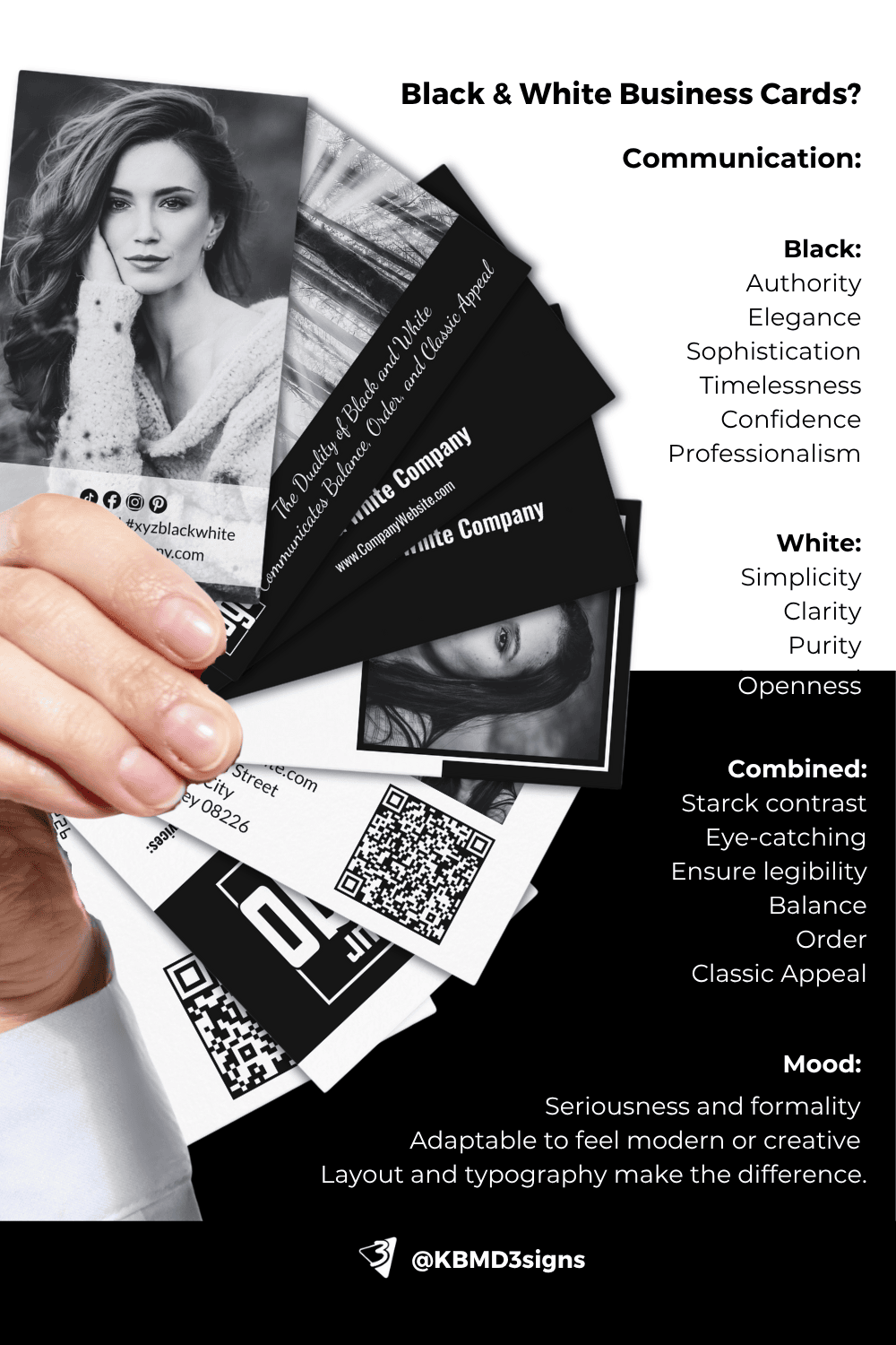
- Black communicates authority, elegance, sophistication, and timelessness. It gives an impression of confidence and professionalism.
- White embodies simplicity, clarity, purity, and openness. When used together with black, it creates a stark contrast that can catch the eye and ensure legibility.
- Combined: The duality of black and white communicates balance, order, and classic appeal. The minimalist nature of this palette helps the essential details stand out without distractions.
2. Effect of Color Balance
- Visual Hierarchy: Proper use of black and white creates clear distinctions in content. A design with a black background and white text exudes luxury and exclusivity, while a white background with black text can feel more approachable and straightforward.
- Emphasis: Using thicker black areas for emphasis and thinner white spaces for breathability ensures the card doesn’t feel heavy or cluttered.
- Mood: This color scheme conveys seriousness and formality but can also be adapted to feel modern or creative based on layout and typography.
3. Small Business Perspective
For small businesses, investing in a black and white business card can be a strategic move:
- Cost-effective: Printing in black and white is typically more affordable than using full color.
- Brand Identity: Minimalist and monochrome business cards help convey a strong, defined brand image. Small businesses looking to communicate confidence and professionalism—such as legal firms, consultants, and luxury brands—benefit from this aesthetic.
- Differentiation: In a world saturated with colorful, visually complex business cards, a black and white card can be a refreshing standout that prompts further inquiry and holds the recipient’s attention.
4. Layouts and Their Communication
- Center-Aligned Layouts: This format emphasizes balance and formality. It’s perfect for law firms, accountants, and consultants, portraying a clear, no-nonsense attitude.
- Left-Aligned Layouts: These cards convey professionalism and stability, and they’re easy to read. They suit professions like architecture, graphic design, and writing.
- Minimalist Layouts: Using ample white space with minimal black text communicates a modern and creative style. Creative agencies, fashion brands, and tech startups can use these layouts to show innovation and forward-thinking.
- Dynamic, Asymmetrical Layouts: These suggest creativity and boldness. While still black and white, this layout is suited for industries like photography, design, and media, where visual impact is key.
5. Professions That Excel with Black and White Business Cards
- Creative Professions: Graphic designers, artists, photographers, and stylists often leverage black and white to showcase their knack for minimalist elegance. The lack of color allows them to showcase their creativity through form, typeface, and layout instead.
- Luxury Brands: High-end fashion designers, jewelers, and exclusive event planners often prefer black and white to communicate luxury and sophistication.
- Consulting and Legal Professions: For consultants, lawyers, and accountants, the straightforward black and white palette projects trustworthiness, clarity, and seriousness.
- Boutique Services: Interior designers and personal chefs can use black and white business cards to portray an eye for refined simplicity and attention to detail.
6. Tips for Designing an Impactful Black and White Business Card
- Choose High-Contrast Typography: Select fonts that are bold and legible, ensuring text is not lost against the background.
- Use Texture and Finishes: Matte or glossy finishes, embossing, and letterpress printing can elevate a simple black and white card.
- Strategic Use of Space: Integrating negative space effectively makes the card easier to read and more visually appealing.
- Iconography: Minimalist icons or logos in black and white can convey professionalism while maintaining a clean look.
Overall, a black and white business card, when thoughtfully designed, transcends trends and maintains an evergreen appeal. The key to standing out lies in how you balance elements, use space, and choose fonts that reflect the essence of your brand or profession.
7. How To Determine What Black & White Business Card Is Right
Determining the right type of black and white business card depends on your goals, profession, and how you want to present yourself or your company. Here’s a breakdown of various black and white business card styles and how to choose the best one for your needs:
7-1. Scannable Business Card
- What It Is: These cards are designed for easy reading, often featuring clean lines, legible fonts, and a balanced layout that allows scanners (both digital and human) to process information quickly.
- Who Should Use It: Professionals in fast-paced environments, such as sales agents or conference participants, who want to ensure their details can be quickly noted and stored.
- Design Tip: Prioritize a minimalist approach with clear, large fonts. Keep the layout simple so scanners and QR code apps can read information seamlessly.
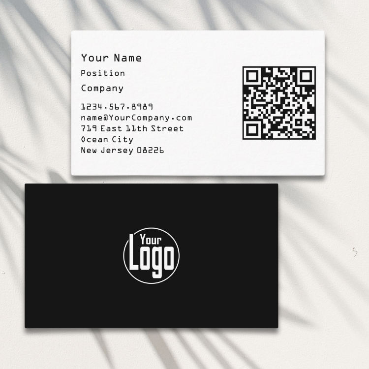
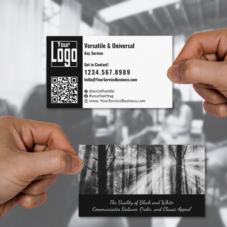
7-2. QR Code Business Card
- What It Is: A business card that features a QR code for directing recipients to a website, portfolio, social media profile, or contact-saving link.
- Who Should Use It: Tech-savvy professionals, marketers, digital creators, and small businesses looking to boost online interactions.
- Design Tip: Place the QR code in a prominent position but ensure it doesn’t overwhelm other essential information. A black background with a white QR code can look modern and sleek while remaining highly scannable.
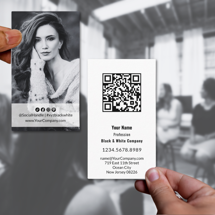
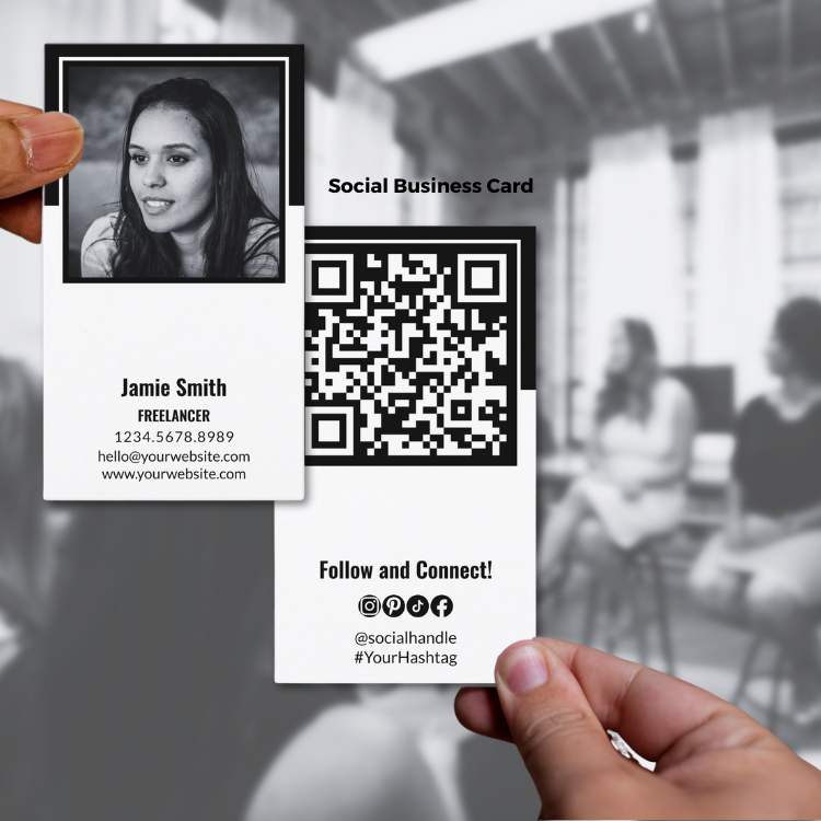
7-3. Portrait Business Card
- What It Is: A vertical business card format that stands out due to its uncommon orientation.
- Who Should Use It: Creative professionals, artists, designers, and anyone looking to differentiate themselves from traditional business formats.
- Design Tip: Use vertical space to emphasize logos at the top, followed by name and details. This layout can showcase an icon or image more effectively and is great for emphasizing brand personality.
7-4. Landsca:pe Business Card
- What It Is: The standard, horizontal layout used for most business cards.
- Who Should Use It: Anyone, as this format is highly versatile and universally recognized.
- Design Tip: A black and white landscape card benefits from a clean design where key information is evenly spaced. Using contrasting typography ensures readability against the card’s background.
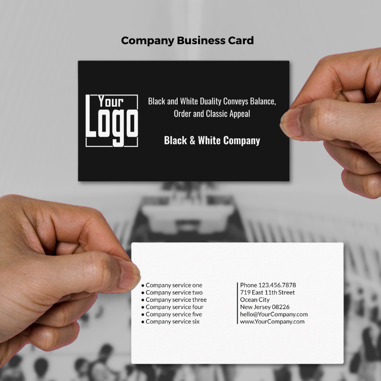
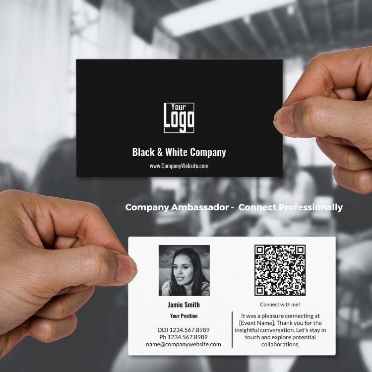
7-5. Company Business Card
- What It Is: A business card designed to represent an entire company, often including the company logo, tagline, and corporate contact details.
- Who Should Use It: Executives, team members, or anyone representing their company in business contexts.
- Design Tip: Focus on reinforcing the company brand identity. Use the logo prominently and include essential details like the main contact number and email in a balanced format. A subtle use of white space can evoke professionalism.
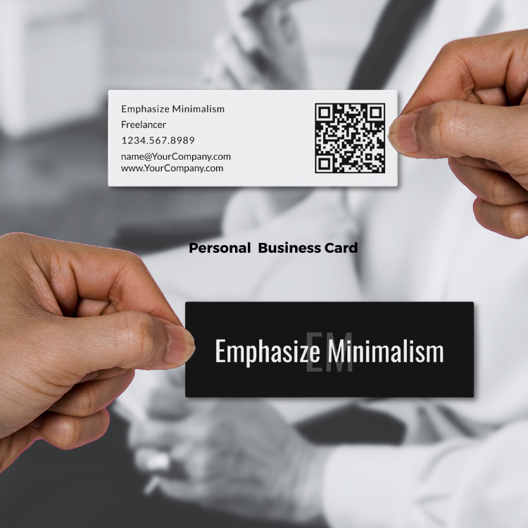
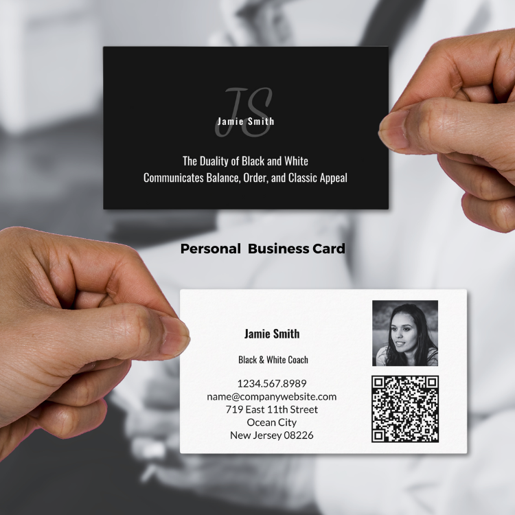
7-6. Personal Business Card
- What It Is: A card representing an individual rather than a company, often used by freelancers, independent consultants, and networkers.
- Who Should Use It: Entrepreneurs, freelancers, artists, and professionals attending networking events.
- Design Tip: Highlight personal contact details like direct phone number and email. Include a personal touch, such as a small photo or signature (if relevant), to create a connection.
7-7. Social Media Business Card
- What It Is: A card that emphasizes social media handles and platforms, potentially including icons for Instagram, LinkedIn, or Twitter.
- Who Should Use It: Influencers, digital marketers, content creators, or any professional looking to boost their online presence.
- Design Tip: Integrate social media icons in a way that’s clean and unobtrusive. Use a clear, modern font that enhances readability. A white background with black icons or vice versa maintains visual balance and simplicity.
7-8. Business Card with Photo
- What It Is: A card that includes a headshot or brand-related image for easy recognition and memorability.
- Who Should Use It: Real estate agents, photographers, personal trainers, or professionals who want to build a personal connection.
- Design Tip: Ensure the photo is high quality and integrated seamlessly into the design, avoiding clashing with text. A black-and-white photo can harmonize with the card’s overall color scheme, maintaining an elegant and cohesive look.
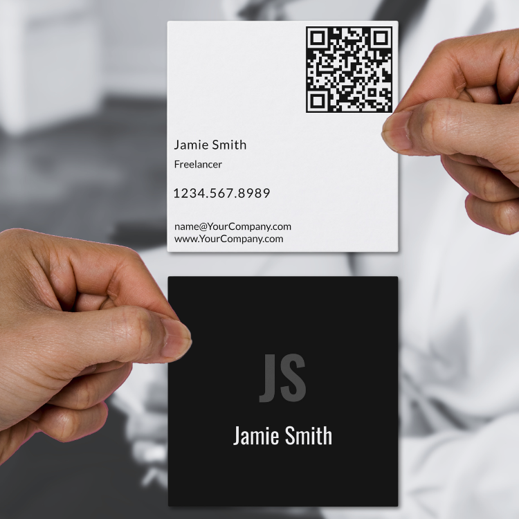
7-9. Business Card Square, 2.5″ x 2.5″
- What It Is: A modern, compact card with equal dimensions on all sides, creating a unique square shape.
- Who Should Use It: Ideal for creative professionals, boutique businesses, or anyone looking to stand out with an unconventional format. It’s perfect for industries like design, photography, fashion, and artisan crafts.
- Design Tip: Use the square shape to feature a central logo or striking visual element. Keep the layout clean to avoid overcrowding, and ensure key contact details remain legible despite the smaller size.
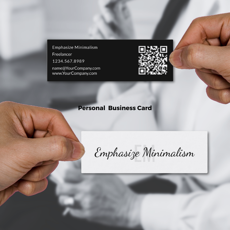
7-10. Business Card, Mini, 3.0″ x 1.0″
- What It Is: A slim, elongated business card format that emphasizes minimalism and portability.
- Who Should Use It: Great for freelancers, consultants, or small businesses that want to make a sleek impression. This format works particularly well for modern, tech-forward industries or personal branding.
- Design Tip: Utilize the horizontal space for streamlined text and logos. Consider a vertical version for an even bolder, unconventional look. Ensure the font size is legible despite the narrower design.
How to Choose the Right Black & White Business Card
- Purpose and Context: Are you trying to emphasize your personal brand or your company? A personal card with a photo is great for relationship-building, while a company card might benefit from a clean layout showcasing your logo.
- Preferred Mode of Contact: If you want people to reach you through your website, a QR code card is ideal. If social media is key, focus on a social media card.
- Format Appeal: Portrait cards are more memorable but less common, so choose this format if you want to stand out in creative industries. Landscape cards are a safe, familiar choice that works in almost any professional setting.
- Information Priority: Decide what details you want to highlight. For example, a QR code or social media handles should be strategically placed to ensure attention.
Final Design Tips
- Use Texture: Enhance a simple black and white design with textured finishes like embossed logos or matte backgrounds.
- Typography: Choose fonts that communicate your style—modern sans-serif for tech and creative fields, serif for traditional professions.
- Logo Placement: Position your logo where it draws the most attention, such as the top center or top left.
- Balance and Legibility: Always prioritize readability. Ensure text contrasts well with the background for easy scanning.
By aligning your design choices with your profession and objectives, your black and white business card can make a lasting impression while staying true to your brand identity.
8. Choosing The Right Black & White Marketing Package For Your Small Business
When choosing a black and white offline marketing package for small businesses, it’s essential to ensure that the materials are cohesive and align with the overall branding. If you’re using platforms like Zazzle for customizable templates, here are key considerations to make the most out of your marketing materials, such as business cards, flyers, posters, and brochures:
8-1. Cohesive Design Across All Materials
- Maintain a Consistent Style: Ensure that your business card and marketing materials share a unified design aesthetic. This includes using the same fonts, logos, and general layout styles. The goal is to create a seamless brand experience.
- Image Filters: Take advantage of Zazzle’s design tools to transform any uploaded images to black and white for a consistent look across all templates.
- Customizable QR Codes: Ensure your marketing templates have placeholders for QR codes that match the business card design, creating a streamlined way for customers to access more information or offers.
8-2. Customizable Placeholders
- Ease of Use: Templates that include placeholders for images, logos, text, and QR codes simplify the design process. Choose templates that clearly indicate where each element should be placed.
- Upload and Personalize: Platforms like Zazzle make it easy to upload and integrate your logo or images. Ensure that the placeholders are compatible with your brand’s high-resolution images to maintain quality.
- Flexible Text Areas: Check that text placeholders are adaptable, allowing you to input essential information such as contact details, slogans, or promotions.
8-3. Use of Design Tools on Zazzle
- Filters for Image Consistency: Utilize Zazzle’s design tools to apply black and white filters to images, ensuring they align with the overall theme of your business card.
- Font Customization: You can modify fonts to fit your branding—whether you prefer bold, modern, or classic serif fonts. Make sure to choose fonts that match the style of your business card for a cohesive look.
- Color Personalization: While maintaining the black and white theme, it’s helpful that the color of text or minor accents on the marketing materials can be customized. This flexibility can highlight key information subtly without deviating from the monochromatic scheme.
8-4. Choice of Marketing Materials
- Flyers and Brochures: Opt for templates that emphasize clean layouts and ample space for text and visuals. The black and white theme should make these materials striking and readable.
- Posters: Use larger placeholders for bold statements or promotions that can catch attention from a distance. The black and white color scheme can create a dramatic and professional look when combined with minimalistic design elements.
- Stickers and Labels: Ideal for small promotional items or packaging, ensuring your brand identity is consistent even in smaller formats.
- Presentation Folders: For a polished, professional appearance when handing out business proposals or portfolios.
8-5. Print Quality and Material Options
- Select Premium Paper: Ensure that your chosen marketing materials are available in high-quality print options. Black and white designs often look best on matte or textured paper, as these reduce glare and enhance the sharpness of the design.
- Consistency of Print: Confirm that the chosen print-on-demand platform can handle large quantities without losing quality. Zazzle typically offers discounts for bulk orders, which is beneficial for small businesses looking to maximize budget efficiency.
- Material Variety: Make sure the designs can be carried across different materials, such as brochures, business cards, posters, and even merchandise like tote bags or mugs if needed.
8-6. Ease of Customization and Support
- User-Friendly Interface: Zazzle’s “Edit using design tools” link provides a straightforward way to customize templates. Look for tutorials or follow the help feature (the speech bubble in the bottom right corner) if you need guidance.
- Interactive Help: Take advantage of Zazzle’s support if you get stuck at any customization stage. This ensures a smooth design process and minimizes frustration.
- Testing Before Order: Use Zazzle’s preview function to see how your materials will look when printed. This helps ensure alignment, text placement, and overall design accuracy.
8-7. Budget Considerations
- Bulk Discounts: Zazzle offers quantity discounts, making it cost-effective to order larger numbers of business cards or marketing materials at once. Plan ahead to take advantage of these savings.
- Template Versatility: Choose templates that transfer well to other products. A well-designed flyer template could double as a poster or brochure with minor adjustments.
8-8. Final Touches
- Proofreading: Double-check all text for errors before placing your order to avoid reprints and extra costs.
- Alignment with Brand Image: Ensure that the overall black and white design reflects your brand’s personality, whether that’s modern and sleek, or traditional and formal.
By considering these aspects, small businesses can effectively use black and white marketing materials from platforms like Zazzle to complement their business cards and create a cohesive offline presence.
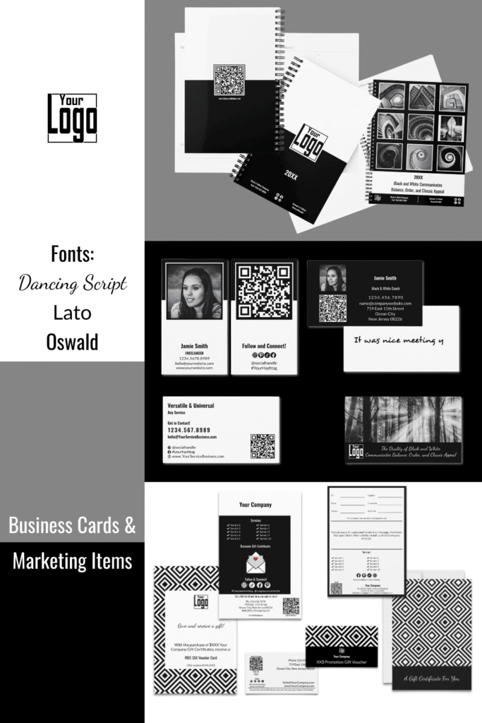
9. Mood Board: Black & White Business Cards & Marketing Items, by KBMD3signs
Shop at Zazzle Store
Cocoon It! – Black & White Business Cards & Marketing Items
At the Cocoon It! Store by KBM D3signs on Zazzle puts all the branding elements and color schemes in your hands. We use color tools to help you choose the perfect hues, and for additional inspiration, explore our curated collection of color palette ideas. Our commitment to customization goes beyond placeholders-almost all elements can be customized to match your chosen colors.
If you need additional assistance customizing or transferring designs to different products, or if you have a unique vision that requires a custom design, we are just a message away. At Designs by KBM D3signs, we go beyond providing marketing materials; we empower you to shape and showcase your brand with creativity and personalization.
Show off your personal style or post a review!
10. Year-Round Adaptations: Refreshing Black & White Brand Identity
Your brand identity can stay consistent while evolving with the seasons. By keeping your core colors—black (#000000) and white (#FFFFFF)—and pairing them with bold seasonal symbols or secondary hues, you create a cohesive yet flexible visual presence.
Each example below is inspired by a seasonal photograph, which sets the tone for expanding the collection into matching thank-you cards and other marketing materials. Flexibility comes from simple adjustments: swapping text for different professions or using relevant images in placeholders. Both stylized and photographic versions ensure your designs feel adaptable, while always staying rooted in the natural rhythm of the seasons.
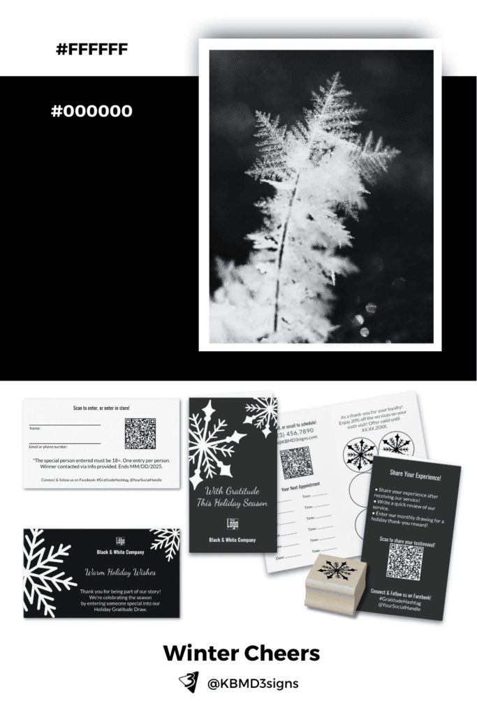
Winter: Bold Frost
Discover the bold beauty of black & white winter designs. This mood board combines snowflake-inspired imagery with crisp contrasts for timeless seasonal business card ideas. Perfect for holiday promotions and seasonal networking.
- Photo Inspiration: Iced fern that resembles a delicate snowflake
- Seasonal Colors: #000000 (black), #FFFFFF (white)
- Mood: Crisp, bold, minimal yet festive
- Stylized Element: Snowflake-inspired shapes in striking black & white contrasts
- Use Case: Winter promotions, seasonal greetings, holiday networking cards
⇒ Shop the collection: Black & White Winter & Christmas Marketing Tools
⇒ Read the article: 6 Winter Marketing Ideas for Small Businesses
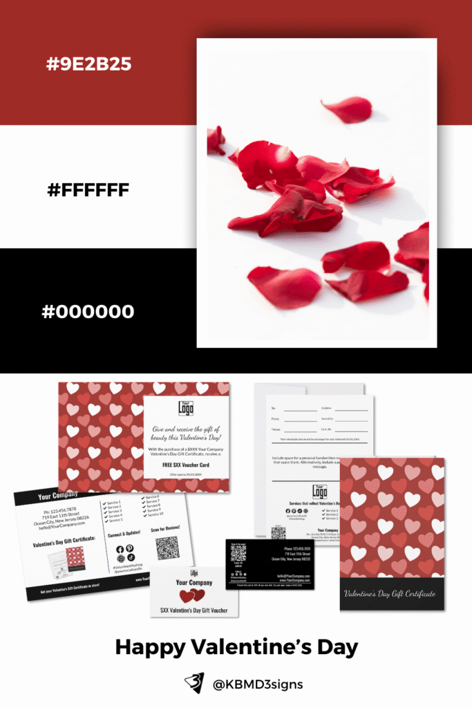
Valentine’s Day: Heartfelt Contrast
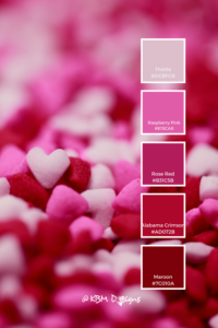
Romantic contrast meets seasonal charm. Explore Valentine’s Day business card designs in black, white, and deep red accents—ideal for seasonal campaigns, heartfelt promotions, and love-themed branding.
- Photo Inspiration: Scattered red flower petals on a white surface
- Seasonal Colors: #000000 (black), #FFFFFF (white), #9E2B25 (deep red shades)
- Mood: Romantic, bold, passionate
- Stylized Element: Heart-shaped red balloons and a repeating heart motif in varying tones of #9E2B25
- Use Case: Valentine’s promotions, love-inspired branding, seasonal campaigns
⇒ Shop the collection: Black and White – Valentine’s Day Marketing
⇒ Read the article: Small Business Valentine’s Day Marketing Ideas to Win Hearts
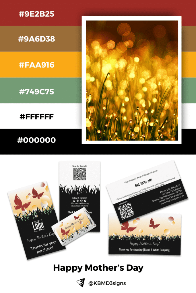
Mother’s Day: Radiant Meadow
Celebrate warmth and nature with this Mother’s Day business card mood board. Featuring golden sunrays, meadow greens, and radiant accents, these designs highlight nurturing beauty for seasonal promotions.
- Photo Inspiration: Golden sunset with sun rays dancing across a meadow
- Seasonal Colors:
- #9E2B25 (deep rose red)
- #9A6D38 (earthy bronze)
- #FAA916 (sunray yellow)
- #749C75 (soft meadow green)
- #000000 (black)
- #FFFFFF (white)
- Mood: Warm, nurturing, natural, radiant
- Stylized Element: Sunrays over a meadow accented with two butterflies
- Use Case: Mother’s Day promotions, heartfelt thank yous, spring-forward business messaging
⇒ Shop the collection: Butterflies Dancing – Mother’s Day Marketing
⇒ Read the article: Mother’s Day Marketing Ideas for Small Local Businesses
11. Natural Brand Color Inspiration, 3 Color Palettes
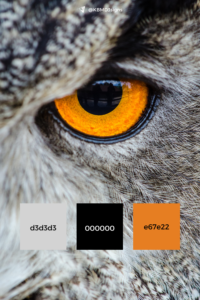
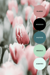
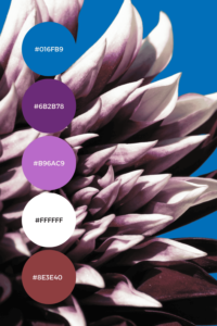
Nature often inspires and validates design ideas, offering timeless color combinations. Black and white is a classic, elegant solution, and the following palettes showcase how this contrast exists in the natural world, creating memorable and impactful designs.
Penguin on the Shore
Inspiration: A penguin standing gracefully on a rocky shore embodies the sleek simplicity of black and white.
Palette: Deep black contrasts with crisp, clean white, balanced by the muted gray of coastal rocks.
Takeaway: This palette is ideal for brands aiming for sophistication and balance, offering a clean and polished aesthetic.
Zebra Stripes
Inspiration: The zebra, native to the African savannah, is a striking example of natural black and white patterning. Its stripes not only serve as camouflage but are also known to repel mosquitos.
Palette: Bold black and white, with optional accents inspired by the golden tones of grasslands or the earthy reds of the African soil.
Takeaway: Perfect for brands seeking a bold, unforgettable identity, where contrast symbolizes strength and uniqueness.
Alaskan Malamute
Inspiration: This furry black-and-white sled dog from Alaska showcases nature’s practicality and beauty in extreme environments.
Palette: Rich black, soft white, and hints of icy gray from snowy landscapes.
Takeaway: An excellent choice for brands wanting to convey resilience, warmth, and trustworthiness with a touch of rugged charm.
Each of these natural examples proves the power and memorability of black and white as a foundation for branding, demonstrating that even in simplicity, nature offers endless inspiration.
11. Frequently Asked Questions (FAQs) About Black and White Business Card Designs
Black and white business cards are timeless, elegant, and versatile. They convey professionalism, simplicity, and sophistication, which can make them stand out in a sea of colorful cards. This color scheme also emphasizes content over decoration, ensuring your contact information and brand message are clear and memorable.
Yes, printing black and white business cards is often more budget-friendly than full-color printing. The use of fewer inks and simpler printing processes can lead to lower costs, making them a great option for small businesses or startups looking to save money without compromising on quality.
Absolutely! Black and white business cards can be both classic and modern, depending on the layout, typography, and design elements. Using bold fonts, strategic negative space, textures (like embossing or letterpress), and innovative layouts can create an engaging and contemporary design.
Black and white cards work well for industries that prioritize elegance and professionalism. These include law firms, financial services, consulting agencies, luxury goods, creative agencies, and freelance professionals such as photographers and designers. They are also effective for personal branding in professions where a clean and sophisticated image is important.
To make a black and white card stand out, focus on:
– Typography: Use unique, bold, or custom fonts to create visual interest.
– Layout: Experiment with unconventional layouts, such as asymmetrical designs or minimalist formats with strategic use of white space.
– Textures and Finishes: Include special printing techniques like embossing, debossing, or a matte finish.
– Contrast: Utilize the stark contrast between black and white to draw attention to key information.
Essential elements include:
– Your name or company name
– Job title or a brief tagline
– Contact details (phone number, email)
– Website or portfolio link
– QR code (optional)
– Social media handles (if relevant) Ensure that the design maintains clarity and that information is easy to read.
Yes, QR codes work effectively on black and white cards. The high contrast between black and white ensures the QR code is easily scannable. This addition is particularly useful for directing clients to websites, portfolios, or social media profiles, enhancing connectivity and interactivity.
To maintain readability:
– Choose high-contrast color placements (e.g., black text on a white background or vice versa).
– Use legible fonts and avoid overly decorative typefaces.
– Opt for a balanced layout with enough white space to keep the card from appearing cluttered.
Current trends include:
– Minimalism: Simple layouts with few design elements, relying on typography and white space.
– Bold Typography: Large, modern fonts that command attention.
– Geometric Patterns: Subtle backgrounds made from black and white shapes or lines.
– Textures: Matte finishes, gloss highlights, and embossed logos or text.
Yes, a black and white photo can be included, especially for personal branding. This works well for real estate agents, consultants, and freelancers who want to put a face to their name. Ensure the image has good contrast and blends seamlessly with the card’s overall design.
The choice depends on your style and industry:
– Landscape: The traditional choice, familiar and easy to organize. Best for formal or conventional professions.
– Portrait: Stands out more and is associated with creativity and innovation. Suitable for designers, artists, and modern brands.
While the primary design should remain black and white for a classic look, small accents of color (such as a logo detail or icon) can be used to draw attention to specific elements or convey subtle branding. This can help the card retain its monochrome aesthetic while adding a touch of distinction.
They can be, especially if printed on recycled paper and using eco-friendly inks. The lack of color ink may also reduce the environmental impact of the printing process. Always check with your printing provider for sustainable options.
Matte and uncoated papers often work well as they prevent glare and enhance readability. For a more luxurious feel, consider textured papers or options like cotton and linen, which add depth and tactile appeal.
-

6 Winter Marketing Ideas for Small Businesses
Read the post …: 6 Winter Marketing Ideas for Small Businesses -

6 Offline Summer Marketing Ideas for Small Businesses
Read the post …: 6 Offline Summer Marketing Ideas for Small Businesses -

What is Seasonal Marketing? A Guide for Small Business Offline Success
Read the post …: What is Seasonal Marketing? A Guide for Small Business Offline Success


