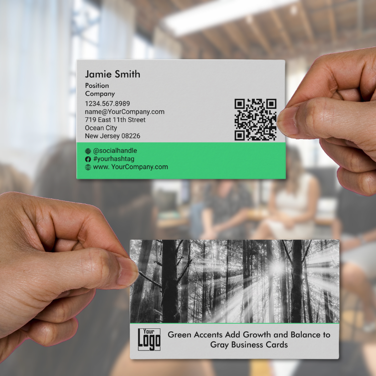
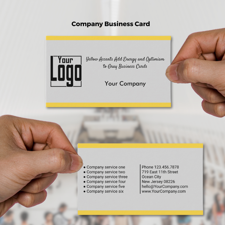
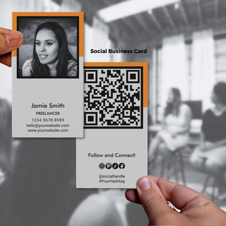
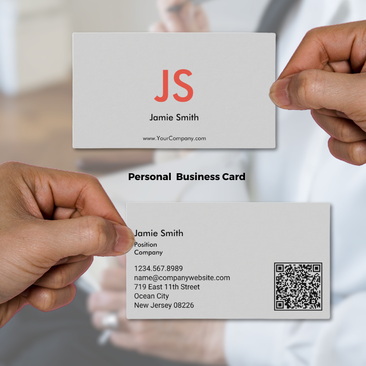
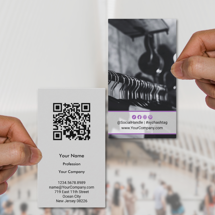
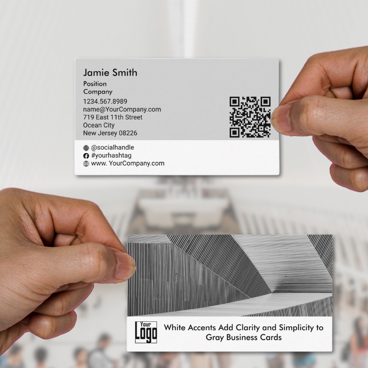
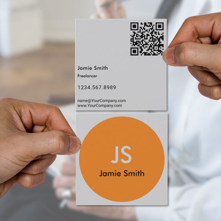
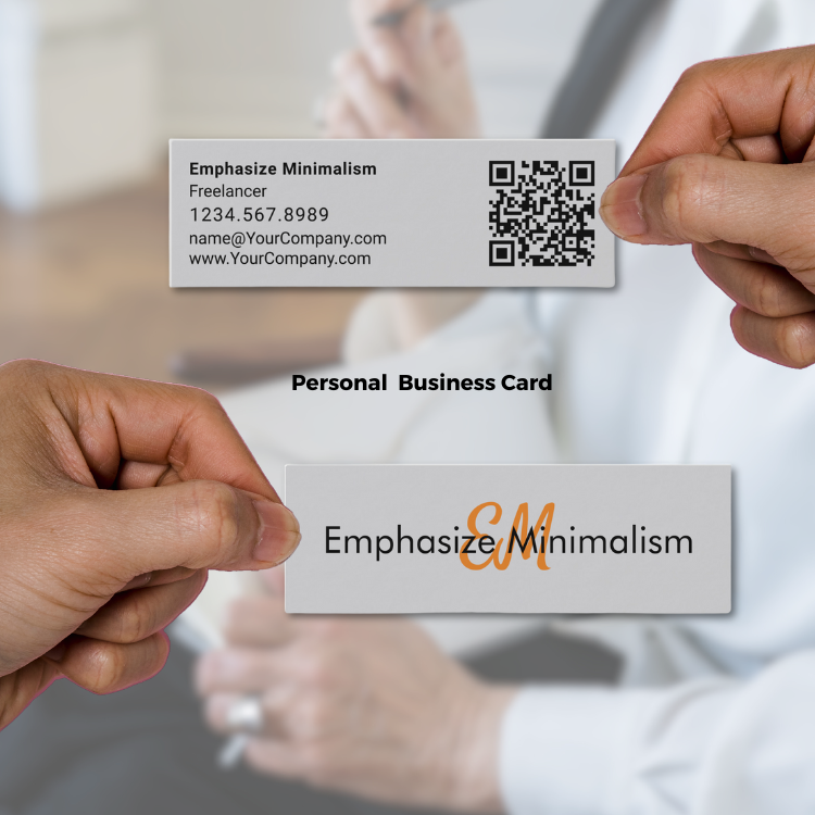
Gray business cards, defined by their understated elegance, are increasingly popular for professionals seeking a modern yet timeless aesthetic. The combination of a light gray background (#d3d3d3) and black text (#000000) communicates a sense of balance, professionalism, and minimalism, making it an ideal choice across various industries.

Article Content:
- What Gray Communicates
- The Influence of Fonts
- Ideal Professions for Gray Business Cards
- Adding Color Accents
- Nature’s Palette: Inspiring Gray, Black, and Orange Designs
- Gray Business Card Designs & Marketing Materials by KBM D3signs
Seasonal Adaptations: Refreshing Brand Identity Year-Round - Frequently Asked Questions About Gray Business Cards
1. What Gray Communicates
Subtle Sophistication and Neutrality
The gray background symbolizes neutrality, wisdom, and practicality. Combined with bold black text, it creates a sharp contrast that enhances readability while exuding authority and confidence. This color pairing makes the card versatile, appealing to those who want to convey reliability without overwhelming the recipient.
When combined with black-and-white photography, gray business cards add a touch of artistic flair. Such cards are particularly fitting for professions emphasizing attention to detail, such as architecture, interior design, or photography.
2. The Influence of Fonts
Font Choices and Their Impact
- Title Font: Futura
This geometric sans-serif font exudes modernity and clarity. Its clean lines align with the gray backdrop’s minimalism, ideal for titles or headlines. - Body Font: Roboto
Roboto’s neutral and highly readable nature complements Futura, ensuring seamless communication of essential details without visual clutter. - Script Font: Satisfy
Adding a script font like Satisfy offers a touch of elegance and warmth. It’s perfect for personal branding or creative professions, providing a human touch while maintaining a professional tone.
These font combinations create a balance between modernity and tradition, ensuring that the card appeals to diverse audiences.
3. Ideal Professions for Gray Business Cards
Gray business cards are particularly effective for professionals in fields that value sophistication and subtlety:
- Architects: The neutral tones complement architectural aesthetics, while the clean fonts emphasize precision.
- Consultants: Gray communicates authority and impartiality, essential for building client trust.
- Photographers: Black-and-white photography enhances the minimalist theme.
- Designers (Interior, Graphic): The understated palette allows their creativity to shine through additional design elements.
- Legal Professionals: The color evokes stability and dependability.
4. Adding Color Accents
Blue (#1E90FF):
Symbolizes trust and intelligence. Ideal for consultants and tech professionals.
Green (#2ECC71):
Represents growth and balance. Perfect for eco-conscious brands or wellness professionals.
Yellow (#F4D03F):
Adds energy and optimism. Great for creative industries or marketing agencies.
Orange (#E67E22):
Conveys enthusiasm and friendliness. Suitable for startups and entrepreneurs.
Red (#E74C3C):
Evokes passion and determination. Works well for legal professionals or high-impact fields.
Purple (#9B59B6):
Suggests luxury and creativity. Fits well with designers or boutique brands.
White (#FFFFFF):
Represents clarity, simplicity, and sophistication. Suits professions like consulting, legal services, or architecture
Accent Application by Card Layout
- Standard Size (3.5” x 2”): Color can outline sections, highlight titles, or add depth to logos.
- Slim Cards (3.5” x 1”): Use accent colors sparingly to emphasize minimalism while drawing attention to essential details like your name or contact info.
- Square Cards (2.5” x 2.5”): Vibrant accents can frame content or highlight graphical elements for creative professions.
Profession-Specific Accent Use
- Legal Professionals: Blue or gray tones dominate, with small red accents for impactful headers.
- Designers: Purple and yellow accents for creativity and warmth.
- Photographers: Minimalist gray with a subtle green or orange border for freshness.
Overall, gray business cards offer an excellent canvas for conveying sophistication and modernity. With strategic use of fonts and accent colors, they can be tailored to support a wide range of professions. Whether showcasing your creativity or professionalism, gray business cards are a timeless choice that reflects both personal style and industry expertise.
⇒ Read more on “How to Choose Brand Colors“.
5. Nature’s Palette: Inspiring Gray, Black, and Orange Designs
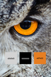
Nature is a master designer, often pairing colors in ways that captivate and inspire. The gray, black, and orange palette featured in our business card and marketing designs echoes the elegance found in the natural world. Here is a striking example of an owl’s close-up.
Owl’s Face Detail:
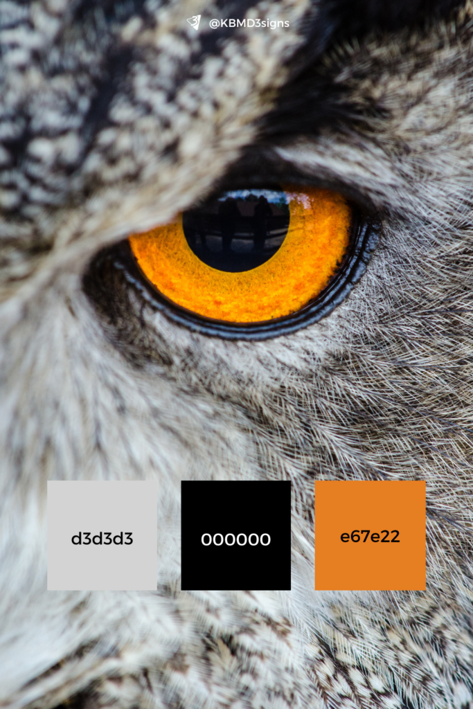
The owl’s piercing amber eyes and feathered grayscale patterns embody harmony and precision. This natural blend mirrors the versatility of the palette, demonstrating its adaptability for both creative and professional designs.
Let nature inspire your next design project. Our gray, black, and orange palette, drawn from the timeless elegance of the natural world, is perfect for creating designs that stand out while maintaining a sense of harmony. Explore how these colors can work for your brand!
6. Gray Business Card Designs & Marketing Materials by KBM D3signs
At KBM D3signs, through our Zazzle store Cocoon It! we are dedicated to empowering brands with exceptional marketing materials tailored to their unique vision. Our easy-to-customize templates simplify the design process, ensuring you can personalize every element to align perfectly with your preferences and branding.
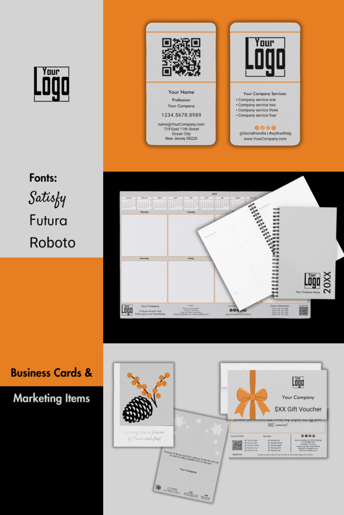
Our design philosophy centers on giving you the freedom to choose your colors while maintaining a cohesive and professional aesthetic. The featured designs showcase the versatility of gray as a primary color, paired with bold black and dynamic orange accents.
Explore Our Business Card Formats
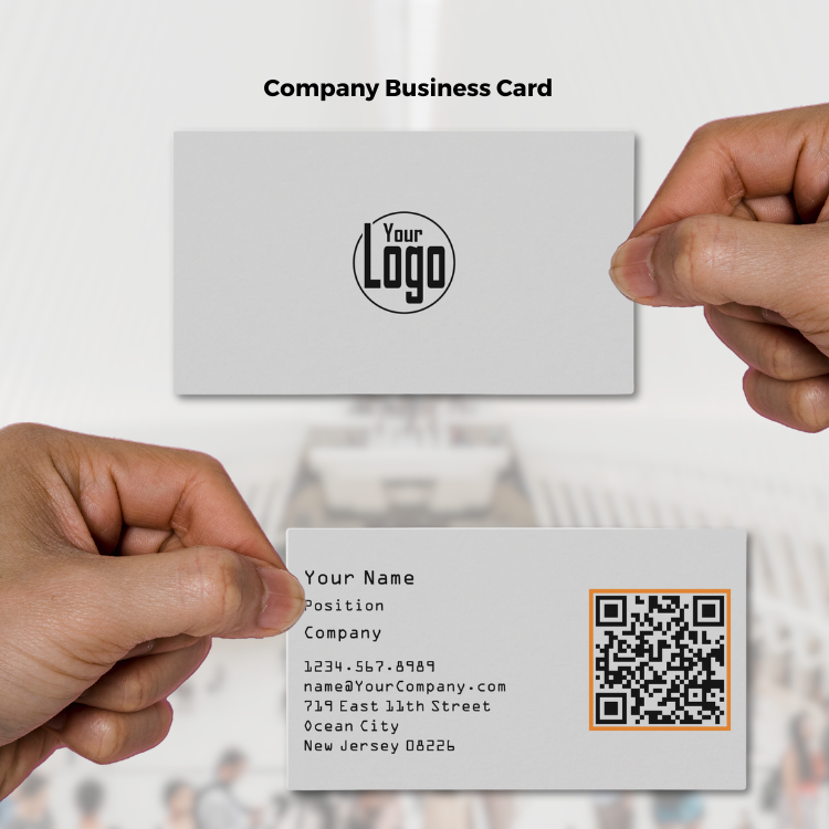
Standard Landscape (3.5” x 2.0”)
Clean, simple, and versatile. Perfect for a wide range of industries.
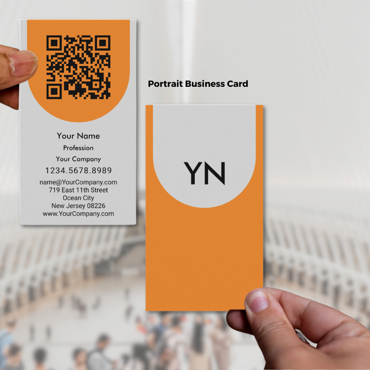
Portrait Business Card
A vertical layout that adds a modern and eye-catching twist to traditional designs.
Square Business Card (2.5” x 2.5”)
Contemporary and stylish, ideal for creative professions.
Slim Business Card (3.5” x 1.75”)
Sleek and minimalist, offering a fresh approach to business card design.
Signature Design Elements
- Colors:
Gray (#003366), Black (#000000), and Orange (#E67E22) create a sophisticated and dynamic palette. - Fonts:
Roboto for body text—clean and highly readable.
Futura for titles—bold and modern.
Satisfy for taglines or initials—elegant and personal. - Features:
Flexible placeholders for text, QR codes, or images.
Customizable colors for background and elements using the “Edit using design tool” feature on Zazzle.
Seasonal Adaptations: Refreshing Brand Identity Year-Round
Your brand identity can remain strong while evolving through the seasons. By maintaining core brand colors—light gray (#d3d3d3), black (#000000), and orange (#e67e22)—and complementing them with seasonal hues, you create a visually cohesive yet adaptable marketing presence.
Each of the examples below draws inspiration from a seasonal photograph. These images lay the foundation for expanding the collection with matching thank you cards and future marketing pieces. Both stylized and photographic versions of the designs offer flexibility while staying rooted in nature’s rhythm.
Spring Bloom
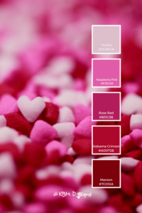
Photo Inspiration: Pink cherry blossoms
Seasonal Colors: #ffd6f1 (light blossom pink), #870058 (deep magenta)
Mood: Hopeful, fresh, and feminine
Stylized Element: Blossoms abstract
Use Case: Welcoming new customers, early-year loyalty rewards
Summer Glow
Photo Inspiration: Coastal sunset with rich blues and warm light
Seasonal Colors: #0353a4 (deep coastal blue), #805d93 (dusky lavender)
Seasonal Font: Bandakala → playful, hand-lettered energy for summer flair and emphasis (used for headings or key phrases like “Sidewalk Sale” or “Today Only!”).
Mood: Confident, energized, slightly playful
Stylized Element: Sunset over calm sea with seabirds
Use Case: Mid-year campaigns, event invitations, limited-time offers
→ Shop the Collection Summer Marketing – Gray Business Cards
Harvest Warmth
Photo Inspiration: Fallen autumn leaves in layered tones
Seasonal Colors: #a23e48 (crimson leaf), #885053 (dusty plum)
Mood: Grounded, warm, and nostalgic
Stylized Element: Leaf shapes
Use Case: Customer appreciation, end-of-season highlights, gratitude campaigns
Frosted Calm
Photo Inspiration: Sunset behind icy twigs with a hint of warmth
Seasonal Colors: #885053 (plum gray), #fcff4b (frosted yellow)
Mood: Serene, introspective, comforting
Stylized Element: Mulled wine with spice icons as warm seasonal motif
Use Case: Holiday thank yous, winter promotions, seasonal exclusives
Color carries emotion—and when thoughtfully adapted, it allows your brand to move with the seasons while staying consistent at its core. These nature-inspired palettes don’t just support your message visually—they make it memorable. As your business grows, these designs can evolve into a full marketing suite that feels fresh, relevant, and unmistakably yours, year-round.
We use color tools to help you choose the perfect hues, and for additional inspiration, explore our curated collection of color palette ideas. Our commitment to customization goes beyond placeholders-almost all elements can be customized to match your chosen colors.
If you need additional assistance customizing or transferring designs to different products, or if you have a unique vision that requires a custom design, we are just a message away. At Designs by KBM D3signs, we go beyond providing marketing materials; we empower you to shape and showcase your brand with creativity and personalization.
Shop at Zazzle Store
Cocoon It! – Gray Business Card Designs & Marketing Items
Explore all of Zazzle ‘s Marketplace for gray business cards or start your business card from scratch.
Show off your personal style or post a review!
-

Marketing Materials Every Personal Trainer Needs to Grow Their Business
Read the post …: Marketing Materials Every Personal Trainer Needs to Grow Their Business -
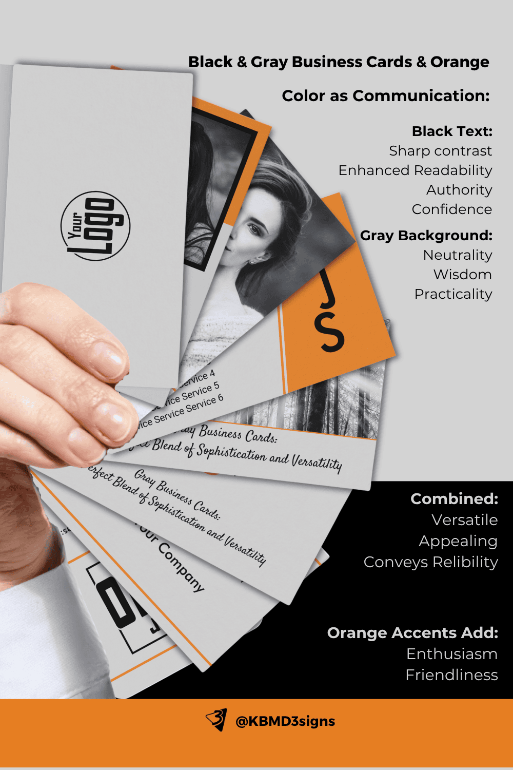
Gray Business Cards: Perfect Blending Of Sophistication And Versatility
Read the post …: Gray Business Cards: Perfect Blending Of Sophistication And Versatility -
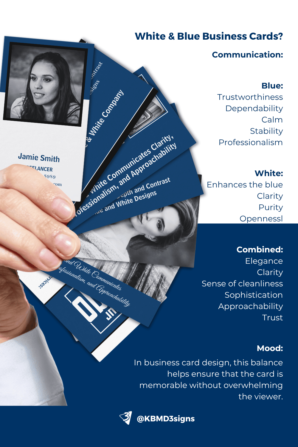
Brand Color Blue : Business Card Designs with an Edge
Read the post …: Brand Color Blue : Business Card Designs with an Edge
7. Frequently Asked Questions About Gray Business Cards
Gray communicates sophistication, neutrality, and professionalism. It’s versatile and works well for various industries while maintaining a minimalist aesthetic.
Gray business cards are ideal for architects, consultants, designers, photographers, and legal professionals—industries that value subtlety and elegance.
This combination creates high contrast, ensuring readability while maintaining a sleek, modern look.
Yes, accent colors like blue, green, or red can enhance visual appeal and personalize the card to suit specific industries or branding.
Absolutely! Gray serves as a neutral base, allowing creative elements like logos, photography, or accent colors to stand out.
Black-and-white photos work best, enhancing the card’s minimalist and sophisticated theme.
Accents highlight key information or add vibrancy without overwhelming the card. For example, blue conveys trust, green symbolizes growth, and red evokes energy.
Yes, they are timeless and contemporary, balancing tradition with modern design elements.
-

What Is A Brand Partnership? – A Small Business Perspective
Read the post …: What Is A Brand Partnership? – A Small Business Perspective -
What Are Business Objectives?” Perspective Of A Small Business
Read the post …: What Are Business Objectives?” Perspective Of A Small Business -

What Is A Focus Group Market Research? – SMB Perspective
Read the post …: What Is A Focus Group Market Research? – SMB Perspective


