

The red and blue color palette, here we explore its characteristics, cultural significance, impact of different shades and practical uses, summarized in a FAQ.
The interplay of red and blue in design and art creates a dynamic and versatile palette that has been used across cultures and time. Each color carries its own set of psychological associations and aesthetic qualities, making their combination both compelling and effective in numerous applications.
Article Content:
1. The Psychology of Red and Blue
Red is often associated with passion, energy, and intensity. It is a color that grabs attention and evokes strong emotions. In branding and marketing, red is used to create a sense of urgency and excitement. It stimulates the appetite, making it a popular choice in the food industry. On a psychological level, red can increase heart rates and create a sense of warmth.
Blue, in contrast, exudes calmness, stability, and trustworthiness. It is the color of the sky and the ocean, which contributes to its soothing and peaceful connotations. Blue is frequently used in corporate designs to promote a sense of reliability and professionalism. It can lower blood pressure and produce a calming effect, making it ideal for spaces intended for relaxation and focus.
When combined, red and blue create a balanced palette that harnesses the best of both worlds: the vibrancy of red and the serenity of blue. This contrast allows for a versatile range of expressions, from bold and dynamic to calm and composed.
Cultural Significance
Throughout history, red and blue have held significant cultural meanings. In many cultures, red is a symbol of luck, prosperity, and happiness. In Chinese culture, red is particularly auspicious and is prominently featured in celebrations like the Lunar New Year.
Blue, on the other hand, is often linked with spirituality and protection. In many Middle Eastern cultures, blue is used in talismans to ward off evil spirits. In Western contexts, blue represents loyalty and authority, which is why it is commonly used in police uniforms and business suits.
The combination of red and blue can be seen in various national flags, such as those of the United States, the United Kingdom, and France, symbolizing ideals of liberty, justice, and unity.
2. Red and Blue Color Palette, Practical Applications in Design
1. Interior Design:
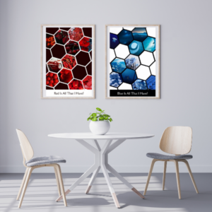
- Living Spaces: Using red and blue in living spaces can create a stimulating yet balanced environment. For instance, a deep blue sofa with red accent pillows can add a touch of elegance and vibrancy to a room.
- Kitchens and Dining Areas: Red accents in kitchens can stimulate appetite, while blue can be used to create a clean and fresh look. Consider red bar stools paired with blue cabinetry for a modern twist.
2. Graphic Design and Branding:
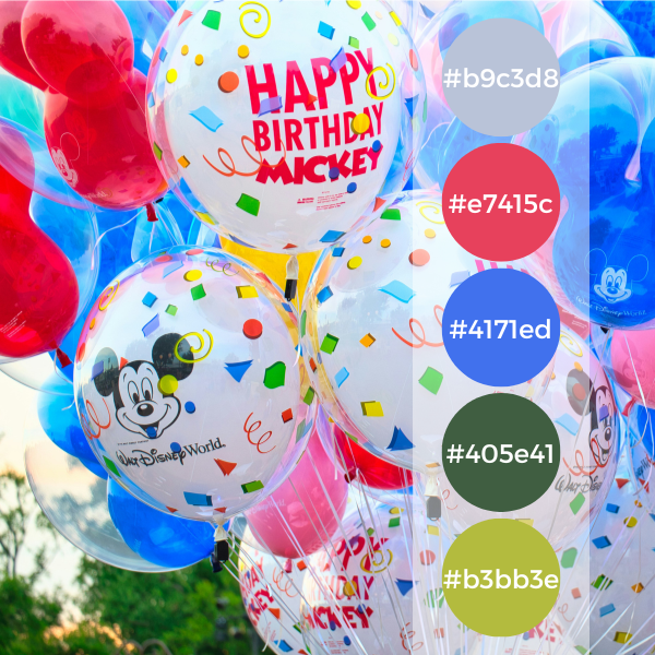
- Logos: Brands like Pepsi and American Express effectively use red and blue in their logos to evoke excitement and trust.
- Web Design: A website that utilizes a red and blue palette can guide user emotions and actions, balancing calls to action (red) with trust-building content areas (blue).
3. Fashion:
- Apparel: Red and blue combinations in clothing can make a bold fashion statement. A classic example is a red dress paired with a blue jacket, merging sophistication with energy.
- Accessories: Red and blue accessories, like ties, scarves, and handbags, can add a pop of color and sophistication to any outfit.
4. Art:
- Artists have long used the red and blue palette to evoke contrast and depth in their works. The interplay of these colors can highlight tension, harmony, and balance within a piece.
5. Wedding:
- The red and blue wedding theme stands out as a captivating choice that combines passion and serenity in equal measure. From the moment guests receive their invitations to the final dance of the evening, every aspect of the celebration is infused with the rich symbolism and elegant beauty of these two complementary colors.
Overall, the red and blue color palette offers a wealth of possibilities for designers, artists, event planners and decorators. By understanding the psychological effects and cultural meanings of these colors, one can create designs that are not only visually appealing, but also emotionally resonant. Whether used in interiors, branding, fashion, art or weddings, the combination of red and blue continues to be a powerful tool for effective and meaningful design.
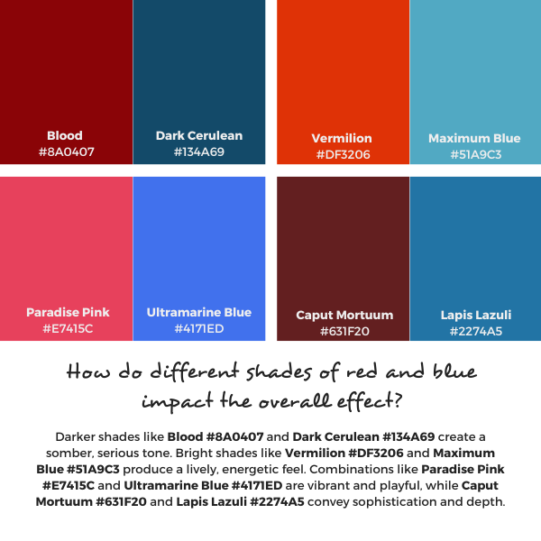
3. How Do Different Shades Of Red And Blue Impact?
Pair 1: Blood (#8A0407) and Dark Cerulean (#134A69)
Blood (#8A0407):
- Description: A deep, dark red with a slightly brownish tint.
- Emotional Impact: Conveys intensity, seriousness, and a sense of grounded strength.
Dark Cerulean (#134A69):
- Description: A dark, muted blue with greenish undertones.
- Emotional Impact: Suggests depth, stability, and a touch of tranquility.
Combined Effect:
- Overall Impact: The combination of Blood and Dark Cerulean creates a somber, sophisticated, and somewhat mysterious palette. It can evoke feelings of depth and seriousness, making it suitable for more formal or serious contexts such as corporate branding or high-end interior design.
Pair 2: Vermilion (#DF3206) and Maximum Blue (#51A9C3)
Vermilion (#DF3206):
- Description: A bright, vivid red-orange.
- Emotional Impact: Conveys energy, enthusiasm, and a sense of urgency.
Maximum Blue (#51A9C3):
- Description: A light, vibrant blue with a touch of green.
- Emotional Impact: Evokes freshness, clarity, and a sense of calm.
Combined Effect:
- Overall Impact: Vermilion and Maximum Blue together create a dynamic and energetic palette. The vividness of Vermilion is balanced by the cool, refreshing tone of Maximum Blue, making this combination suitable for playful, modern designs, such as tech startups or children’s products.
Pair 3: Paradise Pink (#E7415C) and Ultramarine Blue (#4171ED)
Paradise Pink (#E7415C):
- Description: A bright, cheerful pink with red undertones.
- Emotional Impact: Conveys playfulness, warmth, and a touch of romance.
Ultramarine Blue (#4171ED):
- Description: A rich, vivid blue with a slightly purple undertone.
- Emotional Impact: Suggests depth, trust, and a sense of adventure.
Combined Effect:
- Overall Impact: The combination of Paradise Pink and Ultramarine Blue is vibrant and eye-catching. This pairing can create a sense of lively contrast and energetic harmony, making it ideal for artistic projects, fashion, or youthful, vibrant brands.
Pair 4: Caput Mortuum (#631F20) and Lapis Lazuli (#2274A5)
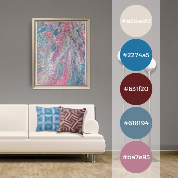
Caput Mortuum (#631F20):
- Description: A dark, earthy red-brown.
- Emotional Impact: Conveys a sense of antiquity, depth, and stability.
Lapis Lazuli (#2274A5):
- Description: A medium to dark blue with a strong, rich quality.
- Emotional Impact: Suggests wisdom, mystery, and a sense of calm authority.
Combined Effect:
- Overall Impact: The combination of Caput Mortuum and Lapis Lazuli creates a regal, historical feel. This palette can evoke a sense of timelessness and sophistication, making it suitable for traditional or luxury brands, historical references, or elegant interior designs.
Conclusion
The different hues of red and blue can significantly alter the overall effect of the color palette:
- Blood and Dark Cerulean create a somber, serious tone.
- Vermilion and Maximum Blue result in a lively, energetic, and modern feel.
- Paradise Pink and Ultramarine Blue produce a vibrant, playful, and eye-catching effect.
- Caput Mortuum and Lapis Lazuli convey a sense of timelessness, sophistication, and depth.
Understanding these nuances allows for the strategic use of color in design to evoke specific emotions and convey the desired message effectively.


4. Frequently Asked Questions About the Red and Blue Color Palette
Red evokes passion, energy, and excitement. It can increase heart rates and create a sense of urgency. Blue, on the other hand, promotes calmness, stability, and trust. It has a soothing effect and can lower blood pressure.
Darker shades like Blood (#8A0407) and Dark Cerulean (#134A69) create a somber, serious tone. Bright shades like Vermilion (#DF3206) and Maximum Blue (#51A9C3) produce a lively, energetic feel. Combinations like Paradise Pink (#E7415C) and Ultramarine Blue (#4171ED) are vibrant and playful, while Caput Mortuum (#631F20) and Lapis Lazuli (#2274A5) convey sophistication and depth.
The red and blue palette is versatile. It works well in:
Interior Design: Adding vibrancy to living spaces or creating calm work environments.
Branding: Combining excitement with trust, suitable for various industries from tech to food.
Fashion: Making bold statements or sophisticated combinations.
Art: Highlighting contrast and depth.
Wedding: Sets the stage for a celebration brimming with elegance and romance.
Yes, it can be very effective. Blue establishes trust and professionalism, while red adds a dynamic and engaging element. This combination is ideal for creating balanced, attention-grabbing corporate designs.
Red often symbolizes luck and happiness in many cultures, while blue represents calm and protection. Together, they can balance these meanings, making the combination powerful in contexts requiring a mix of energy and stability.
National flags like those of the United States, the United Kingdom, and France use red and blue to symbolize ideals of liberty, justice, and unity. Brands like Pepsi and American Express also use these colors to evoke excitement and reliability.
Use red for calls to action and important buttons to grab attention, and blue for backgrounds or informational sections to create a sense of trust and calm. This balance can guide user actions and enhance user experience.
The main challenge is balancing the colors to avoid overwhelming the viewer. Too much red can be overly stimulating, while too much blue can be too calming. Finding the right balance is key to a successful design.
Consider the emotional impact and cultural connotations of different shades. Darker, muted tones are great for serious, sophisticated designs, while brighter, more vibrant shades work well for energetic and modern applications.
Yes, when used thoughtfully. Opt for muted shades and use them sparingly to create focal points and maintain a clean, uncluttered look. This approach can add subtle interest to minimalist designs.

-
Why Christmas Colors Matter & How To Incorporate Brand Colors
Read the post …: Why Christmas Colors Matter & How To Incorporate Brand Colors -
Red and Blue Color Palette: A Blend of Passion and Tranquility
Read the post …: Red and Blue Color Palette: A Blend of Passion and Tranquility -

Black and White Color Palette Its Various Uses
Read the post …: Black and White Color Palette Its Various Uses