Ideas for Collaboration With KBM D3signs for Mutually Beneficial Results
Here at Ideas for Collaboration with KBM D3signs for mutually beneficial outcomes, we invite you to take a look at a list of a few examples of what we think is a great idea. There is a second part to seed ideas that might work well for you.
Part 1 – Our favorite KBM D3signs collaboration ideas:
1. Guest Blog Posts
We love guest post suggestions. A guest blog post or more for KBM D3signs as a method to expand your reach and as part of your backlinking strategy is great.
Topics we welcome include:
The Psychology of Color in Interiors
Art and Home Decor
Wedding Customs and Invitation Etiquette
Children’s Birthday Parties and Activities
Offline Marketing for Small Businesses
2. Product Integration
If you have a content site and would like an exclusive design, please contact us. These can be featured and sold on both sites, each with its own affiliate link. In addition, back-links are possible, crediting the motivator and creator.
3. Creating Printable Resources
Printable resource ideas include:
Printable resources for younger children celebrating their birthday with an art party.
Or an activity booklet for kids invited to a wedding to keep them engaged.
The brainstorming result brought up additional ideas for collaboration that may work for you.
4. Collaborative Content Series
Work together on a series of articles or videos that explore the connection between color and different aspects of life, like how color influences wedding themes or children’s party themes. Each article or video can be hosted on both of the collaborators’ platforms, driving traffic to both of them.
5. Social Media Takeovers
Switch social media accounts for the day or week. You can curate content related to your products and services on their social media, and they can do the same on yours. This cross-promotion can introduce both audiences to each other’s content and offerings.
6. Contests and Giveaways
Host joint contests or giveaways that encourage user participation. For example, you could host a “Design Your Dream Wedding Invitation” contest where participants can win wall art and invitations. Make sure both sites promote the contest to maximize participation.
7. Color-themed Collaboration
Choose a specific color for a collaboration theme and create content around it. For example, you could create a series of articles, videos or product collections around the Pantone Color of the Year. This can help you stay current and engage a broader audience.
8. Influencer Partnerships
Partner with influencers in the interior design, event planning or parenting niche to create sponsored content. Have them use and promote your products in their content related to color, wall art, or invitations.
9. Educational Webinars or Workshops
Co-host online webinars or workshops on topics such as “How to choose the perfect color palette for your wedding. These events can be a great way to connect with your audience and provide valuable information.
10. Collaborative Merchandise
Consider co-creating and selling merchandise together, such as color-themed apparel, mugs, or stationery. Share the profits and promote these products on both sites.
11. Email Newsletter Swaps
Share each other’s content or promotions in your email newsletters. This can help you tap into each other’s subscriber base and drive traffic to your websites.
12. Live Streaming Events
Host live streaming events on platforms like YouTube or Instagram where you discuss various topics related to color, wall art and invitations. Engage with your audience and answer their questions in real time.
For All Parties Involved
Most importantly for the parties involved, remember to align your collaboration ideas with the audiences and goals of both sites. Clear communication and a well-defined partnership agreement are critical to a successful collaboration.
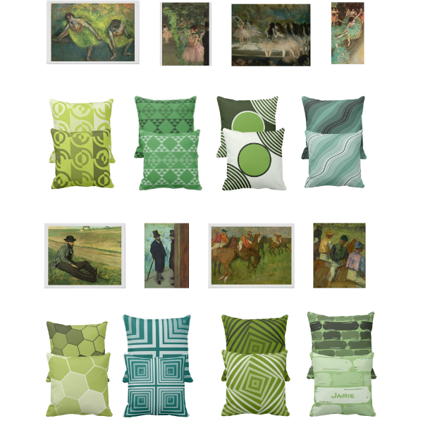
Modern green home decor with a focus on art prints of the famous Edgar Degas.
Here coupled with the paintings a diverse selection of green pillows is shown. Hues include lime-green, summer-green, moss green, and darker teal green. See for yourself and moreover leave a comment about what you think of the result.
Eight Art Prints By Edgar Degas Lead The Green Living-room Decor Ideas
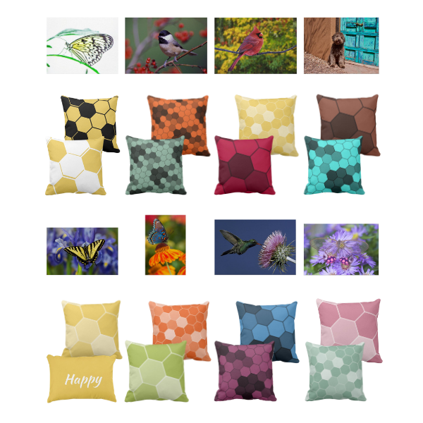
In particular, matching animal print wall decor with hexagon-patterned throw pillows is at the center of attention within the home decor explorations. It is equally important to create a stylish and modern living room environment.
Eight Captivating Animal Photography Lead The Living-room Decor
Beautiful butterfly in black and white with yellow accents
Cool look in red-orange and grey staring at the bird Carolina Chickadee
Autumn vibe in green and yellow surrounding the red Northern Cardinal
Brown and turquoise contrast with a waiting Lagotto Romagnolo
Black and yellow Western Tiger Swallowtail butterfly feeding on a purple Iris
A red-spotted purple-blue butterfly feeds on an orange flower
On a purple thistle-feeding Hummingbird against a deep blue summer sky
A transparent-winged butterfly feeds on purple blossoms
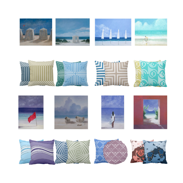
Serene coastal art prints by Lincoln Seligman become the center of the following living room decor ideas.
Selected artworks captivate at first sight and make exceptional modern wall decor, so it became our goal to complement each beach-themed wall hanging with a pillow design by KBM D3signs. Please feel free to comment and let us know what you think about the outcome.
In response to the dominant color range in the paintings, the selected pillow colorations showcase the colors of the coast. The tint of blue, sea-green, purple, grey, and turquoise, while yellow and pink appear in moderation.
Who is Lincoln Seligman?
Born in 1950, the British artist Lincoln Seligman is a sculptor and painter.
Meanwhile, he is likely best known for his large-scale sculptures and installations. Worldwide modern landmark buildings display them in their atriums.
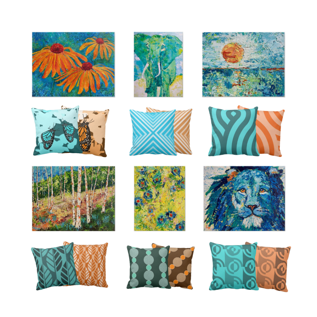
Turquoise and orange pillows are a great and inspiring summer combination. Given this, KBM D3signs presents six living room decoration ideas using vivid colored wall decor by Chris Rice to pair up with throw pillows in turquoise and orange.
Why choose turquoise and orange pillows for your summer living room decor?
Orange finds its place as a secondary color between red and orange. For this reason, the color has characteristics of each of the colors, such as joy, communication, and spreading loving energy. Pairing orange with its complementary color turquoise supports the summer vibe. The energetic expression of turquoise relates to communication and creativity.
Both colors show desirable attributes for a family living room to inspire a vivid, communicative and creative space filled with love and laughter.
Who is Chris Rice?
Musician. Painter. Author.
“Mine is a life inspired by the beauty and color of nature, the contemplation of God, and the humor tucked into small everyday moments. Driven to communicate all of this through creative means, I am overwhelmed by the privilege, and happy to find my work reaching so many people in meaningful ways.”
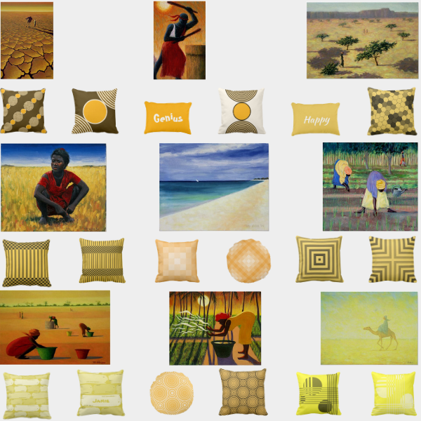
In the post about yellow home decor, KBM D3signs focuses on decorating living room spaces with yellow throw pillows augmented with African art prints by Tilly Willis.
Pillow hues and patterns aim to meet color, shading, and ductus prevalent in the art print.
Why choose yellow home decor?
The first thought associations upon hearing the word yellow are warmth, sun, summer, and a happy emoji smiley face. Despite vivid emotional reactions to the hue yellow ranks in the Yougov survey on the lower end of the favorite colors.
Nonetheless, yellow as the brightest color of the visible spectrum can stimulate a friendly, energetic, communicative, and joyous environment. That makes it a great color to accent with for any living room.
Who is Tilly Willis?
Born and raised in Somerset in the South-West of England, Tilly Willis still resides there. Her family of artists nurtured in her an interest in art. Like this, it came naturally to study at the Somerset College of Art to set the foundation. After completion, she went on to study Fine Art at The Byam Shaw in London.
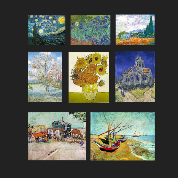
Vincent Van Gogh art has the focus in this edition of Art Meets Pillows. Eight prints of famous impressionist paintings decorate the wall in sample living room spaces. And are thereupon paired with selected pillow designs by KBM D3signs.
Who is Vincent Willem Van Gogh?
Van Gogh is a painter of post-impressionism, and his artwork became posthumously one of the highest traded. The vibrant colors and the unique brushstroke bring an exceptionally dynamic and movement to the painting. Simultaneously the eye of the beholder merges the colors.
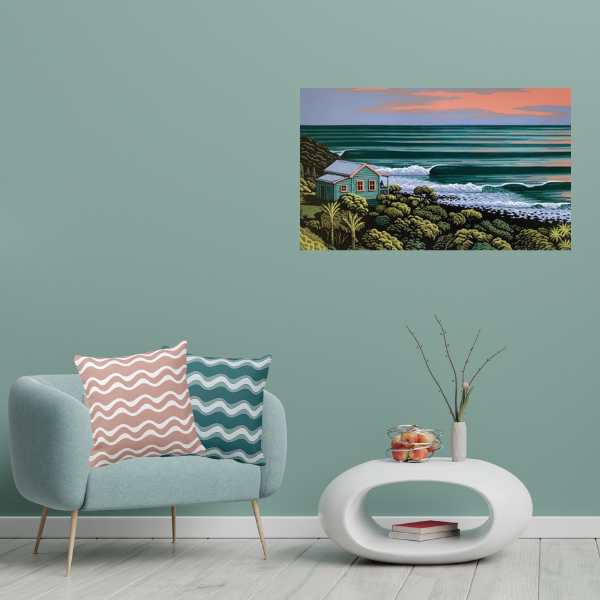
Under the series – Art Meets Pillows – Wave Haven, Raglan is a screenprint by Tony Ogle and complemented by two pillows. One pillow in pink and the second in green. In both cases, the throw pillows display the ripple pattern.
The pillow surface pattern simulates the regular surf rolling towards the coastline, as depicted in the screenprint.
What is noteworthy about Wave Haven Raglan screenprint?
The numbered and signed screenprint shows a peaceful evening view where the observer experiences the sight of the surfer standing on the deck and enjoying the evening spectacle. Also, the scene includes a small single batch in grey-blue with pink accents. Green bush stretches on both sides of the building with an open view towards the sea. There evenly rolling turquoise green surf reaches the beach with a white crown. Meanwhile, the evening sky reflects its pink and blue hues in the distant water.
It is a peaceful scene that stands out in the mix of colors used that are so descriptive to New Zealand’s West Coast.
Raglan is a tourist destination that is famed for an active holiday filled with lots of outdoor activities such as surfing, horse riding, tracking, and kayaking.
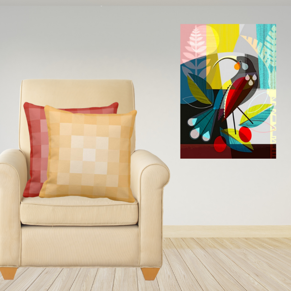
Under the series – Art Meets Pillows – the Huia Dreams art print by Ellen Giggenbach is complemented by two pillows. One pillow in orange and the second in yellow. In both cases, the throw pillows display the pixel pattern.
The pillow surface pattern mirrors overlaying shapes that distinguish shades of yellow only to merge into a square.
Ellen Giggenbach, a New Zealand artist, however, uses this technique with more complexity.
She states explicitly in her own words: “Each design starts its life as an idea only. Piece by piece, it grows like a puzzle till even one more element would upset a carefully crafted balance of shape and color.”
Taranaki Cliffs canvas print by Diana Adams has the spot-light in the series Art Meets Pillows.
On walks, the painter finds her artistic inspiration. Once an inspiration takes roots, she then beautifully reduces her subject to its essence with clear lines like in the Taranaki Cliffs remain. With a three-dimensional feel to the painting, the observer feels pulled into a landscape with brilliant colors.
An overcast sky that opens-up and letting a hint of the sun through and envelopes the eroding ilands off the Taranaki Cliffs. Dark turquoise tinted surf is breaking white-crowned in steady ripples on the shore. In the meantime, the turquoise sea contrasts the greyish black sand beach and the volcanic-layered cliffs.
The top of the cliffs appears capped with the dark green of coastal shrubs. It is a captivating canvas print of one of New Zealand’s contemporary artists.
Art Meets Pillows, Wavy Stripes Pattern Design
Art Meet Pillows relates to the waves and stripes that are defined in the artwork. Wavy-stripes is a monochrome repeat pattern on the grey and green throw pillows.
The pattern reminds, in its horizontal direction, of layered stone, which intensifies through varying shades. Meanwhile, a diagonal direction on a green pillow reminds one of rolling waves.